 Menu
Menu
.Tooltip {
    position: absolute;
    z-index:999;
    width:200px;
    height:57px;
    padding:20px;
    font-family: "Comic Sans MS", cursive;
    font-weight:bold;
    font-size:14px;
    color:rgba(21,139,204,1);
    text-align:justify;
    border-radius:10px;
        -webkit-border-radius:10px;
        -moz-border-radius:10px;
    box-shadow: inset 0px 0px 5px 1px rgba(21,139,204,1);
        -webkit-box-shadow: inset 0px 0px 5px 1px rgba(21,139,204,1);
        -moz-box-shadow: inset 0px 0px 5px 1px rgba(21,139,204,1);
    background:#dbf3ff;
}
.Tooltip .ArrowWrap {
    position:absolute;
    margin-top:77px;
    margin-left:81px;
    height:18px;
    width:37px;
    overflow:hidden;
}
.Tooltip .ArrowWrap .ArrowInner {
    width:25px;
    height:25px;
    margin:-13px 0 0 6px;
    transform: rotate(45deg);
        -ms-transform: rotate(45deg); /* IE 9 */
        -webkit-transform: rotate(45deg); /* Chrome, Safari, Opera */
    box-shadow: inset 0px 0px 5px 1px rgba(21,139,204,1);
        -webkit-box-shadow: inset 0px 0px 5px 1px rgba(21,139,204,1);
        -moz-box-shadow: inset 0px 0px 5px 1px rgba(21,139,204,1);
    background:#dbf3ff;

}
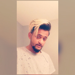
I would like my Tool tip arrow to not be a blocked off triangle caused by the tool tip boarder instead alike my edited Photoshop version shown in the image to the right.
 431
431
Other approach with box-shadows and a pseudo element :
div{
    position:relative;
    width:200px;
    height:57px;
    padding:20px;
    border-radius:10px;
    background:#DBF3FF;
    box-shadow: inset 0px 0px 5px 1px rgba(21,139,204,1);
}
div:after{
    content:'';
    position:absolute;
    left:110px; bottom:-10px;
    width:20px; height:20px;
    background:inherit;
    transform:rotate(45deg);
    box-shadow: inset -5px -5px 5px -4px rgba(21,139,204,1);
}<div></div>On a side note: unless you have very specific needs for browser support, the use of vendor prefixes isn't necessary for box-shadows and border-radius.
119
I think the best option here, is to use svg for the background.
.Tooltip {
position: absolute;
width: 220px;
height: 120px;
padding: 20px;
font-family: "Comic Sans MS", cursive;
font-weight: bold;
font-size: 14px;
color: rgba(21, 139, 204, 1);
text-align: justify;
box-sizing: border-box;
}
#bg {
position: absolute;
top: 0;
left: 0;
z-index: -1;
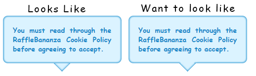
}<div class="Tooltip">
<div>You must read through the RaffleBananza Cookie Policy before agreeing to accept.</div>
<svg id="bg" width="220" height="130" viewBox="0 0 220 140" preserveAspectRatio="none">
<filter id="f" x="-5%" y="-5%" width="110%" height="110%">
<feGaussianBlur in="SourceGraphic" stdDeviation="1" />
</filter>
<path d="M0,7 q0,-7 7,-7 h206 q7,0 7,7 v106 q0,7 -7,7 h-88 l-15,15 l-15,-15 h-88 q-7,0 -7,-7z" fill="#1597E3" />
<path filter="url(#f)" d="M2,9.5 q0,-7 7,-7 h202 q7,0 7,7 v101 q0,7 -7,7 h-86 l-15,15 l-15,-15 h-86 q-7,0 -7,-7z" fill="#dbf3ff" />
</svg>
</div>If you love us? You can donate to us via Paypal or buy me a coffee so we can maintain and grow! Thank you!
Donate Us With