 Menu
Menu
is there a clean and elegant way to achieve a vintage striped text-shadow effect?
To give you an example, i'd like to reproduce with css something like this:
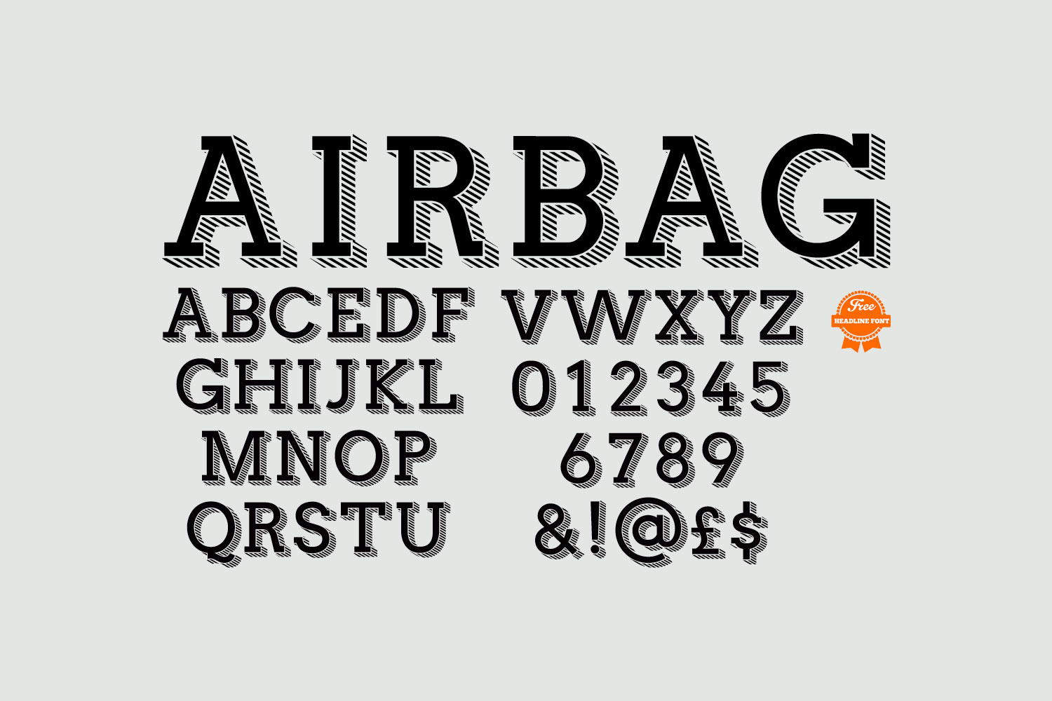
I'd like the stripes to be of a different color from the font.
 250
250
http://jsfiddle.net/kntz6h01/2/
This is the closest I could come up with, but it only works with webkit browsers and is not very customisable in terms of the length of the text-shadow. It also requires an attribute in the tag to duplicate the text.
Basically it works by creating a striped background with -webkit-repeating-linear-gradient, masking out the background with
-webkit-background-clip: text;
-webkit-text-fill-color: transparent;
and duplicating the text with the :after pseudo-element and applying a text-shadow to it.
It's probably not very useful.
61
If you love us? You can donate to us via Paypal or buy me a coffee so we can maintain and grow! Thank you!
Donate Us With

