 Menu
Menu
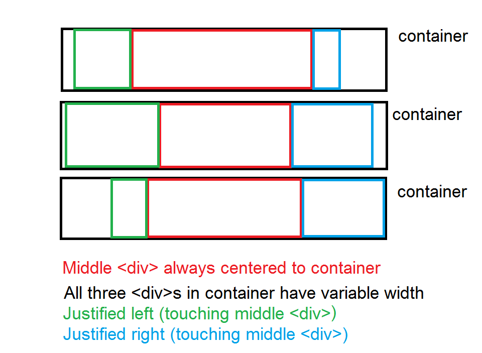
Sorry if the title is confusing. Basically, I'm working on a tumblr theme where I need three adjacent divs wrapped in a fixed-width container. None of their contents are fixed, so they all have variable widths. The middle div should always be centered to the container, while the divs to the left and right will always be "touching" the middle div, and, thus, move around as the middle div's width changes (the left and right s may be images, so text-align doesn't always work). Plus, I may also need to hide the left, right, or both the left and right divs.
Here's a conceptual image:
I can obtain this using flexboxes easily (JFiddle), but flex only has 86% global support.
This is the closest I could get without using flexboxes, but I can't get that middle div (with the text) centered to the title div, while preserving the relative positions of the two images on either side: JFiddle
* {
    height: 100%;
    position: relative;
}
body {
    height: 200px;
}
/* just to get rid of scrollbar */
 p {
    margin: 0;
}
.title {
    background: #aaa;
    height: 22px;
    width: 450px;
    /* for example */
    margin: 0 auto;
}
.container {
    background: #abc;
    float: left;
}
.lr {
    transform: translate(0, -100%);
}
.left {
    background: green;
    float: left;
}
.left img {
    transform: translate(-100%);
}
.center {
    background: red;
    display: inline-block;
    z-index: 2;
}
.right {
    background: blue;
    float: right;
}
.right img {
    transform: translate(100%);
}
.left img, .right img {
    height: 100%;
}

<div class="title">
    <div class="container">
        <div class="center">CENTERCENTERCENTERCEN</div>
        <div class="lr">
            <div class="left">
                <img src="http://i.imgur.com/7bvErJN.jpg" />
            </div>
            <div class="right">
                <img src="http://i.imgur.com/q8Mq0YZ.jpg" />
            </div>
        </div>
    </div>
</div>
Other people have mentioned trying to display the title as a table, but that would require centering the middle cell to the whole row, and having the cells to the left and right take up the rest of the space, and I'm not sure if you can do that when their widths aren't fixed.
Anyone know of any other solutions?
 951
951
If you can change your HTML then apply this:
First move the left and right elements inside center:
<div class="center">
    CENTERCENTERCENTERCEN
    <div class="left">
       testtest<img src="http://i.imgur.com/7bvErJN.jpg" />
    </div>
    <div class="right">
       <img src="http://i.imgur.com/q8Mq0YZ.jpg" />
    </div>
</div>
Then on the CSS :
/*Keep the center container on the middle*/
.title {
   text-align:center;
 }
.center {
   position:relative;
   display:inline-block;
}

/*Position elements based on the relative center parent*/
.left {
   position:absolute;
   top:0;left:0;
   transform:translateX(-100%)
}
.right {
   position:absolute;
   top:0;right:0;
   transform:translateX(100%)
}
Check this DemoFiddle
186
If you love us? You can donate to us via Paypal or buy me a coffee so we can maintain and grow! Thank you!
Donate Us With