 Menu
Menu
I just want to make a research that concerns responsive web design. Don't treat this question like a problem that must be solved. It's just an experiment :)
Sometimes we need to combine percentage and fixed values for dimension calculation especially when it comes to create some responsive layouts. As far as I'm concerned I've found four ways to achieve the desired effect in pure CSS.
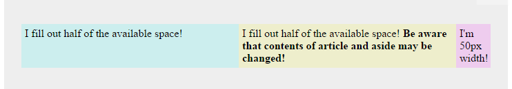
Let's have a quick look on the problem - we need to create a three column layout stretched to the entire width of page where one of the column has a constant width and each remaining column fills out half of the available space.
<main>
  <section>
    <article class="first">
      I fill out half of the available space!
    </article>
    <article class="second">
      I fill out half of the available space!
      <strong>Be aware that contents of article and aside may be changed!</strong>
    </article>
    <aside>
      I'm 50px width!
    </aside>
  </section>
</main>
We have to achieve following layout without modifying HTML structure, contents of <article> and <aside> may be changed. Only pure CSS solutions will be accepted.
The width of each column in default table is calculated automatically and depends on the content of cells. In order to resolve the problem we need to force the size of the column, so this solution uses table that has table-layout property set to fixed. It allows to set the width of any column.
It is probably the most supported solution (read more).
The calc() function enables us to combine percentage and fixed values, for example:
article {
  width: calc(100% - 50px);
}
Unfortunately this is not cross browser solution (read more) and it is recommended to use fallbacks (read more).
This is probably the future of responsive web design. I've implemented desired layout in an instant. Flexbox offers a lot of interesting features (read more).
You can read here about the compatibility.
This is another well supported solution. Absolute position is applied to the static aside element, section has appropriate right margin, 50% width is added for both article elements.
That's a very common problem in responsive world and I am very curious if there is any other ideas how to resolve it in pure CSS. Any thoughts on that will be appreciated.
Try to shrink fiddle's preview pane to the minimal width - in my opinion good, worthy tables still behaves most predictably ;)
Regards.
 727
727
(Edit: this one is similar (/simplified) to the OP's Solution 1 and AFAIK he covered all of the most popular solutions out in the wild. To recap, this one is a neat way to make it cross-browser compatible)
jsBin demo
...would be to simply mimic the way table does it,
and prevent stretches using table-layout: fixed;:
article, aside {
  display:table-cell;
}
aside {
  width: 50px;
}
section {
  display:table;
  table-layout: fixed;
  width:100%;
}
See also: Two column template with static and responsive width
NOTE! Don't forget you can nest elements inside the two-column version or other versions to create different variants.
164
If you love us? You can donate to us via Paypal or buy me a coffee so we can maintain and grow! Thank you!
Donate Us With

