 Menu
Menu
I'm running into some confusion when it comes to CSS Grid. I have the grid-template-columns set to auto-fit and that works perfectly fine. Except as soon as I set column-start/end on div5, I start getting auto-fill behavior instead where multiple blank cells are being created. It seems like the max 1fr of my minmax function isn't doing it's job.
Am I missing something obvious here?
body {
  display: grid;
  grid-template-columns: repeat(auto-fit, minmax(200px, 1fr));
}

#div5 {
  grid-column-start: 1;
  grid-column-end: -1;
}
Images below show increasing/decreasing window size that shows auto-fill behavior.

Added Code Snippet as per request You have to make sure you run it in full screen and increase the screen size horizontally to see the issue.
/* Div Styles */
#div1 { background: yellow     }
#div2 { background: dodgerblue }
#div3 { background: tomato     }
#div4 { background: limegreen  }
#div5 { background: yellow     }


/* Body Style */
body { margin: 0; }


/* Grid Settings */
body {
  display: grid;
  grid-template-columns: repeat(auto-fit, minmax(200px, 1fr));
  grid-template-rows: repeat(auto-fit, minmax(200px, 1fr));
  grid-auto-rows: minmax(200px, 1fr);
}

#div5 {
  grid-column-start: 1;
  grid-column-end: -1;
}
<!DOCTYPE HTML>
<html>
<body>
<div id="div1">Div 1</div>
<div id="div2">Div 2</div>
<div id="div3">Div 3</div>
<div id="div4">Div 4</div>
<div id="div5">Div 5</div>
</body>
</html> 398
398
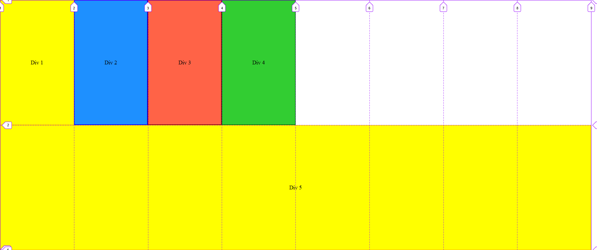
You want the first 4 items always to fill the first row and the last item always to fill the second row.
This means that you want a 4-column grid with the final item spanning all 4 columns.
body {
  display: grid;
  grid-template-columns: repeat(4, 1fr);
}

#div5 {
  grid-column-start: 1;
  grid-column-end: -1;
}
/* Div Styles */
#div1 { background: yellow     }
#div2 { background: dodgerblue }
#div3 { background: tomato     }
#div4 { background: limegreen  }
#div5 { background: aqua     }


/* Body Style */
body { margin: 0; }


/* Grid Settings */
body {
  display: grid;
  grid-template-columns: repeat(4, 1fr);
  grid-template-rows: repeat(auto-fit, minmax(200px, 1fr));
  grid-auto-rows: minmax(200px, 1fr);
}

#div5 {
  grid-column-start: 1;
  grid-column-end: -1;
}
<div id="div1">Div 1</div>
<div id="div2">Div 2</div>
<div id="div3">Div 3</div>
<div id="div4">Div 4</div>
<div id="div5">Div 5</div>The problem with the original code:
grid-template-columns: repeat(auto-fit, minmax(200px, 1fr));
is that it uses auto-fit which is meant for responsive layout grids where the amount of columns isn't fixed but rather the grid makes new columns based on the grid content and layout method.
That obviously isn't what you need in your case.
154
If you love us? You can donate to us via Paypal or buy me a coffee so we can maintain and grow! Thank you!
Donate Us With

