 Menu
Menu
I'm trying to get a very simple layout using the flex model working on iPad.
I have a containing div that is supposed to center the content divs.
The sample code does as intended across all browsers and platforms EXCEPT on the iPad (retina).
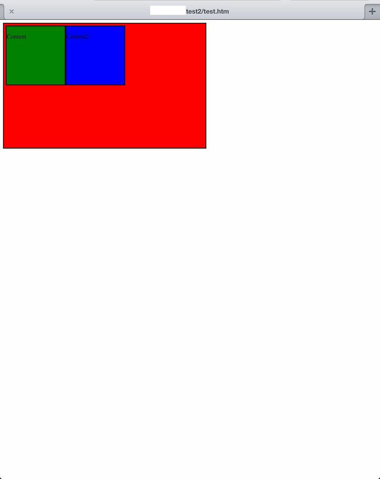
Using various iPad emulators online will not replicate the problem. I've only been able to replicate it on the actual iPad. Here's a screenshot of what it looks like:
Any and all advice will be appreciated very much.
CSS:
.container {
width: 510px;
height: 310px;
background: red;
display: flex;
display: -webkit-flexbox;
display: -ms-flexbox;
display: -webkit-flex;
flex-direction: row;
flex-wrap: wrap;
-webkit-box-pack: center;
-moz-box-pack: center;
-ms-flex-pack: center;
-webkit-justify-content: center;
justify-content: center;
-webkit-flex-align: center;
-ms-flex-align: center;
-webkit-align-items: center;
align-items:center;
border: 2px solid;
padding: 5px;
margin: 0;
}

.content {
float: left;
width: 150px;
height: 150px;
background: green;
border: 2px solid;
padding: 0;
margin: 0;
}

.content2 {
float: left;
width: 150px;
height: 150px;
background: blue;
border: 2px solid;
padding: 0;
margin: 0;
}
HTML:
<div class="container">
<div class="content">
<p>Content</p>
</div>
<div class="content2">
<p>Content2</p>
</div>
</div>
 995
995
If you want to use flexbox to create a simple graph visualization, all you need to do is to set align-items of the container to flex-end and define a height for each bar. flex-end will make sure that the bars are anchored to the bottom of the graph.
In the flex layout model, the children of a flex container can be laid out in any direction, and can "flex" their sizes, either growing to fill unused space or shrinking to avoid overflowing the parent. Both horizontal and vertical alignment of the children can be easily manipulated.
Safari versions 9 and up support the current flexbox spec without prefixes. Older Safari versions, however, require -webkit- prefixes. Sometimes min-width and max-width cause alignment problems which can be resolved with flex equivalents.
You're missing some properties from the old 2009 draft (or have them named wrong). Your container CSS should look like this:
http://cssdeck.com/labs/ci9imeed
.container {
  width: 510px;
  height: 310px;
  background: red;
  display: -webkit-box;
  display: -moz-box;
  display: -ms-flexbox;
  display: -webkit-flex;
  display: flex;
  -webkit-box-pack: center;
  -moz-box-pack: center;
  -ms-flex-pack: center;
  -webkit-justify-content: center;
  justify-content: center;
  -webkit-box-align: center;
  -moz-box-align: center;
  -ms-flex-align: center;
  -webkit-align-items: center;
  align-items: center;
  border: 2px solid;
  padding: 5px;
  margin: 0;
}
Note, however, that none of the browsers with a 2009 Flexbox implementation (Android, older Safari, older Firefox) support wrapping.
199
If you love us? You can donate to us via Paypal or buy me a coffee so we can maintain and grow! Thank you!
Donate Us With

