 Menu
Menu
I'm having a hard time making this preloader animation in CSS.
This is what I'm trying to make.
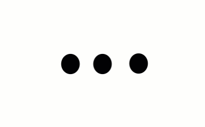
What am I doing wrong?
.l {
  animation: pulse .8s infinite linear;
}
.m {
  animation: pulse .8s infinite linear;
  animation-delay: .2s;
}
.r {
  animation: pulse .8s infinite linear;
  animation-delay: .4s;
}

@keyframes pulse {
  0%   { padding: 8px; }
  50% { padding: 16px; }
  100%  { padding: 8px; }
}
html, body {
  height: 100%;
}

.table {
  display: table;
  width: 100%;
  height: 100%;
  text-align: center;
}

.cell {
  display: table-cell;
  vertical-align: middle;
}

.circle {
  display: inline-block;
  padding: 8px;
  margin: 0 0.6em;
  background: #000;
  border-radius: 100%;
}

.l {
  animation: pulse .8s infinite linear;
}
.m {
  animation: pulse .8s infinite linear;
  animation-delay: .2s;
}
.r {
  animation: pulse .8s infinite linear;
  animation-delay: .4s;
}

@keyframes pulse {
  0%   { padding: 8px; }
  50% { padding: 16px; }
  100%  { padding: 8px; }
}
<div class="table">
<div class="cell">
<div class="circle l"></div>
<div class="circle m"></div>
<div class="circle r"></div>
</div>
</div> 566
566
Use step-end:
animation: pulse .8s infinite step-end;
body{
  padding-top: 40px; /* for demonstration purpose */
}

.table {
  display: table;
  width: 100%;
  height: 100%;
  text-align: center;
}

.cell {
  display: table-cell;
  vertical-align: middle;
}

.circle {
  display: inline-block;
  padding: 8px;
  margin: 0 0.6em;
  background: #000;
  border-radius: 100%;
}

.l {
  animation: pulse 2s infinite step-end;
  animation-delay: .2s;
}
.m {
  animation: pulse 2s infinite step-end;
  animation-delay: .4s;
}
.r {
  animation: pulse 2s infinite step-end;
  animation-delay: .6s;
}

@keyframes pulse {
  0%   { transform: scale( 1 ); }
  50% { transform: scale( 2 ); }
  100%  { transform: scale( 1 ); }
}
<div class="table">
<div class="cell">
<div class="circle l"></div>
<div class="circle m"></div>
<div class="circle r"></div>
</div>
</div>JSFiddle
Now just adjust the animation duration and delay time to make it more like in the OP.
Update: use transform: scale() to make the circle expand from its centar - reference
191
I have extra frames to the animation. Check below answer.
html,
body {
  height: 100%;
}
.table {
  display: table;
  width: 100%;
  height: 100%;
  text-align: center;
}
.cell {
  display: table-cell;
  vertical-align: middle;
}
.circle {
  display: inline-block;
  padding: 8px;
  margin: 0 0.5em;
  background: #000;
  border-radius: 100%;
}
.l {
  animation: pulse 2s infinite linear;
}
.m {
  animation: pulse 2s infinite linear;
  animation-delay: .3s;
}
.r {
  animation: pulse 2s infinite linear;
  animation-delay: .6s;
}
@keyframes pulse {
  10% {
    transform: scale(1);
  }
  20% {
    transform: scale(1);
  }
  30% {
    transform: scale(1.7);
  }
  50% {
    transform: scale(1.7);
  }
  70% {
    transform: scale(1.7);
  }
  80% {
    transform: scale(1);
  }
  90% {
    transform: scale(1);
  }
  100% {
    transform: scale(1);
  }
}
<div class="table">
<div class="cell">
<div class="circle l"></div>
<div class="circle m"></div>
<div class="circle r"></div>
</div>
</div>If you love us? You can donate to us via Paypal or buy me a coffee so we can maintain and grow! Thank you!
Donate Us With