 Menu
Menu
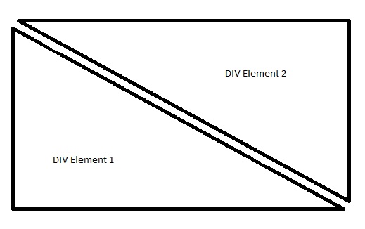
I'm developing a responsive web application, and need to create 2 separate content areas as follows,
So far, I tried,
border-right: 30px solid transparent;
border-bottom: 30px solid #4c4c4c;
height: 100%;
width: 100%;
position: fixed;
But, unfortunately couldn't create a triangle.
Is there any other way to create a triangle using CSS with the possibility to wrap content entirely within the div's besides using the border property?
Any help would be greatly appreciated.
 698
698
 asked Jan 02 '16 05:01
The idea is a box with zero width and height. The actual width and height of the arrow is determined by the width of the border. In an up arrow, for example, the bottom border is colored while the left and right are transparent, which forms the triangle.
If you want to generate a triangle with rounded corners, the code is at least , and the best way is to use SVG to generate it. Use SVG's polygon tag <polygon> generate a triangle, and use SVG's stroke-linejoin="round" generate rounded corners at the connection.
I believe you are looking for triangles with borders and a transparent cut in between (which none of the existing answers seem to address) and so here is an example. It's absolutely possible to achieve with but takes a lot of hacking around.
Using CSS Transforms:
The below snippet uses pseudo-elements and transforms to produce the triangles effect. The output is responsive but the usage of skew transforms mean that if the container's shape becomes a rectangle then the skew angles would need modification and more tweaking of the positioning attributes etc.
.container {
  position: relative;
  overflow: hidden;
  height: 200px;
  width: 200px;
}
.div-1,
.div-2 {
  position: absolute;
  top: 0px;
  left: 0px;
  height: 100%;
  width: 100%;
  overflow: hidden;
}
.div-1 {
  top: calc(-100% - 5px);
  transform: skewY(45deg);
  transform-origin: left top;
  border-bottom: 2px solid;
}
.div-1:after {
  position: absolute;
  content: '';
  height: calc(100% - 2px);
  width: calc(100% - 2px);
  top: calc(100% + 7px);
  left: 0px;
  transform: skewY(-45deg);
  transform-origin: left top;
  border: 1px solid;
}
.div-2 {
  top: 5px;
  transform: skewY(45deg);
  transform-origin: left bottom;
  border-top: 1px solid;
}
.div-2:after {
  position: absolute;
  content: '';
  height: calc(100% - 7px);
  width: calc(100% - 7px);
  top: 0px;
  left: 0px;
  transform: skewY(-45deg);
  transform-origin: left bottom;
  border: 1px solid;
}
* {
  box-sizing: border-box;
}

/* just for demo */
.container{
  transition: all 1s;
}
.container:hover{
  width: 400px;
  height: 400px;
}
body{
  background: radial-gradient(circle at center, aliceblue, mediumslateblue);
  min-height: 100vh;
}
<script src="https://cdnjs.cloudflare.com/ajax/libs/prefixfree/1.0.7/prefixfree.min.js"></script>
<div class='container'>
<div class='div-1'></div>
<div class='div-2'></div>
</div>Using Gradients:
Another approach would be to use a couple of linear gradients as background images like in the below snippet. But there are plenty of drawbacks here too. (1) Gradients have very poor browser support at present. (2) Angular gradients tend to produce jagged lines which would need smoothing. (3) You had specifically mentioned 2 div elements in the image in question and I presume you want content within them, in which case that would need extra work.
.container {
  position: relative;
  overflow: hidden;
  height: 200px;
  width: 300px;
  background: linear-gradient(to top right, transparent calc(50% + 2px), black calc(50% + 2px), black calc(50% + 4px), transparent calc(50% + 4px)), linear-gradient(to bottom left, transparent calc(50% + 2px), black calc(50% + 2px), black calc(50% + 4px), transparent calc(50% + 4px)) ;
    }
.container:before{
  position: absolute;
  content: '';
  height: calc(100% - 6px);
  width: calc(100% - 6px);
  left: 4px;
  border-top: 2px solid black;
  border-right: 2px solid black;
}
.container:after{
  position: absolute;
  content: '';
  height: calc(100% - 6px);
  width: calc(100% - 6px);
  top: 4px;
  border-left: 2px solid black;
  border-bottom: 2px solid black;
}
/* just for demo */
.container{
  transition: all 1s;
}
.container:hover{
  width: 700px;
  height: 400px;
}
body{
  background: radial-gradient(circle at center, aliceblue, mediumslateblue);
  min-height: 100vh;
}
<script src="https://cdnjs.cloudflare.com/ajax/libs/prefixfree/1.0.7/prefixfree.min.js"></script>
<div class='container'>
</div>Using SVG:
All these lead me to my suggestion, which is, to use SVG for creating such shapes. They are easy to create using just path elements, easily maintainable and are responsive by nature.
.container {
  position: relative;
  height: 300px;
  width: 200px;
}
svg {
  position: absolute;
  top: 0px;
  left: 0px;
  height: 100%;
  width: 100%;
}
svg path {
  fill: transparent;
  stroke: black;
}
/* just for demo */

.container {
  transition: all 1s;
}
.container:hover {
  height: 400px;
  width: 700px;
}
body {
  background: radial-gradient(circle at center, aliceblue, mediumslateblue);
  min-height: 100vh;
}
<script src="https://cdnjs.cloudflare.com/ajax/libs/prefixfree/1.0.7/prefixfree.min.js"></script>
<div class='container'>
<svg viewBox='0 0 100 100' preserveAspectRatio='none'>
<path d='M4,2 L98,2 98,96 4,2z M2,4 L2,98 96,98 2,4z' vector-effect='non-scaling-stroke' />
</svg>
</div>Note: With any of the approaches mentioned above (or those given in other answers), you cannot make the content to remain within the boundaries of those triangles. Text can be placed upon them but the text cannot be contained within those boundaries unless the CSS Shapes module's
shape-insideproperty is fully implemented.
162
If you love us? You can donate to us via Paypal or buy me a coffee so we can maintain and grow! Thank you!
Donate Us With
