 Menu
Menu
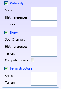
I have the following XAML, in which there are three group boxes stacked. In the header of those groupboxes are checkboxes.
What I'd like to achieve : when I check/uncheck a box, I'd like the corresponding groupbox to slowly expand/collapse, with a smooth animation.
I'm trying this in Blend 4 but am quite a newbie. Any help on how to achieve this ? In particular, can the animation be self-contained in the XAML ?
UPDATE : This seems to come close , but I don't quite get it
<UserControl
    xmlns="http://schemas.microsoft.com/winfx/2006/xaml/presentation"
    xmlns:x="http://schemas.microsoft.com/winfx/2006/xaml"
    xmlns:d="http://schemas.microsoft.com/expression/blend/2008"
    xmlns:mc="http://schemas.openxmlformats.org/markup-compatibility/2006"
    mc:Ignorable="d"
    x:Class="WpfControlLibrary1.MainControl"
    x:Name="MultiVol">
        <StackPanel x:Name="LayoutRoot" HorizontalAlignment="Stretch">
            <GroupBox Margin="8,0" BorderBrush="#FF88B1D8">
                <GroupBox.Header>
                    <WrapPanel>
                    <CheckBox IsChecked="True" VerticalAlignment="Center" />
                    <Label Content="Volatility" Background="#00000000" Foreground="#FF0033FF" FontWeight="Bold" FontFamily="/WpfControlLibrary1;component/Fonts/#Tahoma" />
                    </WrapPanel>
                </GroupBox.Header>
                <UniformGrid Columns="2">
                    <Label Content="Spots"></Label>
                    <TextBox AcceptsReturn="False" AcceptsTab="True" AllowDrop="True" IsTabStop="True" />
                    <Label Content="Hist. references" />
                    <TextBox AcceptsReturn="False" AcceptsTab="True" AllowDrop="True" IsTabStop="True" />
                    <Label Content="Tenors" />
                    <TextBox AcceptsReturn="False" AcceptsTab="True" AllowDrop="True" IsTabStop="True" />

                </UniformGrid>
            </GroupBox>
            <GroupBox  Margin="8,0" BorderBrush="#FF88B1D8">
                <GroupBox.Header>
                    <WrapPanel>
                    <CheckBox IsChecked="True" VerticalAlignment="Center" />
                    <Label Content="Skew" Background="#00000000" Foreground="#FF0033FF" FontWeight="Bold" FontFamily="/WpfControlLibrary1;component/Fonts/#Tahoma" />
                    </WrapPanel>
                </GroupBox.Header>
                <UniformGrid Columns="2">
                    <Label Content="Spot Intervals"></Label>
                    <TextBox AcceptsReturn="False" AcceptsTab="True" AllowDrop="True" IsTabStop="True" />
                    <Label Content="Hist. references" />
                    <TextBox AcceptsReturn="False" AcceptsTab="True" AllowDrop="True" IsTabStop="True" />
                    <Label Content="Tenors" />
                    <TextBox AcceptsReturn="False" AcceptsTab="True" AllowDrop="True" IsTabStop="True" />
                    <Label Content="Compute 'Power'" />
                    <CheckBox IsChecked="False" VerticalAlignment="Center"/>
                </UniformGrid>
            </GroupBox>
            <GroupBox Margin="8,0" BorderBrush="#FF88B1D8">
                <GroupBox.Header>
                    <WrapPanel>
                    <CheckBox IsChecked="True" VerticalAlignment="Center" />
                    <Label Content="Term structure" Background="#00000000" Foreground="#FF0033FF" FontWeight="Bold" FontFamily="/WpfControlLibrary1;component/Fonts/#Tahoma" />
                    </WrapPanel>
                </GroupBox.Header>
                <UniformGrid Columns="2">
                    <Label Content="Spots" />
                    <TextBox AcceptsReturn="False" AcceptsTab="True" AllowDrop="True" IsTabStop="True" />
                    <Label Content="Tenors" />
                    <TextBox AcceptsReturn="False" AcceptsTab="True" AllowDrop="True" IsTabStop="True" />
                </UniformGrid>
            </GroupBox>
        </StackPanel>
</UserControl>
 618
618
Just edited the first group box in your simple code:
    <GroupBox Margin="8,0" BorderBrush="#FF88B1D8" Height="150">
        <GroupBox.Resources>
            <Style TargetType="GroupBox">
                <Style.Triggers>
                    <EventTrigger RoutedEvent="CheckBox.Unchecked">
                        <BeginStoryboard>
                            <Storyboard>
                                <DoubleAnimation Storyboard.TargetProperty="Height" Duration="0:0:.2"  To="30" />
                            </Storyboard>
                        </BeginStoryboard>
                    </EventTrigger>
                    <EventTrigger RoutedEvent="CheckBox.Checked">
                        <BeginStoryboard>
                            <Storyboard>
                                <DoubleAnimation Storyboard.TargetProperty="Height" Duration="0:0:.2" />
                            </Storyboard>
                        </BeginStoryboard>
                    </EventTrigger>
                </Style.Triggers>
            </Style>
        </GroupBox.Resources>
        <GroupBox.Header>
            <WrapPanel>
                <CheckBox IsChecked="True" VerticalAlignment="Center" />
                <Label Content="Volatility" Background="#00000000" Foreground="#FF0033FF" FontWeight="Bold" />
            </WrapPanel>
        </GroupBox.Header>
        <UniformGrid Columns="2">
            <Label Content="Spots"></Label>
            <TextBox AcceptsReturn="False" AcceptsTab="True" AllowDrop="True" IsTabStop="True" />
            <Label Content="Hist. references" />
            <TextBox AcceptsReturn="False" AcceptsTab="True" AllowDrop="True" IsTabStop="True" />
            <Label Content="Tenors" />
            <TextBox AcceptsReturn="False" AcceptsTab="True" AllowDrop="True" IsTabStop="True" />

        </UniformGrid>
    </GroupBox>
If you want to have this on a single group box you could place the Style Element inside this code
<GroupBox.Resources>
  <!--Style Inside HEre-->
</GroupBox.Resources>
to implement it on a single group box.
Another suggestion is created a Style inside the stack panel and add a key to it:
    <StackPanel.Resources>
        <Style TargetType="GroupBox" x:Key="groupBoxStyle">
            <Style.Triggers>
                <EventTrigger RoutedEvent="CheckBox.Unchecked">
                        <BeginStoryboard>
                            <Storyboard>
                                <DoubleAnimation Storyboard.TargetProperty="Height" Duration="0:0:.2"  To="30" />
                            </Storyboard>
                        </BeginStoryboard>
                </EventTrigger>
                <EventTrigger RoutedEvent="CheckBox.Checked">
                    <BeginStoryboard>
                        <Storyboard>
                            <DoubleAnimation Storyboard.TargetProperty="Height" Duration="0:0:.2" />
                        </Storyboard>
                    </BeginStoryboard>
                </EventTrigger>
            </Style.Triggers>
        </Style>
    </StackPanel.Resources>
then attached it to the style of the groupbox:
    <GroupBox Margin="8,0" Height="150" BorderBrush="Transparent" Style="{StaticResource groupBoxStyle}">
        <GroupBox.Header>
            <WrapPanel>
                <CheckBox IsChecked="True" VerticalAlignment="Center" />
                <Label Content="Volatility" Background="#00000000" Foreground="#FF0033FF" FontWeight="Bold" />
            </WrapPanel>
        </GroupBox.Header>
        <Border BorderBrush="Black" BorderThickness="2">
        <UniformGrid Columns="2">
            <Label Content="Spots"></Label>
            <TextBox AcceptsReturn="False" AcceptsTab="True" AllowDrop="True" IsTabStop="True" />
            <Label Content="Hist. references" />
            <TextBox AcceptsReturn="False" AcceptsTab="True" AllowDrop="True" IsTabStop="True" />
            <Label Content="Tenors" />
            <TextBox AcceptsReturn="False" AcceptsTab="True" AllowDrop="True" IsTabStop="True" />
        </UniformGrid>
        </Border>
    </GroupBox>
this approach will be more useful when you want to implement this on the future to multiple groupboxes
In Case you want to handle the checkbox and unchecked event you could use this code
    <GroupBox Margin="8,0" Height="150" BorderBrush="Transparent" Style="{StaticResource groupBoxStyle}" CheckBox.Checked="CheckBox_Checked" CheckBox.Unchecked="CheckBox_Unchecked">
        <GroupBox.Header>
            <WrapPanel>
                <CheckBox x:Name="chkHeader" IsChecked="True" VerticalAlignment="Center" />
                <Label Content="Volatility" Background="#00000000" Foreground="#FF0033FF" FontWeight="Bold" />
            </WrapPanel>
        </GroupBox.Header>
        <Border BorderBrush="Black" BorderThickness="2">
        <UniformGrid Columns="2">
            <Label Content="Spots"></Label>
            <TextBox AcceptsReturn="False" AcceptsTab="True" AllowDrop="True" IsTabStop="True" />
            <Label Content="Hist. references" />
            <TextBox AcceptsReturn="False" AcceptsTab="True" AllowDrop="True" IsTabStop="True" />
            <Label Content="Tenors" />
            <TextBox AcceptsReturn="False" AcceptsTab="True" AllowDrop="True" IsTabStop="True" />
        </UniformGrid>
        </Border>
    </GroupBox>
and add this in the code behind:
    private void CheckBox_Checked(object sender, RoutedEventArgs e)
    {
        if ((e.OriginalSource as CheckBox).Name != "chkHeader")
        {
            e.Handled = true;
        }
    }

    private void CheckBox_Unchecked(object sender, RoutedEventArgs e)
    {
        if ((e.OriginalSource as CheckBox).Name != "chkHeader")
        {
            e.Handled = true;
        }
    }
You probably should use an Expander for this (that's what they are for) and animate that.
If you don't like the look re-template them, you can make them look like a group-box.
27
If you love us? You can donate to us via Paypal or buy me a coffee so we can maintain and grow! Thank you!
Donate Us With