 Menu
Menu
We are trying to use the bootstrap 3 panels to create a responsive grid layout, however we are unable to work out how to get them to display in the way that we want them. Below shows an example of what we have so far:

And the django/bootstrap code that generates the layout (indicents is simply a list of objects where we display one incident_panel.html per list item):
{% for incident in incidents %}
    <div class="col-lg-4 col-md-4 col-sm-6 col-xs-12">
        {% include 'incident_panel.html' %}
    </div>
{% endfor %}
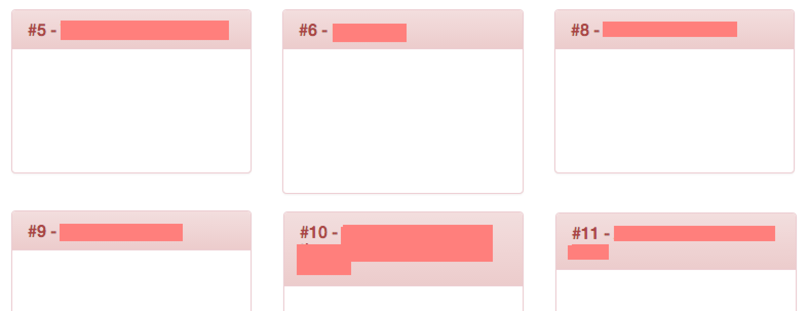
The problem is caused here by the varying heights of panels #5, #6 and #8, which means we don't get a complete row laid out below them. Ideally, we would want the layout to do something like this:
We are looking for a CSS based solution if possible, which will maintain the responsive behavior of laying the panels out with varying number of columns based on screen width. There are a couple of solutions we have considered, but neither of them are particularly good:
<div class="row-fluid"> element. This is more elegant, however to maintain the responsive behavior we would have to layout 3 different grids on the page which we show/hide based on screen width. 525
525
Here's my take on it:
You can fix every panel's height and then add a scroll bar to them. A scroll bar will automatically appear in those panels in which the content doesn't fit in their height.
CSS
.mypanel {
    height: 100px;
    overflow-y: scroll;
}
HTML
Add the .mypanel class to your panel's body.
<div class="panel-body mypanel"> ... </div>
Using overflow-y: scroll; will always display a scroll bar even if the content fits completely in the panels. So, if you want to add a scroll bar to only those panels whose content doesn't fit in them, use overflow-y: auto; instead.
65
If you love us? You can donate to us via Paypal or buy me a coffee so we can maintain and grow! Thank you!
Donate Us With