 Menu
Menu
Update - I've decided against the JavaScript solution. The only way to make sure it always works is to put it in setInterval() going every few seconds. Don't want to do that. I know this CSS is possible, I've seen it work. I'll re-open the bounty for more like 150 if it ends.
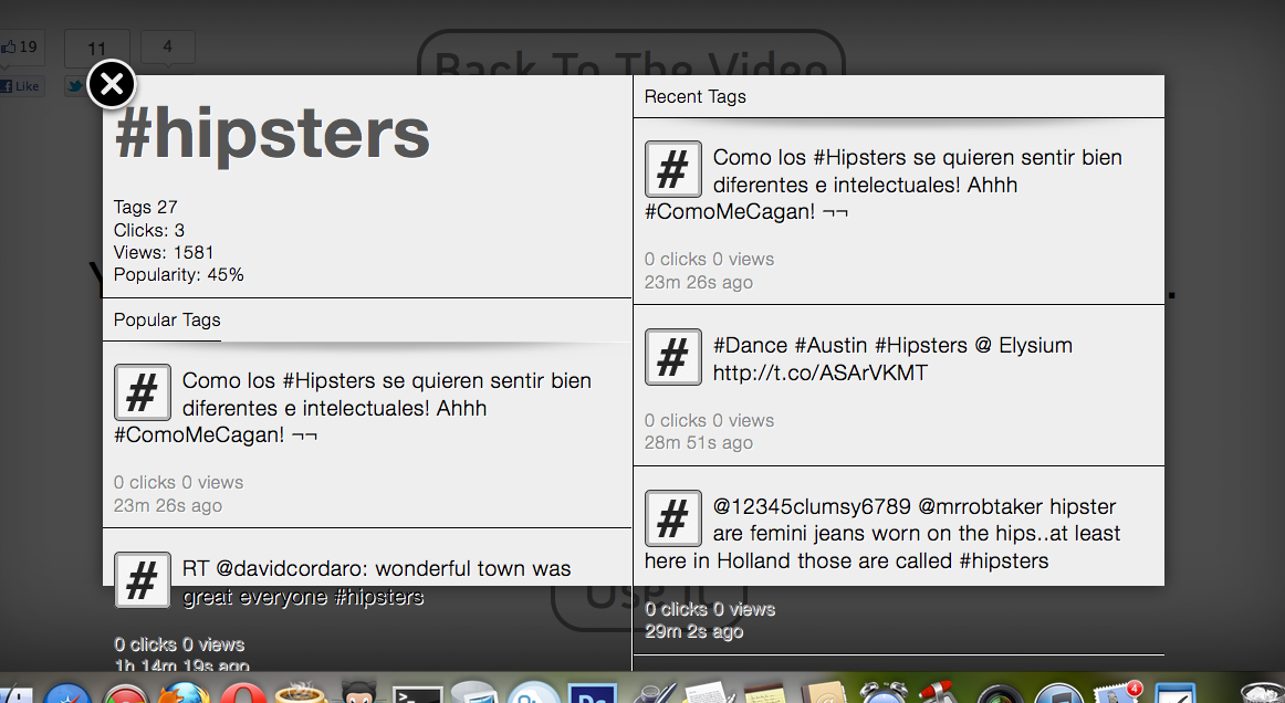
I have a modal popup made up of two sections: left and right. Within both sections are a label above and the content below. The label is fixed at a certain number of pixels, but the bottom area needs to be able to fill the remaining space, so I'm using display:table on the left and right sides and display: table-cell on the inner sections to achieve the "fill remaining space" effect. It works great in Chrome and Safari.
Here's the CSS:
#tagBoxLeft,#tagBoxRight {
    display: table;
    height: 100%;
    width: 50%;
    position: absolute;
    right: 0;
    opacity: 0;
}
#tagBoxLeft { left: 0 }
#tagBoxDescription {
    display: table-row;
    -webkit-border-top-left-radius: 20px;
    width: 100%;
    word-break: break-all;
    word-wrap: break-word;
    -webkit-box-shadow: 0 1px 0 #FFF;
    -moz-box-shadow: 0 1px 0 #FFF;
    box-shadow: 0 1px 0 #FFF;
}
.nano {
    position: relative;
    width: 100%;
    height: 100%;
    overflow: hidden;
    display: table-cell;
}
#taglabel {
    display: table-row;
    z-index: 10000;
    border-top: 1px solid #FFF;
    width: 100%;
    height: 39px;
}
And it just makes a bunch of divs into a table so they can have heights that are relative to each other. Also notice that the left and right sides are relative to the browser window, so that's why I can't just use percentages.
However, in Firefox and Opera, the #tagBoxLeft and #tagBoxRight sides sections refuse to accept height:100%; while they have display:table;. So it won't force the bottom sections up responsively.I know Firefox & Opera support this normally (see http://jsfiddle.net/Qxswa/). But why does all my content overflow in Firefox and Opera?
Here's a screenshot of the issue:
 413
413
Is there a reason why you can't simply use JavaScript to calculate the correct height and apply it inline? It's not as nice and simple, but it would be trivial for what you are describing.
var boxHeight = $('#tagBox').height();
var leftLabelHeight = $('#tagBoxDescription').height();
$('#tagBoxPopular').css('height', boxHeight - leftLabelHeight + 'px');

var rightLabelHeight = $('#taglabel').height();
$('#tagBoxStream').css('height', boxHeight - rightLabelHeight + 'px');
Here's an alternative to using display:table and friends, which uses the oft-neglected ability of absolutely positioned elements to have both their top and bottom (and left and right) values set. It essentially 'sticks' the top and bottom edge, giving you a height relative to a container, but without explicitly setting a height.
UDPATED: As Jackson mentioned, the CSS-only version of this code doesn't provide an auto-height, fixed panel in the column. A simple bit of JS will fix that - you'd just need to set a sensible default height for users without JS. The JS only needs to run when you load the modal, not at intervals.
Here's the updated fiddle: http://jsfiddle.net/cxY7D/5
and here's the simplified HTML:
<div id="modal">
      <div class="left">
          <div class="description">
            <h1>#tag_name</h1>
            <dl>
             <dt>Tags</dt> <dd>27</dd>
            </dl>
          </div>
          <div class="contents">
            <div class="header">
              <h2>Featured</h2>
            </div>
            <ol>
              <li>Something Something</li>
              <li>...</li>
            </ol>
          </div>
      </div>
      <div class="right">
        <div class="contents">
          <div class="header">
            <h2>Recent</h2>
          </div>
          <ol>
            <li>Something Something</li>
            <li>...</li>
          </ol>
        </div>
      </div>
  </div>
and CSS:
body {
      background:#444;
    }
     #modal {
       background:#FFF;
       position: absolute;
       top: 4em;
       bottom: 4em;
       left: 6em;
       right: 6em;
     }

     #modal .left,
     #modal .right {
       position:absolute;
       top: 0;
       bottom: 0;
     }

     #modal .left {
       background:#ACF9E4;
       left: 0;
       right:50%;
     }

     #modal .right {
       background:#FCFFCD;
       right: 0;
       left:50%;
     }

     #modal .contents {
      position:absolute;
      top: 0;
      bottom: 0;
      width: 100%;
      overflow-y:auto;
     }

     #modal .description {
       height: 8em;
     }

     #modal .description + .contents {
       top: 10em;
   }

     #modal .header,
     #modal .description,
     .contents li {
       border-bottom:1px solid #CCC;
       padding: 1em;
     }

     #modal .description dt {
       float: left;
       padding-right: 1em;
     }
It's a really useful and robust technique. A lot of people get the shudders when you mention 'absolute positions', but used like this, it's really liberating!
The JS (assuming jQuery)
$(function(){
$('#modal').on('display', function(){
//Calculate the height of the top left panel, and provide the remaining space to the bottom left
var leftColumn = $(this).find('.left'),
descriptionHeight = leftColumn.find('.description').height('auto').outerHeight(); //Set the height to auto, then read it
leftColumn.find('.contents').css('top', descriptionHeight)//Apply the height to the scrolling contents pane
});
$('#modal').trigger('display');
});
The JS resets the top-left pane to auto-height, then reads the height and applies it as the top co-ordinate of the bottom-left panel. It's applied as a custom event, so you can trigger it as part of your modal display code.
Here's an answer I gave, using a similar technique, and more explanations of the hows and whys: The Impossible Layout?. Check the A list apart article for more discussion, and some simple fixes that make it work in IE6 (if you care about that).
28
If you love us? You can donate to us via Paypal or buy me a coffee so we can maintain and grow! Thank you!
Donate Us With