 Menu
Menu
I am working on the dynamic side bar for our project, basically what we want to do is to set up a dynamic side bar when user click on the side bar it will spread when user click back sidebar should collapse and show only icons (but not totally collapse it will keep the icons) for example before user click the icon. We are using sidenav.toggle()from angular material function which basically closes the sidebar completely and if I don't use toggle() function "Side" mode for navbar does not work. So I want collapse to icon with side mode. (The other reason we need to keep the side mode is that we also need to make sure when user spread the sidebar, right side content should push to right)
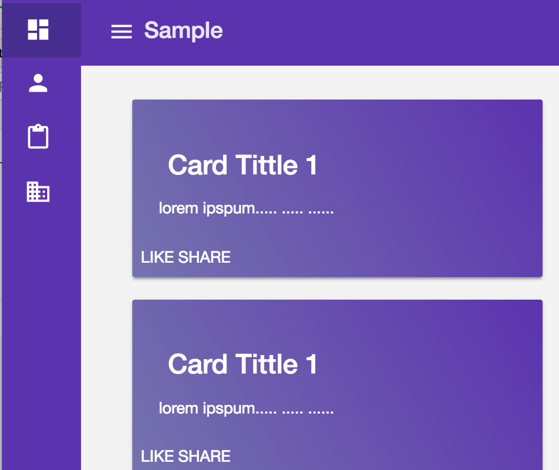
After user click the icon 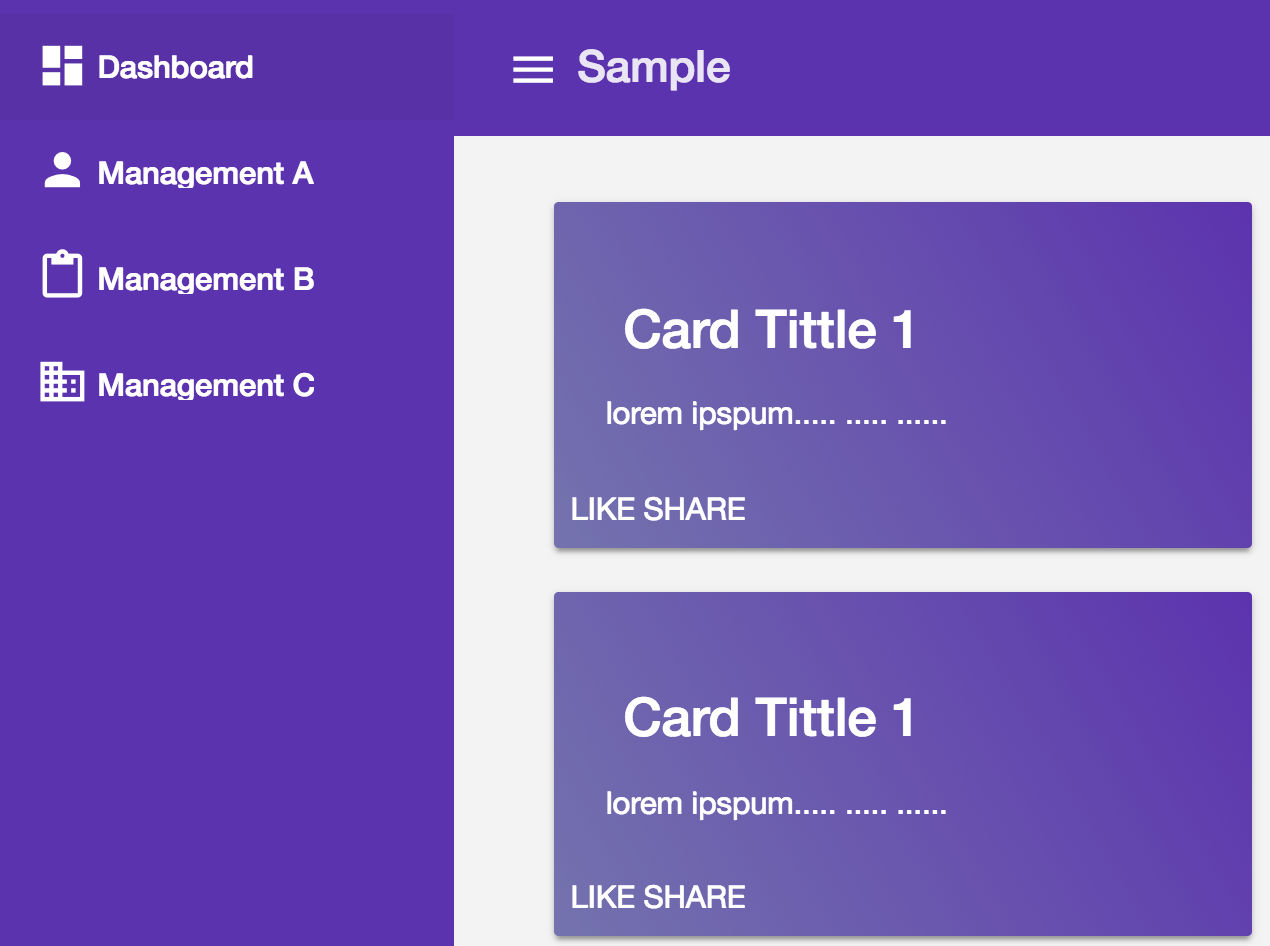
Is there a way to do that?
Thanks.
 450
450
Option 1: Generating Automatically:
You can create a navigation component from templates provided by Material itself using 'Angular CLI component schematics'
ng generate @angular/material:nav your-component-name
The above command will generate a new component that includes a toolbar with the app name and a responsive side nav based on Material breakpoints. See more about angular material schematics here
Option 2: Implementing Manually:
To implement that, you just have to refer these two links:
glance through the following code. Implementation will be something like this:
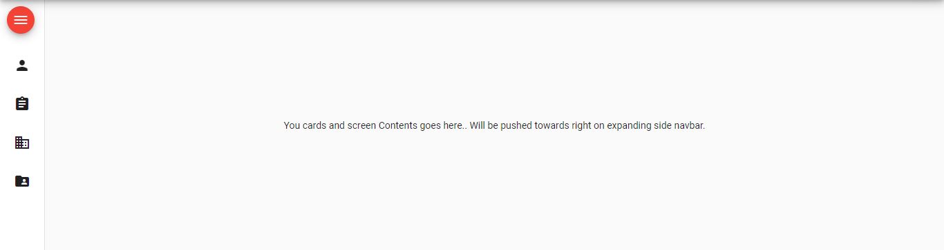
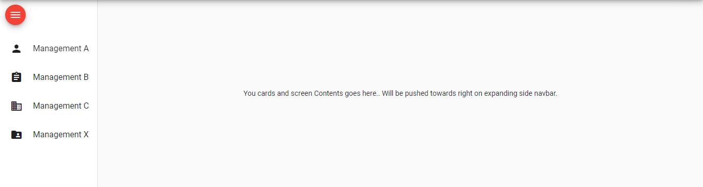
<mat-drawer-container class="example-container mat-typography" autosize>
  <mat-drawer #drawer mode="side" disableClose="true" opened="true">
    <button mat-mini-fab (click)="isExpanded = !isExpanded" color="warn" style="margin: 10px;">
      <mat-icon aria-label="Menu">menu</mat-icon>
    </button>

    <mat-nav-list>
      <mat-list-item>
        <mat-icon mat-list-icon>person</mat-icon>
        <h4 mat-line *ngIf="isExpanded">Management A</h4>
      </mat-list-item>
      <mat-list-item>
        <mat-icon mat-list-icon>assignment</mat-icon>
        <h4 mat-line *ngIf="isExpanded">Management B</h4>
      </mat-list-item>
      <mat-list-item>
        <mat-icon mat-list-icon>domain</mat-icon>
        <h4 mat-line *ngIf="isExpanded">Management C</h4>
      </mat-list-item>
      <mat-list-item>
        <mat-icon mat-list-icon>folder_shared</mat-icon>
        <h4 mat-line *ngIf="isExpanded">Management X</h4>
      </mat-list-item>
    </mat-nav-list>
  </mat-drawer>

  <div class="example-sidenav-content">
    You cards and screen Contents goes here..
    Will be pushed towards right on expanding side navbar.
  </div>
</mat-drawer-container>
77
I did this with a bit of CSS
    mat-sidenav:not(.mat-drawer-opened) {
    transform: translate3d(0, 0, 0) !important;
    visibility: visible !important;
    width: 60px !important;
    overflow: hidden;
  }
So when the draw is NOT open, the width of the sidenav is 60px and not 0. Just enough to show your icons.
OK, the next issue is that you'll need to hide a bunch of stuff like button name and other descriptive stuff, for me I need to change the height of the profile image and hide additional text. I did this in the same way as above using the :not selector:
  mat-sidenav:not(.mat-drawer-opened) div.leftNav div.navProfile img {
    width: 40px; margin: 16px 0 0px 0;
  }
  mat-sidenav:not(.mat-drawer-opened) .navTitle,
  mat-sidenav:not(.mat-drawer-opened) .profileTitle {
    display: none;
  }
When collapsed I didn't want to show the button names so I wrapped the name in a *ngIf
<span class="navName" *ngIf="opened">{{ page?.name }} </span>
This should work, and it does but there is a problem. The ngIf is bound to the opened event and you will notice a delay when the event is firing (to account for it animation) to show your labels when the drawer is open.
To fix this I had to delve into the api of sidenav and found an eventemitter call openedStart and closedStart. I created a new bool in the component class,
showNavLabels: boolean;
then bound the events to this bool in the HTML.
  <mat-sidenav class="sidenav" #sidenav mode="side" [(opened)]="opened"
      (openedStart)='showNavLabels = !showNavLabels'
      (closedStart)='showNavLabels = !showNavLabels' >
I am sure there is better way as I am not that experienced with Angular yet.
I hope it helps you out.
44
I created an example based on scss. Maybe someone can help to create the mobile version according to this sample.
styles.scss
// src/styles.scss
:root {
  --menu-width-open: 200px;
  --menu-width-closed: 64px;
}

.mat-drawer-container {
  .mat-drawer {
    box-sizing: content-box;
    width: var(--menu-width-open);
    transition: all 0.3s ease-in-out !important;
  }

  .mat-drawer-content {
    // transform: translateX(200px);
    margin-left: var(--menu-width-open) !important;
    transition: all 0.3s ease-in-out !important;
  }

  &.container-closed {
    .mat-drawer {
      width: var(--menu-width-closed);
    }

    .mat-drawer-content {
      // transform: translateX(64px) !important;
      margin-left: var(--menu-width-closed) !important;
    }
  }
}
app.componenet.html
<mat-drawer-container class="example-container" autosize [ngClass]="{ 'container-closed': !showFiller }">
  <mat-drawer #drawer class="example-sidenav" mode="side" disableClose="true" opened="true">
    <button (click)="showFiller = !showFiller" mat-raised-button>click</button>
  </mat-drawer>
  <div class="example-sidenav-content">
    <router-outlet></router-outlet>
    <button type="button" mat-button (click)="drawer.toggle()">Toggle sidenav</button>
  </div>
</mat-drawer-container>
showFiller = false; to app.component.ts file.// app.component.ts
@Component({
selector: 'app-root',
templateUrl: './app.component.html',
styleUrls: ['./app.component.scss'],
})
export class AppComponent {
showFiller = false;
}
If you love us? You can donate to us via Paypal or buy me a coffee so we can maintain and grow! Thank you!
Donate Us With