 Menu
Menu
I am now trying for hours. I use Material2 and simply want to change the color of the progress-bar. I know there are those themes (primary/accent/warn) but I want to have a custom color (green) for my progressbar.
I already tried the weirdest css-combinations.. but with no effort. Maybe someone had the same problem?
 321
321
You can use ::ng-deep selector to achieve what you want, this answer has some info on it.
How I did it:
CSS
::ng-deep .mat-progress-bar-fill::after {
    background-color: #1E457C;
}

::ng-deep .mat-progress-bar-buffer {
    background: #E4E8EB;
}

::ng-deep .mat-progress-bar {
    border-radius: 2px;
}
HTML
<mat-progress-bar mode="determinate" value="{{progress}}"></mat-progress-bar>
And the result is this:

EDIT:
I found a way to avoid using ::ng-deep as it will be removed from angular soon.
It seems that if you move your style from your component.css file to the global styles.css file it will work without ::ng-deep.
So, a style defined above can change in
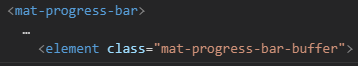
mat-progress-bar .mat-progress-bar-buffer {
  background: #E4E8EB;
}
Move it to styles.css and it will be applied like this:
LATER EDIT
As an explanation why setting styles in the global style sheet works:
For components the default is that angular adds a attribute to each DOM-element of a component, and then adds the same attribute to every class in the css for the same component. Adding styles to a global stylesheet does not add these attributes, hence the style will be applied. (thanks Jompis for this)
This worked for me on a new project. I did not checked specifically with the old code but the conditions are the same and there is no reason for it not to work.
135
Since nobody mentioned so far...
He's how I solved it.
@Meet Dave is right about his approach. But you should use encapsulation: ViewEncapsulation.None (disables css modules)
Something like this:
Component
@Component({
  selector: '...',
  templateUrl: '...',
  styleUrls: ['...'],
  encapsulation: ViewEncapsulation.None,
})
Sass (in my case)
.audio-progress-bar {
  &.mat-progress-bar {
    height: 10px;
  }

  .mat-progress-bar-fill::after {
    background-color: #37474f;
  }

  .mat-progress-bar-buffer {
    background-color: #90a4ae;
  }

  /* remove animation and the dots*/
  .mat-progress-bar-background {
    animation: none;
    background-color: #eceff1;
    fill: #eceff1;
  }
}
View
<mat-progress-bar
  class="audio-progress-bar"
  mode="buffer"
></mat-progress-bar>
Update:
Avoid using deep, TL;DR: Deep is technically invalid (like, deeprecated :p)
For more info refer: The use of /deep/ and >>> in Angular 2
Now, to change the color of mat-progress bar, Here is how I got it working,
Head over to your styles.scss file (or the main css/scss file in your project)
Add this class -->
.green-progress .mat-progress-bar-fill::after {
    background-color: green !important;
}
Your mat-progress should use the above class, like -->
<mat-progress-bar class="green-progress" mode="indeterminate"></mat-progress-bar>
Angular 8 solution:
for me it was putting my styling in a top level .scss file. Also had to select in .scss as follows:
html:
<mat-progress-bar [ngClass]="passwordStatusBarColor"
                  aria-label="Password strength meter"
                  mode="determinate"
                  [value]="progress">
</mat-progress-bar>

<!--passwordStatusBarColor could be 'weak', 'weakest', etc. with a corresponding rule-->
styles.scss:
.weakest {
  .mat-progress-bar-fill::after {
    background-color: yellow;
  }
}
If you love us? You can donate to us via Paypal or buy me a coffee so we can maintain and grow! Thank you!
Donate Us With