 Menu
Menu
I'd like to have a layout that consist of three adjacent divs. Side divs have static width (it may change via javascript) and center div fills a remaining area. When the first div's size changes it affect only the center one. It is similar to table (with dynamic rendering) that consist of three columns.
Ok, but where is the problem. The problem is that if I put floating-left div into the first column, and block div in the second and third one, block divs behave in a strange way. They are rendered in their column below floating div from the first column.
An example. In the first and second column I have floating div, and block div in the third column. The block div is shifted down around the height of floating divs. Div in the center column is not shifted in his y position only that it has float left property.
I'd like to each of the three layouting divs to be independent on each other. I have no idea why elements in the third column floats div in first two columns (with float property).
CODE:
<div style="margin: auto; display: table; width: 260px;">
        <div style="display: table-row;">
            <div style="display: table-cell; width: 100px;">

                <div style="float: left; width: 40px; height: 50px;">COL1</div>

            </div>
            <div style="display: table-cell;">

                <div style="float: left; height: 50px;  width: 40px;">COL2</div>

            </div style="display: table-cell; width: 100px;">
            <div class="sideContainer">

                <div>COL3</div>

            </div>
        </div>
</div>
How do I make all layouting divs (columns) to be independent on each other? Any ideas?
 374
374
You can do that by floating col1 and col3 to the left and to the right, with a fixed width.
Then add a left and right margin to col2 equal to the width of col1 and col3.
This gives you three columns; col1 and col3 having a fixed width and col2 filling the available width:
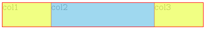
(col2's content box in blue, and its margins in yellow)
<div class='container'>
    <div class='right'>
        col3
    </div>
    <div class='left'>
        col1
    </div>
    <div class='middle'>
        col2
    </div>
</div>


.container {
    overflow: hidden;
}
.right {
    float: right;
    width: 100px;
}
.left {
    float: left;
    width: 100px;
}
.middle {
    margin: 0 100px;
}
Try it here: http://jsfiddle.net/22YBU/
BTW if you need display: table, display: table-row and display: table-cell, use a table ;-)
91
If you love us? You can donate to us via Paypal or buy me a coffee so we can maintain and grow! Thank you!
Donate Us With