 Menu
Menu
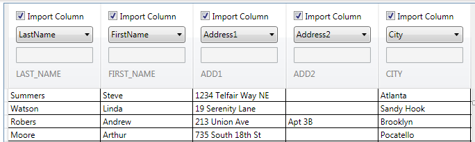
I am trying to figure out how to bind a WPF DataGrid's column header and main data to a data source using an MVVM pattern. The result I'm looking for would look like this:
(source: vallelunga.com)
I've successfully styled the headers here, but I'm unsure how to bind the values in the headers. Specifically, the IsChecked property of the check-box, the selected index of the combo box and the value of the text box.
I was previously using a simple DataTable to populate the main grid data, but I'm going to need something more complex to hold both the grid data and the values for each column. Or perhaps I can store them as separate entities entirely.
So, does anyone have any idea of how I might pull off this binding? One limitation is that the columns must be auto-generated since I have no idea what they will be until runtime. The application simply loads the data form an Excel spreadsheet and there may be any number of columns present.
Thanks, Brian
 291
291
Here's what I ended up doing to use this with the MVVM pattern:
I have two sets of data for binding on my view model: one for the actual grid data and one for the column headers. Currently these are exposed as two properties:
// INotifyPropertyChanged support not shown for brevity
public DataTable GridData { get; set; }
public BindingList<ImportColumnInfo> ColumnData { get; set; }
The trick to working with two differing sets of data is in the grid. I have subclassed the DataGrid and given the grid an additional data source called ColumnSource, as a dependency property. This is what is bound to the ColumnData on my view model. I then set the header of each auto-generated column to the appropriately indexed data in the ColumnSource data source. The code is as follows:
public class ImporterDataGrid : DataGrid
{
    protected override void OnAutoGeneratingColumn(DataGridAutoGeneratingColumnEventArgs e)
    {
        base.OnAutoGeneratingColumn(e);

        int columnIndex = this.Columns.Count;
        var column = new ImporterDataGridColumn();
        column.Header = ColumnSource[columnIndex];
        column.Binding = new Binding(e.PropertyName) { Mode = BindingMode.OneWay };
        e.Column = column;
    }

    public IList ColumnSource
    {
        get { return (IList)GetValue(ColumnSourceProperty); }
        set { SetValue(ColumnSourceProperty, value); }
    }

    public static readonly DependencyProperty ColumnSourceProperty = DependencyProperty.Register("ColumnSource", typeof(IList), typeof(ImporterDataGrid), new FrameworkPropertyMetadata(null));

}
I can now perform normal data binding in the templated header of my columns, which will all bind against the data in the ColumnData property of my view model.
UPDATE: I was asked to show the XAML for my grid. It's really basic, but here it is:
<Controls:ImporterDataGrid
    AutoGenerateColumns="True" x:Name="previewDataGrid"
    VerticalScrollBarVisibility="Visible"
    HorizontalScrollBarVisibility="Visible"
    IsReadOnly="True"
    SelectionMode="Extended"
    HeadersVisibility="Column"
    ItemsSource="{Binding PreviewData}"
    ColumnSource="{Binding PreviewColumnData}"
    Style="{StaticResource ImporterDataGridStyle}"
    Background="White" CanUserReorderColumns="False" CanUserResizeRows="False"
    CanUserSortColumns="False" AlternatingRowBackground="#FFFAFAFA" AllowDrop="True" />
And here is the ImporterColumnHeaderStyle:
<Style x:Key="ImporterDataGridColumnHeaderStyle" TargetType="{x:Type toolkit:DataGridColumnHeader}">
    <Setter Property="Template">
        <Setter.Value>
            <ControlTemplate TargetType="{x:Type toolkit:DataGridColumnHeader}">
                <Grid>
                    <toolkit:DataGridHeaderBorder Background="{TemplateBinding Background}" BorderBrush="{TemplateBinding BorderBrush}" BorderThickness="{TemplateBinding BorderThickness}" Padding="{TemplateBinding Padding}" IsClickable="{TemplateBinding CanUserSort}" IsHovered="False" IsPressed="False" SortDirection="{TemplateBinding SortDirection}">
                        <Grid>
                            <CheckBox Height="16" Margin="6,6,16,0" Name="importCheckBox" IsChecked="{Binding Path=Import}" VerticalAlignment="Top">Import Column</CheckBox>
                            <StackPanel IsEnabled="{Binding Path=Import}">
                                <ComboBox Height="24" Margin="6,29,6,0" Name="columnTypeComboBox" VerticalAlignment="Top" SelectedValue="{Binding ColumnType}" ItemsSource="{Binding Source={local:EnumList {x:Type Models:ImportColumnType}}}">
                                </ComboBox>
                                <TextBox Height="23"  Margin="6,6,6,33" Name="customHeadingTextBox" VerticalAlignment="Bottom" Text="{Binding Path=CustomColumnName}" IsEnabled="{Binding ColumnType, Converter={StaticResource ColumnTypeToBooleanConverter}}" />
                            </StackPanel>
                            <TextBlock Height="20" Margin="6,0,6,7" Name="originalHeadingTextBlock" Text="{Binding Path=OriginalColumnName}" VerticalAlignment="Bottom" Foreground="Gray" />
                        </Grid>
                    </toolkit:DataGridHeaderBorder>

                    <Thumb x:Name="PART_LeftHeaderGripper" HorizontalAlignment="Left">
                        <Thumb.Style>
                            <Style TargetType="{x:Type Thumb}">
                                <Setter Property="Width" Value="8"/>
                                <Setter Property="Background" Value="Transparent"/>
                                <Setter Property="Cursor" Value="SizeWE"/>
                                <Setter Property="Template">
                                    <Setter.Value>
                                        <ControlTemplate TargetType="{x:Type Thumb}">
                                            <Border Background="{TemplateBinding Background}" Padding="{TemplateBinding Padding}"/>
                                        </ControlTemplate>
                                    </Setter.Value>
                                </Setter>
                            </Style>
                        </Thumb.Style>
                    </Thumb>
                    <Thumb x:Name="PART_RightHeaderGripper" HorizontalAlignment="Right">
                        <Thumb.Style>
                            <Style TargetType="{x:Type Thumb}">
                                <Setter Property="Width" Value="8"/>
                                <Setter Property="Background" Value="Transparent"/>
                                <Setter Property="Cursor" Value="SizeWE"/>
                                <Setter Property="Template">
                                    <Setter.Value>
                                        <ControlTemplate TargetType="{x:Type Thumb}">
                                            <Border Background="{TemplateBinding Background}" Padding="{TemplateBinding Padding}"/>
                                        </ControlTemplate>
                                    </Setter.Value>
                                </Setter>
                            </Style>
                        </Thumb.Style>
                    </Thumb>
                </Grid>
            </ControlTemplate>
        </Setter.Value>
    </Setter>
</Style>
If you love us? You can donate to us via Paypal or buy me a coffee so we can maintain and grow! Thank you!
Donate Us With
