 Menu
Menu
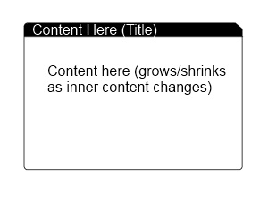
I am trying to create something similar to the image below in WPF. This control is designed to be the base view of everything in my app and will be sitting inside a Window control with a background (probably a gradient of some kind).
The requirements are as follows:
I've been fighting with this for hours, but being new to WPF I'm starting to find myself running around in circles. I think there are major benefits to the flexibility of WPF, but for people just starting out it is almost too daunting.
Any help would be much appreciated! Thanks!
 874
874
I don't know how to 'fill' the clip so I made the clip in code. Let me know if you need more help adding more properties to control colors etc. Here goes:
Code:
public class Tabby : HeaderedContentControl
{
    static Tabby()
    {
        DefaultStyleKeyProperty.OverrideMetadata(typeof(Tabby), new FrameworkPropertyMetadata(typeof(Tabby)));
    }

    public double DogEar
    {
        get { return (double)GetValue(DogEarProperty); }
        set { SetValue(DogEarProperty, value); }
    }

    public static readonly DependencyProperty DogEarProperty =
        DependencyProperty.Register("DogEar",
        typeof(double),
        typeof(Tabby),
        new UIPropertyMetadata(8.0, DogEarPropertyChanged));

    private static void DogEarPropertyChanged(
        DependencyObject obj,
        DependencyPropertyChangedEventArgs e)
    {
        ((Tabby)obj).InvalidateVisual();
    }

    public Tabby()
    {
        this.SizeChanged += new SizeChangedEventHandler(Tabby_SizeChanged);
    }

    void Tabby_SizeChanged(object sender, SizeChangedEventArgs e)
    {
        var clip = new PathGeometry();
        clip.Figures = new PathFigureCollection();
        clip.Figures.Add(
            new PathFigure(
                new Point(0, 0),
                new[] {
                    new LineSegment(new Point(this.ActualWidth - DogEar, 0), true),
                    new LineSegment(new Point(this.ActualWidth, DogEar), true),
                    new LineSegment(new Point(this.ActualWidth, this.ActualHeight), true),
                    new LineSegment(new Point(0, this.ActualHeight), true) },
                true)
        );
        this.Clip = clip;
    }
}
Generic.xaml
<Style TargetType="{x:Type local:Tabby}">
    <Setter Property="Padding"
            Value="5" />
    <Setter Property="Template">
        <Setter.Value>
            <ControlTemplate TargetType="{x:Type local:Tabby}">
                <Grid>
                    <Grid.RowDefinitions>
                        <RowDefinition Height="auto" />
                        <RowDefinition Height="auto" />
                    </Grid.RowDefinitions>
                    <Border CornerRadius="3,0,0,0"
                            BorderBrush="Black"
                            BorderThickness="1"
                            Background="Black">
                        <ContentPresenter Content="{TemplateBinding Header}"
                                          Margin="{TemplateBinding Padding}" />
                    </Border>
                    <Border CornerRadius="0,0,3,3"
                            BorderBrush="Black"
                            BorderThickness="1"
                            Background="White"
                            Grid.Row="1">

                        <ContentPresenter Content="{TemplateBinding Content}"
                                          Margin="{TemplateBinding Padding}" />
                    </Border>
                </Grid>

            </ControlTemplate>
        </Setter.Value>
    </Setter>
</Style>
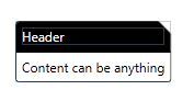
Using it:
<my:Tabby DogEar="12"
          x:Name="tabby1">
    <my:Tabby.Header>
        <TextBlock Foreground="White">Header</TextBlock>
    </my:Tabby.Header>
    <my:Tabby.Content>
        <TextBlock Text="Content can be anything" />
    </my:Tabby.Content>
</my:Tabby>
Try this to get started:
<Grid Width="100" Height="100">
    <Border Background="Green" CornerRadius="8,0,8,8">
      <Border.Clip>
        <PathGeometry>
          <PathGeometry.Figures>
            <PathFigure StartPoint="0,0">
              <PathFigure.Segments>
                <LineSegment Point="90,0"/>
                <LineSegment Point="100,10"/>
                <LineSegment Point="100,100"/>
                <LineSegment Point="0,100"/>
              </PathFigure.Segments>
            </PathFigure>
          </PathGeometry.Figures>
        </PathGeometry>
      </Border.Clip>
    </Border>
  </Grid>
If you love us? You can donate to us via Paypal or buy me a coffee so we can maintain and grow! Thank you!
Donate Us With