 Menu
Menu
I guess that's nothing better to explain than this:
I almost accomplished what I want with pure CSS, but...
The code is a div with overflow: hidden and a child with negative margin-top (and animation).
Live demonstration:
body {
  font-size: 2em;
  font-family: sans-serif;
 }

 .animation {
    vertical-align: sub;
    height: 1em;
    overflow: hidden;
    display: inline-block;
    line-height: 2em;
 }

ul {
  animation: animation 10s infinite;
  padding: 0;
  margin-top: -0.55em;
  list-style: none;
}

@keyframes animation {
    0%        { margin-top: -0.55em }
    12.5%     { margin-top: -2.54em }
    25%       { margin-top: -4.55em }
    37.5%     { margin-top: -6.55em }
    50%       { margin-top: -8.5em }
    62.5%     { margin-top: -6.55em }
    75%       { margin-top: -4.55em }
    87.5%     { margin-top: -2.54em }
    100%      { margin-top: -0.55em }
}
Lorem ipsum dolor sit
<div class="animation">
<ul>
<li>golfish</li>
<li>dog</li>
<li>cat</li>
<li>hamster</li>
<li>fox</li>
</ul>
</div>
, consectetur adipiscing elit. So...
I think that I can't solve my problems because they are CSS limitations, so... It is possible to get this with jQuery?
 882
882
You don't need jQuery. Here is a simple pure js solution using css transition.
function createWordListAnimation(animNode, delay){
  // Fetch the DOM elements.
  var animWindow = animNode.querySelector(".animation-window");
  var ul = animWindow.querySelector("ul");
  var lis = ul.querySelectorAll("li");

  // Copy the animation's window to create the gray list.
  var grayList = animWindow.cloneNode(true);
  var grayUl = grayList.querySelector("ul");
  grayList.classList.remove("animation-window");
  grayList.classList.add("animation-gray-list");
  animNode.insertBefore(grayList, animWindow);

  // This function shows the li number `liNum`.
  function goTo(liNum){
    var li = lis[liNum];
    var liTop = li.getBoundingClientRect().top;
    var ulTop = ul.getBoundingClientRect().top;
    var liOffset = liTop - ulTop;
    ul.style.top = -liOffset + "px";
    grayUl.style.top = -liOffset + "px";
  }

  // Set up an interval that changes the current li every `delay` ms.
  var current = 0;
  // We need a boolean to know if the animation is going up or down.
  var ascending = true;
  // Create the interval.
  return setInterval(function(){
    ascending = ascending && current + 1 < lis.length || current === 0;
    current = ascending ? current + 1: current - 1;
    goTo(current);
  }, delay);
}

createWordListAnimation(document.querySelector(".animation"), 1000 /* (ms) */);
body {
font-size: 2em;
font-family: sans-serif;
}
.animation {
vertical-align: sub;
display: inline-block;
margin-top: -.1em;
margin-bottom: -.1em;
border-style: solid;
border-color: lightgray;
border-width: 1px;
height: 1.2em;
}
.animation-window {
position: relative;
height: 100%;
overflow: hidden;
background-color: white;
}
.animation-gray-list {
position: absolute;
color: lightgray;
}
.animation ul {
position: relative;
list-style: none;
top: 0;
padding: 0;
margin: 0;
transition: top 300ms;
}
.animation li {
margin: 0 .2em;
text-align: center;
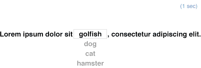
}Lorem ipsum dolor sit
<div class="animation">
<div class="animation-window">
<ul>
<li>golfish</li>
<li>dog</li>
<li>cat</li>
<li>hamster</li>
<li>fox</li>
</ul>
</div>
</div>,
consectetur adipiscing elit.The drawback of this solution is that the window cannot be transparent (it has to hide the gray list). It is still possible to make it transparent, but you'll have to create two gray lists – one above, one below – and it starts to be a bit complicated.
173
If you love us? You can donate to us via Paypal or buy me a coffee so we can maintain and grow! Thank you!
Donate Us With