 Menu
Menu
Apologies for the ambiguous title; however I am attempting to port our PhoneGap application which is working fine on Android and iOS onto Windows Phone 8 (written in jQuery Mobile/JavaScript, HTML and CSS3).
The most part of it worked (albeit I had to change a couple of bits but that was expected). One major problem I am having at the moment is getting the scrolling list functionality of our application working, and the signature capture (both I believe are related). I'm not too sure where the problem lies but when I scroll/sign, the entire page moves with my finger, and the individual elements do not pick up the touch-events. I am using iScroll, jQuery 1.7.2 and jQM 1.1.0; however, continue reading because the scrolling functionality was working (the signing feature has always been a problem)!
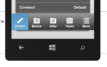
Before scrolling stopped working, I was having an issue with the gap between the footer bar and the bottom of the page:
One thing I was advised to do was to add the following bit of CSS; and it resolved the 'gap' issue:
@media screen and (orientation: portrait) {
    @-ms-viewport {
        width: 320px;
        user-zoom: fixed;
        max-zoom: 1;
        min-zoom: 1;
    }
}
However, it then caused the scrolling features to become unresponsive. The entire page moves up/down but not the list element which is the opposite of what I want! I've tried adding the following but without luck:
-ms-touch-action: none;
I added this to my div element which contains the page. It stopped the page moving up and down! However the list remained unresponsive. However, if I remove both these CSS classes, then the scroll functionality works again, but that reintroduces the gap issue. The viewport CSS class is definitely the correct route I believe - but I cannot, for the life of me, get it to work the way I'd like it to.
If somebody could help, it would be greatly appreciated.
Thanks.
 369
369
First of all, @-ms-viewport doesn't support the zooming, so remove the zoom properties because they will generate parsing errors. The supported properties are listed here
Second, try to add this rules to your CSS and use iScroll in your central container as you said you were doing
@-ms-viewport{width:device-width;}

body {
  overflow: hidden;
  -ms-user-select: none;
  -ms-content-zooming: none;
  -ms-touch-action: none;
}
If you love us? You can donate to us via Paypal or buy me a coffee so we can maintain and grow! Thank you!
Donate Us With