 Menu
Menu
Using Chrome Browser DevTools I wanted to add a custom device in the Emulated devices tab. You can choose several options such as the width and height. And also choose between:
So the difference between Mobile and Desktop doesn't seem to be the touch events.
Is a device of 1000*1000px screen size Mobile (no touch)
and a device of 1000*1000px screen size Desktop
the same?
Or a device of 1000*1000px screen size Mobile
and a device of 1000*1000px screen size Desktop (touch)
the same?
So my question is:
What is the difference between Desktop and Mobile from a technical point of view?
Please explain the difference both conceptually (I'm specially interested in this one) and in the DevTools.
Edit for bounty:
I came to this doubt after answering other question and seeing how Google, Amazon and probably some other big companies make the differentiation on the way they display their pages. It is not on screen size but on device type (if I am correct). So I am wondering what are the technical aspects that make them discern between a desktop and a mobile, other than "a mobile can be moved".
 316
316
Targetting Desktop and Mobile
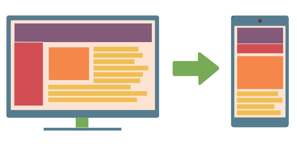
The key difference between a mobile device and a desktop device, at least as far as the mobile/desktop setting in web browsers are concerned, is the physical size of the screen. This is not to be confused with the resolution of the screen.
When targetting a design at desktop, the interface is expected to include more expanded content on screen at one time, with the mobile version having the majority of the content hidden within icons to be expanded at a touch. The mobile version will be space optimised in comparison.
In fact, when a tablet has a larger than standard screen size e.g. the tablets with detachable keyboards available these days, mobile versions of the site can look over-optimised for space, which is the reason why browsers allow tablet users to opt to display sites in desktop mode.
The resolution of a mobile device might well be higher than on a desktop, but the fact that the screen is (at least assumed to be) so much bigger on a desktop machine, people using desktop machines are comfortable with more expanded content on screen at once than a people viewing on mobile devices.
Prime consideration comparison
Desktop:
Mobile:
186
If you love us? You can donate to us via Paypal or buy me a coffee so we can maintain and grow! Thank you!
Donate Us With