 Menu
Menu
The title prettymuch says it all. The first picture below is a screenshot when the whole page is about 8000 pixels tall, taken in the latest version of Chrome:

while this picture is for a different page (using the same CSS) which is about 800 pixels tall:

and here is the code:
  body{
     background-color: #f3ffff;
     margin:0px;
     background-image: url('/media/flourish.png'),
        -webkit-linear-gradient(
            top,
           rgba(99, 173, 241, 1) 0px,
           rgba(0, 255, 255, 0) 250px
        );

     background-image: url('/media/flourish.png'),
        -moz-linear-gradient(
           top,
           rgba(99, 173, 241, 1) 0px,
           rgba(0, 255, 255, 0) 250px
        );


     background-image: url('/media/flourish.png'),
        -o-linear-gradient(
           top,
           rgba(99, 173, 241, 1) 0px,
           rgba(0, 255, 255, 0) 250px
        );
     background-position: center top, center top;
     background-repeat: no-repeat, repeat-x;
     -ms-filter: "progid:DXImageTransform.Microsoft.gradient(GradientType=0, startColorstr='#63ADF1', endColorstr='#00000000')";
  }
The gradient is meant to cut off at 250px from the top of the page. The fact that the degree of banding seems to depend on the total height of the page is very strange: pages of heights in between these two (800px and 8000px) seem to have bands which are smaller than the first example but still noticeable.
Interestingly, I was previously using -webkit-gradient('linear'...) instead and that did not have the same problem; I only swapped over to -webkit-linear-gradient so it would fall in line with my -moz and -o gradients.
I haven't tried it on Safari, but the code above makes it work perfectly fine in Firefox and kind-of-work in Opera (the colors get messed up, but the gradient is still smooth). Nevermind IE, which i have given up on.
Has anyone else seen this before?
Update: This happens on my Mac's Chrome/Safari too, but the bands are about 1/3 the size of the bands shown in the top image, for the exact same page. The banding is identical in both OSX Chrome and OSX Safari.
1/3 the size is still noticeable, but not quite so jarring. The actual page is at http://www.techcreation.sg/page/web/Intro%20to%20XTags/, if you want to see for yourself in some other browser. The CSS is "inline" css compiled in-browser using less.js.
 609
609
Looks like a webkit bug. I came up with the work-around below, tested on the latest Chrome and FF. In short, you'll position a div containing the background behind your main content. I also added a few styles to make IE happier.
Given this HTML:
<html lang="en">
<head>
    <style>
        ...
    </style>
</head>
<body>
    <div class="background">bgdiv</div>
    <div class="content_pane">
        <div class="titlebar">Leave a Comment!</div>
        <div class="comment">Your Comment.</div>
    </div>
</body>
</html>
Combined with this stylesheet:
    body{
        background-color: #f3ffff;
        min-height: 100%;
        margin:0px;
    }
    .background {
        height: 250px;
        left: 0;
        position: absolute;  /* could use fixed if you like. */
        right: 0;
        top: 0;
        z-index: -10;

        background-image:
            -webkit-linear-gradient(top,
                rgba(99, 173, 241, 1) 0px,
                rgba(0, 255, 255, 0) 250px
            );
        background-image:
            -moz-linear-gradient(top,
                rgba(99, 173, 241, 1) 0px,
                rgba(0, 255, 255, 0) 250px
            );
        background-image:
            -o-linear-gradient(top,
                rgba(99, 173, 241, 1) 0px,
                rgba(0, 255, 255, 0) 250px
            );
        background-image:
            -ms-linear-gradient(top,
                rgba(99,173,241,1) 0%,
                rgba(0,255,255,0) 250px
            ); /* IE10+ */
        filter: progid:DXImageTransform.Microsoft.gradient( startColorstr='#63adf1', endColorstr='#0000ffff',GradientType=0 ); /* IE6-9 */
        background-image:
            linear-gradient(top,
                rgba(99,173,241,1) 0%,
                rgba(0,255,255,0) 250px
            ); /* W3C */
        background-position: center top, center top;
        background-repeat: no-repeat, repeat-x;
    }
    .content_pane {
        background: white;
        border: 1px dotted white;
        border: 1px solid grey;
        font-family: arial, sans;
        font-weight: bold;
        margin: 6em auto 5em;
        width: 50%;
    }
    .titlebar {
        background: #3f7cdb;
        color: white;
        font-family: arial, sans;
        padding: .25em 2ex .25em;
    }
    .comment {
        padding: 1em;
    }
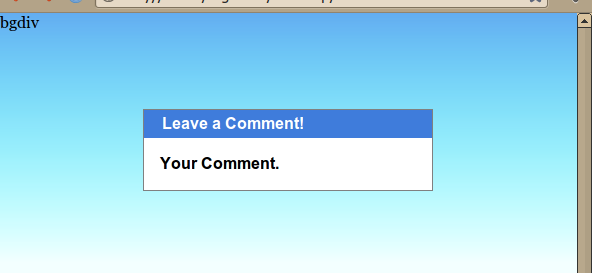
It should come out looking like this, regardless of window size:
154
Your demo link does not work but i did some tests and it worked fine for me using Chrome when you add width/height of 100% to the body/html elements, like so:
body, html {
    width:100%;
    height:100%;
}
Demo
You can try that or you can just declare a header/logo piece where you can add the starting gradient and just add the ending gradient to the body of your css so it blends in correctly, like so:
CSS
body, html {
    width:100%;
    height:100%;
    margin:0;
    padding:0;
}

body {
    background-color: #f3ffff;
    margin:0px;
    height:10000px;
}

.header {
    height:300px;
    width:100%;
    background-image: url('http://cdn1.iconfinder.com/data/icons/stuttgart/32/premium.png'),
    -webkit-linear-gradient(top, rgba(99, 173, 241, 1), rgba(0, 255, 255, 0));

    background-image: url('http://cdn1.iconfinder.com/data/icons/stuttgart/32/premium.png'),
    background-image: -webkit-gradient(linear, left top, left bottom, from(#444444), to(#999999));

    background-image: url('http://cdn1.iconfinder.com/data/icons/stuttgart/32/premium.png'),
    -moz-linear-gradient(top, rgba(99, 173, 241, 1) 0px, rgba(0, 255, 255, 0) 250px
    );

    background-image: url('http://cdn1.iconfinder.com/data/icons/stuttgart/32/premium.png'),
    -o-linear-gradient(top, rgba(99, 173, 241, 1) 0px, rgba(0, 255, 255, 0) 250px);
    background-position: center top, center top;
    background-repeat: no-repeat, repeat-x;
    background-size:auto;
    -ms-filter: "progid:DXImageTransform.Microsoft.gradient(GradientType=0, startColorstr='#63ADF1', endColorstr='#00000000')";
}
HTML
<div class="header">
    content
</div>
Demo
Friendly note: For anybody looking for the issue you can see it happening here in Chrome: http://jsfiddle.net/skJGG/
4
If you love us? You can donate to us via Paypal or buy me a coffee so we can maintain and grow! Thank you!
Donate Us With


