 Menu
Menu
I am trying to create a UWP button which will change background color when the mouse pointer hovers over it. The trouble I am having is that by default, it seems to already do this, but not to the color I want. When I hover over my button, which is red, it turns to the default grey and then back when I mouse out. I wrote code in C# to attempt to make it turn blue when I hover over it
private void button_PointerEntered_1(object sender, PointerRoutedEventArgs e)
    {
        button.Background = new SolidColorBrush(Windows.UI.Color.FromArgb(255, 0, 0, 255));
    }

    private void button_PointerExited_1(object sender, PointerRoutedEventArgs e)
    {
        button.Background = new SolidColorBrush(Windows.UI.Color.FromArgb(255, 255, 0, 0));
    }
Below is the XAML code for the button
<Grid Background="{ThemeResource ApplicationPageBackgroundThemeBrush}">
        <Button x:Name="button"
                Content="Button"
                HorizontalAlignment="Left"
                Margin="417,188,0,0"
                VerticalAlignment="Top"
                Height="230"
                Width="461"
                FontSize="72"
                ManipulationMode="None"
                PointerEntered="button_PointerEntered_1"
                PointerExited="button_PointerExited_1">
            <Button.Foreground>
                <SolidColorBrush Color="Black"/>
            </Button.Foreground>
            <Button.Background>
                <SolidColorBrush Color="Red"/>
            </Button.Background>
        </Button>

    </Grid>
 663
663
The easiest way to achieve it is to override the resources in your button's dictionaries (for the themes you want)
You can change the value of the resource keys named Button<Property>PointerOver for the effect to work:
<Button Background="Red" Foreground="Black"> <!-- These are only applied when your button is not being hovered-->
    <Button.Resources>
        <ResourceDictionary>
            <ResourceDictionary.ThemeDictionaries>
                <ResourceDictionary x:Key="Dark">
                    <SolidColorBrush x:Key="ButtonForegroundPointerOver" Color="Red"/>
                    <SolidColorBrush x:Key="ButtonBackgroundPointerOver" Color="Black"/>
                </ResourceDictionary>
                <ResourceDictionary x:Key="Light">
                    <SolidColorBrush x:Key="ButtonForegroundPointerOver" Color="Red"/>
                    <SolidColorBrush x:Key="ButtonBackgroundPointerOver" Color="Black"/>
                </ResourceDictionary>
            </ResourceDictionary.ThemeDictionaries>
        </ResourceDictionary>
    </Button.Resources>
</Button>
Here is an example on how this is done in the official Microsoft documentation for the following result :
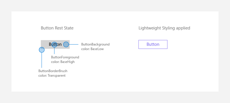
And here is the list of resources that you can override in a button
98
A possible but more complicated approach is to override Button style:
<Page.Resources>
    <Style TargetType="Button" x:Key="CustomButtonStyle">
        <Setter Property="Background" Value="{ThemeResource SystemControlBackgroundBaseLowBrush}" />
        <Setter Property="Foreground" Value="{ThemeResource SystemControlForegroundBaseHighBrush}"/>
        <Setter Property="BorderBrush" Value="{ThemeResource SystemControlForegroundTransparentBrush}" />
        <Setter Property="BorderThickness" Value="{ThemeResource ButtonBorderThemeThickness}" />
        <Setter Property="Padding" Value="8,4,8,4" />
        <Setter Property="HorizontalAlignment" Value="Left" />
        <Setter Property="VerticalAlignment" Value="Center" />
        <Setter Property="FontFamily" Value="{ThemeResource ContentControlThemeFontFamily}" />
        <Setter Property="FontWeight" Value="Normal" />
        <Setter Property="FontSize" Value="{ThemeResource ControlContentThemeFontSize}" />
        <Setter Property="UseSystemFocusVisuals" Value="True" />
        <Setter Property="Template">
            <Setter.Value>
                <ControlTemplate TargetType="Button">
                    <Grid x:Name="RootGrid" Background="{TemplateBinding Background}">
                        <VisualStateManager.VisualStateGroups>
                            <VisualStateGroup x:Name="CommonStates">
                                <VisualState x:Name="Normal">
                                    <Storyboard>
                                        <PointerUpThemeAnimation Storyboard.TargetName="RootGrid" />
                                    </Storyboard>
                                </VisualState>
                                <VisualState x:Name="PointerOver">
                                    <Storyboard>

                                        <ObjectAnimationUsingKeyFrames Storyboard.TargetName="RootGrid" Storyboard.TargetProperty="Background">
                                            <DiscreteObjectKeyFrame KeyTime="0" Value="Orange" />
                                        </ObjectAnimationUsingKeyFrames>

                                        <ObjectAnimationUsingKeyFrames Storyboard.TargetName="ContentPresenter" Storyboard.TargetProperty="BorderBrush">
                                            <DiscreteObjectKeyFrame KeyTime="0" Value="{ThemeResource SystemControlHighlightBaseMediumLowBrush}" />
                                        </ObjectAnimationUsingKeyFrames>
                                        <ObjectAnimationUsingKeyFrames Storyboard.TargetName="ContentPresenter" Storyboard.TargetProperty="Foreground">
                                            <DiscreteObjectKeyFrame KeyTime="0" Value="{ThemeResource SystemControlHighlightBaseHighBrush}" />
                                        </ObjectAnimationUsingKeyFrames>
                                        <PointerUpThemeAnimation Storyboard.TargetName="RootGrid" />
                                    </Storyboard>
                                </VisualState>
                                <VisualState x:Name="Pressed">
                                    <Storyboard>
                                        <ObjectAnimationUsingKeyFrames Storyboard.TargetName="RootGrid" Storyboard.TargetProperty="Background">
                                            <DiscreteObjectKeyFrame KeyTime="0" Value="{ThemeResource SystemControlBackgroundBaseMediumLowBrush}" />
                                        </ObjectAnimationUsingKeyFrames>
                                        <ObjectAnimationUsingKeyFrames Storyboard.TargetName="ContentPresenter" Storyboard.TargetProperty="BorderBrush">
                                            <DiscreteObjectKeyFrame KeyTime="0" Value="{ThemeResource SystemControlHighlightTransparentBrush}" />
                                        </ObjectAnimationUsingKeyFrames>
                                        <ObjectAnimationUsingKeyFrames Storyboard.TargetName="ContentPresenter" Storyboard.TargetProperty="Foreground">
                                            <DiscreteObjectKeyFrame KeyTime="0" Value="{ThemeResource SystemControlHighlightBaseHighBrush}" />
                                        </ObjectAnimationUsingKeyFrames>
                                        <PointerDownThemeAnimation Storyboard.TargetName="RootGrid" />
                                    </Storyboard>
                                </VisualState>
                                <VisualState x:Name="Disabled">
                                    <Storyboard>
                                        <ObjectAnimationUsingKeyFrames Storyboard.TargetName="RootGrid" Storyboard.TargetProperty="Background">
                                            <DiscreteObjectKeyFrame KeyTime="0" Value="{ThemeResource SystemControlBackgroundBaseLowBrush}" />
                                        </ObjectAnimationUsingKeyFrames>
                                        <ObjectAnimationUsingKeyFrames Storyboard.TargetName="ContentPresenter" Storyboard.TargetProperty="Foreground">
                                            <DiscreteObjectKeyFrame KeyTime="0" Value="{ThemeResource SystemControlDisabledBaseLowBrush}" />
                                        </ObjectAnimationUsingKeyFrames>
                                        <ObjectAnimationUsingKeyFrames Storyboard.TargetName="ContentPresenter" Storyboard.TargetProperty="BorderBrush">
                                            <DiscreteObjectKeyFrame KeyTime="0" Value="{ThemeResource SystemControlDisabledTransparentBrush}" />
                                        </ObjectAnimationUsingKeyFrames>
                                    </Storyboard>
                                </VisualState>
                            </VisualStateGroup>
                        </VisualStateManager.VisualStateGroups>
                        <ContentPresenter x:Name="ContentPresenter" BorderBrush="{TemplateBinding BorderBrush}" BorderThickness="{TemplateBinding BorderThickness}" Content="{TemplateBinding Content}" ContentTransitions="{TemplateBinding ContentTransitions}" ContentTemplate="{TemplateBinding ContentTemplate}" Padding="{TemplateBinding Padding}" HorizontalContentAlignment="{TemplateBinding HorizontalContentAlignment}" VerticalContentAlignment="{TemplateBinding VerticalContentAlignment}" AutomationProperties.AccessibilityView="Raw"/>
                    </Grid>
                </ControlTemplate>
            </Setter.Value>
        </Setter>
    </Style>
</Page.Resources>

<Grid Background="{ThemeResource ApplicationPageBackgroundThemeBrush}" x:Name="gridRoot">

    <Button Content="stackoverflow" Style="{StaticResource CustomButtonStyle}"/>
</Grid>
Look at the PointerOver state and how I setup Background property.
39
As a complement to the updated answer by @Treycos, you can also use the Fluent XAML Theme Editor (available also on Store), which allows you to define colour palette and generates most of the system resources for you.
1
You can drag an Button to your grid and left click it select the edit item .And then you will see the style default as @Andrii answer.If you want to change the mouse over color and you can change the code <VisualState x:Name="Pressed">
<ObjectAnimationUsingKeyFrames Storyboard.TargetName="RootGrid" Storyboard.TargetProperty="Background">
    <DiscreteObjectKeyFrame KeyTime="0" Value="The new Color" />
You can change the The new Color as your color.
1
If you love us? You can donate to us via Paypal or buy me a coffee so we can maintain and grow! Thank you!
Donate Us With