 Menu
Menu
Live example: https://jsfiddle.net/b8vLg0ny/
It's possible to use the CSS scale and translate functions to zoom into element.
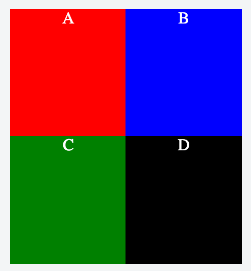
Take this example, of 4 boxes in a 2x2 grid.
HTML:
<div id="container">
  <div id="zoom-container">
    <div class="box red">A</div>
    <div class="box blue">B</div>
    <div class="box green">C</div>
    <div class="box black">D</div>
  </div>
</div>
CSS:
* { margin: 0; }

body, html { height: 100%; }

#container {
  height: 100%;
  width: 50%;
  margin: 0 auto;
}

#zoom-container {
  height: 100%;
  width: 100%;
  transition: all 0.2s ease-in-out;
}

.box {
  float: left;
  width: 50%;
  height: 50%;
  color: white;
  text-align: center;
  display: block;
}

.red { background: red; }
.blue { background: blue; }
.green { background: green; }
.black { background: black; }
JavaScript:
window.zoomedIn = false;

$(".box").click(function(event) {
  var el = this;
  var zoomContainer = $("#zoom-container");

  if (window.zoomedIn) {
    console.log("resetting zoom");
    zoomContainer.css("transform", "");
    $("#container").css("overflow", "auto");
    window.zoomedIn = false;
  } else {
    console.log("applying zoom");
    var top = el.offsetTop;
    var left = el.offsetLeft - 0.25*zoomContainer[0].clientWidth;

    var translateY = 0.5*zoomContainer[0].clientHeight - top;
    var translateX = 0.5*zoomContainer[0].clientWidth - left;

    $("#container").css("overflow", "scroll");
    zoomContainer.css("transform", "translate(" + 2 * translateX + "px, " + 2 * translateY + "px) scale(2)");
    window.zoomedIn = true;
  }
});
By controlling the value of translateX and translateY, you can change how the zooming works.
The initial rendered view looks something like this:
Clicking on the A box will zoom you in appropriately:
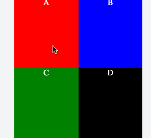
(Note that clicking D at the end is just showing the reset by zooming back out.)
The problem is: zooming to box D will scale the zoom container such that scrolling to the top and left doesn't work, because the contents overflow. The same happens when zooming to boxes B (the left half is cropped) and C (the top half is cropped). Only with A does the content not overflow outside the container.
In similar situations related to scaling (see CSS3 Transform Scale and Container with Overflow), one possible solution is to specify transform-origin: top left (or 0 0). Because of the way the scaling works relative to the top left, the scrolling functionality stays. That doesn't seem to work here though, because it means you're no longer repositioning the contents to be focused on the clicked box (A, B, C or D).
Another possible solution is to add a margin-left and a margin-top to the zoom container, which adds enough space to make up for the overflowed contents. But again: the translate values no longer line up.
So: is there a way to both zoom in on a given element, and overflow with a scroll so that contents aren't cropped?
Update: There's a rough almost-solution by animating scrollTop and scrollLeft, similar to https://stackoverflow.com/a/31406704/528044 (see the jsfiddle example), but it's not quite a proper solution because it first zooms to the top left, not the intended target. I'm beginning to suspect this isn't actually possible, because it's probably equivalent to asking for scrollLeft to be negative.
 772
772
The non-standard zoom CSS property can be used to control the magnification level of an element. transform: scale() should be used instead of this property, if possible. However, unlike CSS Transforms, zoom affects the layout size of the element.
The scale() CSS function defines a transformation that resizes an element on the 2D plane. Because the amount of scaling is defined by a vector, it can resize the horizontal and vertical dimensions at different scales. Its result is a <transform-function> data type.
The transform CSS property lets you rotate, scale, skew, or translate an element.
To apply a basic scale transformation, define a number that instructs the browser how large to scale an element. The default value for scale() is: scale(1) . To make an element twice as large, write 2 as the value: scale(2) . One scale() value evenly scales an element both vertically and horizontally.
Why not just to reposition the TransformOrigin to 0 0 and to use proper scrollTop/scrollLeft after the animation?
If you do not need the animation, the TransformOrigin can always stays 0 0 and only the scrolling is used to show the box.
To make the animation less jumpy use transition only for transform porperty, otherwise the transform-origin gets animated also. I have edited the example with 4x4 elements, but I think it makes sense to zoom a box completely into view, thats why I changed the zoom level. But if you stay by zoom level 2 and the grid size 15x15 for instance, then with this approach really precise origin should be calculated for transform, and then also the correct scrolling.
Anyway I don't know, if you find this approach useful.
Stack snippet
var zoomedIn = false;
var zoomContainer = $("#zoom-container");

$(".box").click(function(event) {
  var el = this;

  if (zoomedIn) {
    zoomContainer.css({
    	transform: "scale(1)",
      transformOrigin: "0 0"
    });
    zoomContainer.parent().scrollTop(0).scrollLeft(0);
    zoomedIn = false;
    return;
  }
  zoomedIn = true;
  var $el = $(el);
  animate($el);
  zoomContainer.on('transitionend', function(){
  	zoomContainer.off('transitionend');
  	reposition($el);
  })
});

var COLS = 4, ROWS = 4,
  	COLS_STEP = 100 / (COLS - 1), ROWS_STEP = 100 / (ROWS - 1),
    ZOOM = 4;


function animate($box) {
  var cell = getCell($box);
  var col =  cell.col * COLS_STEP + '%',
      row =  cell.row * ROWS_STEP + '%';
  zoomContainer.parent().css('overflow', 'hidden');
	zoomContainer.css({
    transition: 'transform 0.2s ease-in-out',
  	transform: "scale(" + ZOOM + ")",
    transformOrigin: col + " " + row
  });
}
function reposition($box) {
  zoomContainer.css({
    transition: 'none',
  	transform: "scale(" + ZOOM + ")",
    transformOrigin: '0 0'
  });
  zoomContainer.parent().css('overflow', 'auto');
  $box.get(0).scrollIntoView();
}
function getCell ($box) {
	var idx = $box.index();
  var col = idx % COLS,
      row =  (idx / ROWS) | 0;
  return { col: col, row: row };
}
* { margin: 0; }
body, html { height: 100%; }
#container {
height: 100%;
width: 50%;
margin: 0 auto;
overflow: hidden;
}
#zoom-container {
height: 100%;
width: 100%;
will-change: transform;
}
.box {
float: left;
width: 25%;
height: 25%;
color: white;
text-align: center;
}
.red { background: red; }
.blue { background: blue; }
.green { background: green; }
.black { background: black; }
.l { opacity: .3 }<script src="//cdnjs.cloudflare.com/ajax/libs/jquery/2.2.2/jquery.min.js"></script>
<div id="container">
<div id="zoom-container">
<div class="box red">A</div>
<div class="box blue">B</div>
<div class="box green">C</div>
<div class="box black">D</div>
<div class="box red l">E</div>
<div class="box blue l">F</div>
<div class="box green l">G</div>
<div class="box black l">H</div>
<div class="box red">I</div>
<div class="box blue">J</div>
<div class="box green">K</div>
<div class="box black">L</div>
<div class="box red l">M</div>
<div class="box blue l">N</div>
<div class="box green l">O</div>
<div class="box black l">P</div>
</div>
</div>If you love us? You can donate to us via Paypal or buy me a coffee so we can maintain and grow! Thank you!
Donate Us With