 Menu
Menu
I have a full screen fixed background image. I would like the text in my scrolling div to fade out at the top, presumably by applying a gradient mask to the background at only the top part of the div. I'm interested in having the text look like it fades away as it the user scrolls down, but still having a large area of full opacity for actually reading the text.
I know there are masking options in the webkit, but I can't find a way to fade through to the page's background over the contained text only applying the gradient to a small portion of the element.
Here's an image of the desired result:
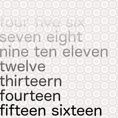
 510
510
To add a gradient overlay to a text element, we need to set three different CSS properties to the text we want to style: background-image: <gradient> background-clip: text. text-fill-color: transparent.
I've been wondering this exact same thing. The solution is actually quite simple. Although this is of course quite a modern feature, so you're stuck to browser compatibility.
Webkit can take care of this with a single line of CSS:
-webkit-mask-image: -webkit-gradient(linear, left 90%, left bottom, from(rgba(0,0,0,1)), to(rgba(0,0,0,0))) (The new standardised way of doing it is would use mask-image and linear-gradient using its new syntax. See caniuse.com for mask-image and linear-gradient.)
This would fade out the bottom 10% of whatever element it's applied to, without using even so much as an image. You could add padding-bottom: 50% to make sure that content is only faded when there is more to scroll to.
Source: http://www.webkit.org/blog/181/css-masks/
A Mozilla (Gecko) fallback is a bit trickier though: you can use its 'mask' feature, but this demands a SVG-image. You could try to base64 embed that image into your stylesheet... Use mask-image in Firefox now.
191
Here's how you can do it using modern mask-image and linear-gradient properties. Sadly, in 2021, they are not completely supported in all browsers. (See caniuse.com for CSS masks and linear-gradient.)
In this code snippet, I've given the html element an orange and yellow gradient background, to prove that this method is using real transparency and uses the element underneath it as background.
html { background: linear-gradient(to right, orange, yellow, orange); height: 100%; } div { -webkit-mask-image: linear-gradient(to bottom, rgba(0, 0, 0, 0), rgba(0, 0, 0, 1)); mask-image: linear-gradient(to bottom, rgba(0, 0, 0, 0), rgba(0, 0, 0, 1)); }<div> One two three four five six seven eight nine ten One two three four five six seven eight nine ten One two three four five six seven eight nine ten One two three four five six seven eight nine ten One two three four five six seven eight nine ten One two three four five six seven eight nine ten One two three four five six seven eight nine ten One two three four five six seven eight nine ten One two three four five six seven eight nine ten One two three four five six seven eight nine ten One two three four five six seven eight nine ten One two three four five six seven eight nine ten One two three four five six seven eight nine ten One two three four five six seven eight nine ten One two three four five six seven eight nine ten One two three four five six seven eight nine ten One two three four five six seven eight nine ten One two three four five six seven eight nine ten One two three four five six seven eight nine ten One two three four five six seven eight nine ten One two three four five six seven eight nine ten One two three four five six seven eight nine ten One two three four five six seven eight nine ten One two three four five six seven eight nine ten </div>If you love us? You can donate to us via Paypal or buy me a coffee so we can maintain and grow! Thank you!
Donate Us With


