 Menu
Menu
I am new to Bootstrap 3 and I would like to have 3 panels on my landing page of equal height, even though the middle panel has less content. When resized they become the same height, but are not upon initial visit to the page.
I already tried hiding the overflow with CSS and it cuts off the bottom of the panel which isn't what I want, so I'm thinking I need to use jQuery.
Here is my code:
<div class="row-fluid">
<!--begin panel 1 -->
<div class="col-md-4">
<div style="text-align:center" class="panel panel-primary">
<div class="panel-heading">
<h1 class="panel-title text-center">Web y Metrícas</h1>
</div>
<!-- end panel-heading -->
<div class="panel-body">
<p>
<img style="margin: 0 auto;" class="img-responsive" src="web.png" height="30%" width="30%" alt="Web y Metrícas" />
</p>
<p class="text-left lead2">Apoyamos estratégicamente la presencia de tu empresa en el mundo digital, a través de la construcción de recursos web atractivos para tus clientes.</p>
<ul class="text-left">
<li>Web Corporativas</li>
<li>Tiendas Virtuales</li>
<li>Plataformas e-Learning</li>
<li>Arquitectura de Información</li>
<li>Google Analytics, SEO–SEM</li>
<li>Análisis de Competencia Digital</li>
<li>Data Mining</li>
</ul> <a class="btn btn-primary" href="#">Ver más »</a>
</div>
<!-- end panel-body -->
</div>
<!-- end panel-primary -->
</div>
<!--end col-md-4 -->
<!-- begin panel 2 -->
<div class="col-md-4">
<div style="text-align:center" class="panel panel-primary">
<div class="panel-heading">
<h1 class="panel-title">Gestíon de Redes Socials</h1>
</div>
<!-- end panel-heading -->
<div class="panel-body">
<p>
<img style="margin: 0 auto;" class="img-responsive" src="redes.png" height="30%" width="30%" alt="Gestíon de Redes Socials" />
</p>
<p class="text-left lead2">Crear una experiencia de marca excepcional a través de redes es más inteligente, rápida y las comunicaciones sociales serán más eficientes.</p>
<ul class="text-left">
<li>Compromiso</li>
<li>Publicación</li>
<li>Monitoreo</li>
<li>Analítica</li>
<li>Colaboración</li>
<li>CRM</li>
<li>Movil</li>
</ul> <a class="btn btn-primary" href="#">Ver más »</a>
</div>
<!-- end panel-body -->
</div>
<!-- end panel-primary -->
</div>
<!-- end col-md-4 -->
<!--begin panel 3 -->
<div class="col-md-4">
<div style="text-align:center" class="panel panel-primary">
<div class="panel-heading">
<h1 class="panel-title">Plan de Medios</h1>
</div>
<!-- end panel-heading -->
<div class="panel-body">
<p>
<img style="margin: 0 auto;" class="img-responsive" src="medios.png" height="30%" width="30%" alt="Plan de Medios" />
</p>
<p class="text-left lead2">Trabajamos en conjunto con la empresa para reforzar las fortalezas de su organización y las comunicamos de forma integral y con un mensaje claro.</p>
<ul class="text-left">
<li>Asesoría Comunicacional</li>
<li>RR.PP</li>
<li>Presencia de Marca</li>
<li>Clipping Digital</li>
<li>Manejo de Crisis</li>
<li>Lobby</li>
<li>Media Training</li>
</ul> <a class="btn btn-primary" href="#">Ver más »</a>
</div>
<!-- end panel-body -->
</div>
<!-- end panel-primary -->
</div>
<!-- end col-md-4 -->
</div>
<!-- end row -->
 556
556
Following is a summary of what we have discussed in this tutorial: Twitter Bootstrap's default grid system is 940px wide and can hold 12 columns. In the Grid, rows are created with 'class="row"' and columns are created with 'class="spanx"', where x is a positive integer. Sum of x for all columns used must not exceed 12.
Twitter Bootstrap's default grid system is 940px wide and can hold 12 columns. In the Grid, rows are created with 'class="row"' and columns are created with 'class="spanx"', where x is a positive integer. Sum of x for all columns used must not exceed 12. By adding responsive css of Bootstrap, you can add responsive features to the default grid.
In this tutorial, you will learn how to use Twitter Bootstrap to create a Grid System. As you may know, in graphics design, a Grid system is a two-dimensional structure made up of horizontal and vertical axes having intersecting areas, useful for structuring content. It is widely used to design layout and content structure in print design.
And columns contain the actual content. As of Version 2.3.2, Twitter Bootstrap offers two types of Grids. The default Grid System is 940px wide and 12 column. You can add the responsive stylesheet to it and then it will become adaptable to 724px and 1170px wide with respect to the viewport it is rendered on. There is also a fluid grid system.
This can be done with CSS flexbox. Only minimal CSS is needed..
.equal {
    display: -webkit-flex;
    display: flex;
}
Just add .equal to your .row and flexbox does the rest.
http://www.codeply.com/go/BZA25rTY45
UPDATE: Bootstrap 4 uses flexbox so there is no need for the additional CSS. http://www.codeply.com/go/0Aq0p6IcHs
86
Bootstrap's solution - add this css and add the class to your row:
.row-eq-height {
  display: -webkit-box;
  display: -webkit-flex;
  display: -ms-flexbox;
  display:         flex;
}
It has a couple caveats, as posted at http://getbootstrap.com.vn/examples/equal-height-columns/, but it sounds like it'll be good enough for your case.
I also saw this answer here.
Update for dynamic number of columns
Bootstrap automatically wraps columns into new rows when you add more than can fit in one row, but this flexbox approach breaks this. To get flexbox to wrap, I've found you can do something like this:
-webkit-flex-flow: row wrap;
flex-flow: row wrap;
-webkit-align-content: flex-end;
align-content: flex-end;
This is awesome when you have a dynamic number of columns, or columns that change width according to the screen size. So you can have something like this:
<div class="row row-eq-height">
    <div class="col-sm-6 col-md-4">Content...</div>
    <div class="col-sm-6 col-md-4">Content...</div>
    <div class="col-sm-6 col-md-4">Content...</div>
    <div class="col-sm-6 col-md-4">Content...</div>
    <div class="col-sm-6 col-md-4">Content...</div>
</div>
And it all lines up the way it's expected. Just watch out - it only works in newer browsers. More info here
33
If you're going to use the bootstrap grid, I don't think you're going to find an easy way to accomplish this without hacks like the following css.
This basically says. When the screen width is greater than the md breakpoint in bootstrap, give all the elements with panel-body class which are direct descendants of the column elements a minimum height of 420px which happens to be a "magic number" that works with your existing content.
Again, I think this is a really gross solution, but it "works" in a pinch.
@media (min-width: 992px) {
  .col-md-4 > .panel > .panel-body {
    min-height: 420px;
  }
}
Here's a CSS-Tricks article Fluid Width Equal Height Columns which covers various ways (display: table & flexbox) to accomplish this. However, you might need to step away from the responsive bootstrap grid for this particular task.
Also, here's the Complete Guide to Flexbox
8
Haven't found any of these CSS methods to work in my case I am using images in my panels too instead I used a simple JQuery function to get the job done
        window.onload = function resizePanel(){
            var h = $("#panel-2").height();
            $("#panel-1").height(h); // add a line like this for each panel you want to resize
        }
Where the ids "panel-1" and and "panel-2" are in the panel tag choose the largest panel as the one you use to set h and call the function at the end of you html.
<body onresize = "resizePanel()">
I also make it so the function is called when if the window is resized by adding the onresize attribute to the body
2
this function finds the largest .panel-body height, then makes that the height of all my .panel-body elements.
function evenpanels() {
    var heights = [];                           // make an array
    $(".panel-body").each(function(){           // copy the height of each
        heights.push($(this).height());         //   element to the array
    });
    heights.sort(function(a, b){return b - a}); // sort the array high to low
    var minh = heights[0];                      // take the highest number
    $(".panel-body").height(minh);              // and apply that to each element
}
Now that all the panel-bodys are the same, the heights need to be cleared when the window resizes before running the "evenpanels" function again.
$(window).resize(function () {
        $(".panel-body").each(function(){
            $(this).css('height',"");           // clear height values
        });
        evenpanels();
});
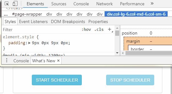
I add top and bottom paddings in style for the lower <div>.
<div class="xxx" style="padding: 8px 0px 8px 0px">
    ...
</div>
Because after all each case is different and you have to adjust according to the situation.
Chrome dev tool can be very useful in situations like this.
1
If you love us? You can donate to us via Paypal or buy me a coffee so we can maintain and grow! Thank you!
Donate Us With