 Menu
Menu
I need to give the user the possibility to select a date and time within a QML application. For selection dates there is the Calendar in QtQuick Controls.
I haven't found a similar control to let the user select the time of day.
On the internet there are a couple of examples like Grog or Harmattan. I assume however that they do not integrate with the native look and feel like the other QtQuick Controls do.
Is there a standard approach which I am not aware of, good alternatives I have not come across or recommendations about which to choose?
 932
932
Since Qt 5.5 the so called Qt Quick Enterprise Controls will be available also in the community edition of Qt under the name Qt Quick Extras. Among the others, the Tumbler seems a feasible solution for your requirements: you can easily setup two columns, one for the hours and one for the minutes.
If you are still interested in the circular selection (or wants to implement your own tumbler) you can take different routes such as create your own component inheriting from QQuickItem or QQuickPaintedItem or exploiting a custom view with PathView. The latter is the case I'm going to cover in this answer. Just refer to the provided links for examples about custom components creation.
Citing the documentation of PathView:
The view has a model, which defines the data to be displayed, and a delegate, which defines how the data should be displayed. The delegate is instantiated for each item on the path. The items may be flicked to move them along the path.
Hence the path defines the way items are laid out on the screen, even in a circular fashion. A path can be constructed via a Path type, i.e. a sequence of path segments of different kind. PathArc is the one we are interested in, since it provides the desired rounded shape.
The following example uses these elements to define a circular time picker. Each path is constructed by exploiting the currentIndexof the delegate: an integer is used as model for the PathViews - 12 for the hours view and 6 for the minutes view, respectively. The text of the delegates is generated by exploiting the index attached property and manipulating it to generate hours and 10-minutes interval values (see the delegates Text items). Finally, the text of the current element (i.e. the currentItem) is bound to the time label in the center of the window: as the currentIndex and currentItem change, also the label gets updated.
The overall component looks like this:
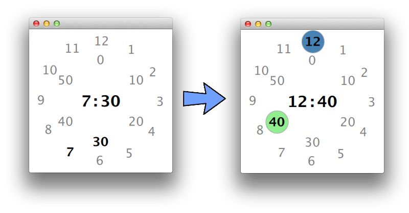
highlightcomponents (blue and green circles) are used to graphically representing editing of the time: when visible the time can be edited, i.e. another Item of the path can be selected. Switching between normal and editing mode occurs by clicking the time label in the center.
When in editing mode the user can simply hover the different hours/minutes values to select them. If the newly selected hour/minute is clicked the editing for that specific PathView is disabled and the corresponding highlight circle disappears.
This code is clearly just a toy example to give you a grasp of what PathView can be used for. Several improvements can be done, e.g. animations, a better number positioning, detailed minutes representation, a nice background and so on. However they are out of scope w.r.t. the question and were not considered.
import QtQuick 2.4
import QtQuick.Window 2.2
import QtQuick.Controls.Styles 1.3
import QtQuick.Layouts 1.1

Window {
    visible: true
    width: 280; height: 280

    RowLayout {             // centre time label
        anchors.centerIn: parent
        Text {
            id: h
            font.pixelSize: 30
            font.bold: true
            text: outer.currentItem.text
        }
        Text {
            id: div
            font.pixelSize: 30
            font.bold: true
            text: qsTr(":")
        }
        Text {
            id: m
            font.pixelSize: 30
            font.bold: true
            text: inner.currentItem.text
        }

        MouseArea {
            anchors.fill: parent
            onClicked: outer.choiceActive = inner.choiceActive = !outer.choiceActive
        }
    }


    PathView {          // hours path
        id: outer
        property bool pressed: false
        model: 12

        interactive: false
        highlightRangeMode:  PathView.NoHighlightRange
        property bool choiceActive: false

        highlight: Rectangle {
            id: rect
            width: 30 * 1.5
            height: width
            radius: width / 2
            border.color: "darkgray"
            color: "steelblue"
            visible: outer.choiceActive
        }

        delegate: Item {
            id: del
            width: 30
            height: 30
            property bool currentItem: PathView.view.currentIndex == index
            property alias text : textHou.text
            Text {
                id: textHou
                anchors.centerIn: parent
                font.pixelSize: 24
                font.bold: currentItem
                text: index + 1
                color: currentItem ? "black" : "gray"
            }

            MouseArea {
                anchors.fill: parent
                enabled: outer.choiceActive
                onClicked: outer.choiceActive = false
                hoverEnabled: true
                onEntered: outer.currentIndex = index
            }
        }

        path: Path {
            startX: 200; startY: 40
            PathArc {
                x: 80; y: 240
                radiusX: 110; radiusY: 110
                useLargeArc: false
            }
            PathArc {
                x: 200; y: 40
                radiusX: 110; radiusY: 110
                useLargeArc: false
            }
        }
    }

    PathView {          // minutes path
        id: inner
        property bool pressed: false
        model: 6
        interactive: false
        highlightRangeMode:  PathView.NoHighlightRange
        property bool choiceActive: false

        highlight: Rectangle {
            width: 30 * 1.5
            height: width
            radius: width / 2
            border.color: "darkgray"
            color: "lightgreen"
            visible: inner.choiceActive
        }

        delegate: Item {
            width: 30
            height: 30
            property bool currentItem: PathView.view.currentIndex == index
            property alias text : textMin.text
            Text {
                id: textMin
                anchors.centerIn: parent
                font.pixelSize: 24
                font.bold: currentItem
                text: index * 10
                color: currentItem ? "black" : "gray"
            }

            MouseArea {
                anchors.fill: parent
                enabled: inner.choiceActive
                onClicked: inner.choiceActive = false
                hoverEnabled: true
                onEntered: inner.currentIndex = index
            }
        }

        path: Path {
            startX: 140; startY: 60
            PathArc {
                x: 140; y: 220
                radiusX: 40; radiusY: 40
                useLargeArc: false
            }
            PathArc {
                x: 140; y: 60
                radiusX: 40; radiusY: 40
                useLargeArc: false
            }
        }
    }

    // to set current time!
    onVisibleChanged: {
        var d = new Date();
        outer.currentIndex = d.getUTCHours() % 12
        inner.currentIndex = d.getMinutes() / 10
    }
}
If you love us? You can donate to us via Paypal or buy me a coffee so we can maintain and grow! Thank you!
Donate Us With

