 Menu
Menu
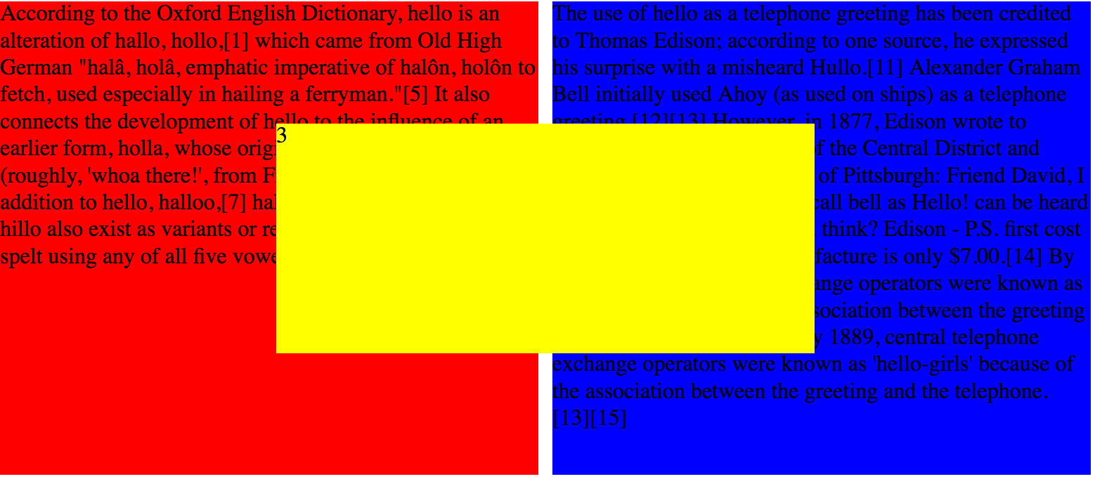
I've been experimenting with CSS Grid and am stuck on finding the most effective means to have text wrap around a <div> element that is positioned partially on-top of two other <div/> elements. Basically, like in the image below, I want the text in the red and blue divs to wrap around the yellow div that has been partially positioned in the columns and rows of the other two elements. Obviously, this is a Grid based layout, so I'm not interested in doing this with typical floats. How can I use CSS Grid to achieve this effect?
Here is my css and html:
.grid {
  display: grid;
  grid-template-columns: 1fr 1fr 1fr 1fr;
  grid-template-rows: 1fr 1fr 1fr 1fr;
  grid-gap: 10px;
}

.red {
  background-color: red;
  grid-column: 1 / span 2;
  grid-row: 1 / span 4;
}

.blue {
  background-color: blue;
  grid-column: 3 / span 2;
  grid-row: 1 / span 4;
}

.yellow {
  background-color: yellow;
  grid-column: 2 / span 2;
  grid-row: 2 / 4;
}
<div class="grid">
<div class="red">According to the Oxford English Dictionary, hello is an alteration of hallo, hollo,[1] which came from Old High German "halâ, holâ, emphatic imperative of halôn, holôn to fetch, used especially in hailing a ferryman."[5] It also connects the development
of hello to the influence of an earlier form, holla, whose origin is in the French holà (roughly, 'whoa there!', from French là 'there').[6] As in addition to hello, halloo,[7] hallo, hollo, hullo and (rarely) hillo also exist as variants or related
words, the word can be spelt using any of all five vowels.[8][9][10]</div>
<div class="blue">The use of hello as a telephone greeting has been credited to Thomas Edison; according to one source, he expressed his surprise with a misheard Hullo.[11] Alexander Graham Bell initially used Ahoy (as used on ships) as a telephone greeting.[12][13]
However, in 1877, Edison wrote to T.B.A. David, the president of the Central District and Printing Telegraph Company of Pittsburgh: Friend David, I do not think we shall need a call bell as Hello! can be heard 10 to 20 feet away. What you think? Edison
- P.S. first cost of sender & receiver to manufacture is only $7.00.[14] By 1889, central telephone exchange operators were known as 'hello-girls' because of the association between the greeting and the telephone.[13][15] By 1889, central telephone
exchange operators were known as 'hello-girls' because of the association between the greeting and the telephone.[13][15] </div>
<div class="yellow">3</div>
</div> 867
867
Today I'm going to talk about a rarely used but extremely useful CSS property, the word-wrap. You can force long (unbroken) text to wrap in a new line by specifying break-word with the word-wrap property. For example, you can use it to prevent text extending out the box and breaking the layout.
break-word: This is the actual CSS syntax that tells the browser to wrap a long text over to a new line. normal: It breaks each word at the normal points of separation within a DOM.
To prevent the text from wrapping, you can use the CSS white-space property with the “nowrap” or “pre” value.
Complete HTML/CSS Course 2022 HTML <pre> tag defines preformatted text. It is used to display code blocks since it preserves spaces and line breaks. If the line is large, then the <pre> tag won't wrap it by default. To wrap it, we need to use CSS.
You can use exclusions, but these are only supported by Microsoft's Internet Explorer and Edge and should be used with caution (for now, we have to prefix properties with -ms- for exclusions to work, but that doesn't always end in success). In a nutshell, an exclusion is an area around an element that inline flow content wraps around.
An element becomes an exclusion when its wrap-flow property has a computed value other than auto, so an example might be .p { wrap-flow: maximum }. The wrap-margin property sets the margin or offset surrounding the exclusion area.In your case, you could put .yellow { wrap-flow: both } in your CSS to allow the text in the other divs to wrap around the yellow div.
Example of wrap-flow: both

Links: Tutorial, browser support, specifications, tutorial
Related Tags: html css css3 css-grid
172
If you love us? You can donate to us via Paypal or buy me a coffee so we can maintain and grow! Thank you!
Donate Us With