 Menu
Menu
I'm quite new to the SwiftUI framework and I haven't wrapped my head around all of it yet so please bear with me.
Is there a way to trigger an "overlay view" from inside "another view" when its binding changes? See illustration below:
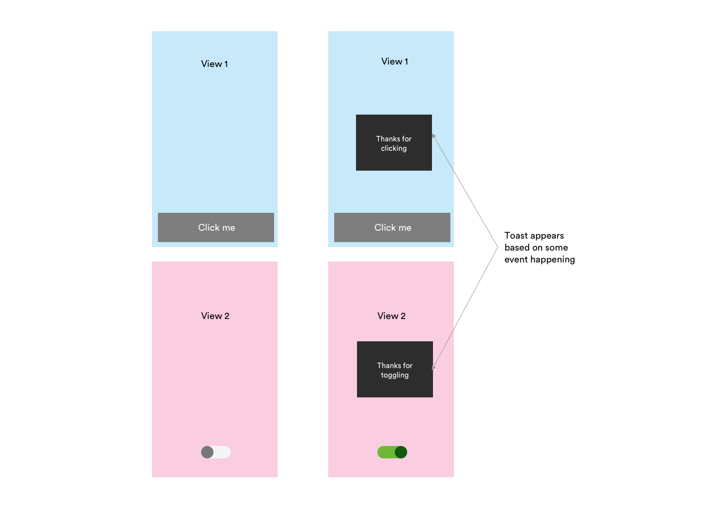
I figure this "overlay view" would wrap all my views. I'm not sure how to do this yet - maybe using ZIndex. I also guess I'd need some sort of callback when the binding changes, but I'm also not sure how to do that either.
This is what I've got so far:
ContentView
struct ContentView : View { @State private var liked: Bool = false var body: some View { VStack { LikeButton(liked: $liked) } } } LikeButton
struct LikeButton : View { @Binding var liked: Bool var body: some View { Button(action: { self.toggleLiked() }) { Image(systemName: liked ? "heart" : "heart.fill") } } private func toggleLiked() { self.liked = !self.liked // NEED SOME SORT OF TOAST CALLBACK HERE } } I feel like I need some sort of callback inside my LikeButton, but I'm not sure how this all works in Swift.
Any help with this would be appreciated. Thanks in advance!
 260
260
It's quite easy - and entertaining - to build a "toast" in SwiftUI!
Let's do it!
struct Toast<Presenting>: View where Presenting: View { /// The binding that decides the appropriate drawing in the body. @Binding var isShowing: Bool /// The view that will be "presenting" this toast let presenting: () -> Presenting /// The text to show let text: Text var body: some View { GeometryReader { geometry in ZStack(alignment: .center) { self.presenting() .blur(radius: self.isShowing ? 1 : 0) VStack { self.text } .frame(width: geometry.size.width / 2, height: geometry.size.height / 5) .background(Color.secondary.colorInvert()) .foregroundColor(Color.primary) .cornerRadius(20) .transition(.slide) .opacity(self.isShowing ? 1 : 0) } } } } Explanation of the body:
GeometryReader gives us the preferred size of the superview , thus allowing the perfect sizing for our Toast.ZStack stacks views on top of each other.isShowing == false), then we render the presenting view. If the toast has to be presented (isShowing == true), then we render the presenting view with a little bit of blur - because we can - and we create our toast next.VStack with a Text, with custom frame sizing, some design bells and whistles (colors and corner radius), and a default slide transition.I added this method on View to make the Toast creation easier:
extension View { func toast(isShowing: Binding<Bool>, text: Text) -> some View { Toast(isShowing: isShowing, presenting: { self }, text: text) } } And a little demo on how to use it:
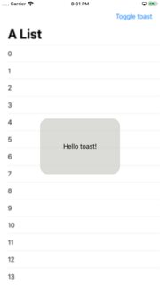
struct ContentView: View { @State var showToast: Bool = false var body: some View { NavigationView { List(0..<100) { item in Text("\(item)") } .navigationBarTitle(Text("A List"), displayMode: .large) .navigationBarItems(trailing: Button(action: { withAnimation { self.showToast.toggle() } }){ Text("Toggle toast") }) } .toast(isShowing: $showToast, text: Text("Hello toast!")) } } I used a NavigationView to make sure the view fills the entire screen, so the Toast is sized and positioned correctly.
The withAnimation block ensures the Toast transition is applied.
How it looks:
It's easy to extend the Toast with the power of SwiftUI DSL.
The Text property can easily become a @ViewBuilder closure to accomodate the most extravagant of the layouts.
To add it to your content view:
struct ContentView : View { @State private var liked: Bool = false var body: some View { VStack { LikeButton(liked: $liked) } // make it bigger by using "frame" or wrapping it in "NavigationView" .toast(isShowing: $liked, text: Text("Hello toast!")) } } How to hide the toast afte 2 seconds (as requested):
Append this code after .transition(.slide) in the toast VStack.
.onAppear { DispatchQueue.main.asyncAfter(deadline: .now() + 2) { withAnimation { self.isShowing = false } } } Tested on Xcode 11.1
55
If you love us? You can donate to us via Paypal or buy me a coffee so we can maintain and grow! Thank you!
Donate Us With