 Menu
Menu
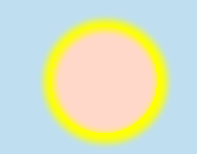
I am developing a Sunrise and Sunset animation with CSS3, Please check runtime jsFiddle output.
Sun is transiting from one color to another color as expected
Click For Larger Image

Click For Larger Image
Click For Larger Image

Click For Larger Image

Click For Larger Image

Problem lies in Sky transition from one mode to another mode, the color changes are abrupt and are not linear
@-webkit-keyframes changeSkyColor /* Safari and Chrome */
{
    1%{
        background: -webkit-linear-gradient(top, rgba(30, 152, 209, 1) 0%,rgb(202, 229, 243) 40%,rgba(125, 185, 232, 0.82) 100%); /* Background of Sky */
    }
    11%{
        background: -webkit-linear-gradient(top, rgba(30, 152, 209, 1) 0%,rgb(202, 229, 243) 40%,rgba(125, 185, 232, 0.82) 100%); /* Background of Sky */
    }
    33%  {
        background: -webkit-linear-gradient(top, rgb(240, 231, 26) 0%,rgb(245, 86, 12) 50%,rgba(197, 127, 81, 0.82) 100%); /* Background of Sky */
    }
    66%  {
        background: -webkit-linear-gradient(top, rgb(34, 33, 3) 0%,rgb(162, 55, 5) 50%,rgb(24, 10, 1) 100%); /* Background of Sky */
    }
    100% {
        background: -webkit-linear-gradient(top, rgba(5, 5, 5, 1) 0%,rgb(54, 55, 56) 40%,rgb(3, 3, 3) 100%); /* Background of Sky */
    }
}
Please Check JsFiddle Code(It is with comments).
Is there some thing i am missing? I Would be thankful if some one can give me some references or any pointers to take it forward.
 358
358
What I would do is apply the entire gradient, start to finish, onto a single element (for my example, I'll use #sky) and then animate the position of that element to make it look like the colors are fading. Twitter's Bootstrap uses this trick for animating the background on the button hovers.
See my fork of your JSFiddle with this approach: http://jsfiddle.net/jakebellacera/6Zabx/
Here's the CSS I added:
#sky {
    position: absolute;
    top: 0;
    left: 0;
    width: 100%;
    height: 900%; /* This must be in a factor of three */
    background-image: -webkit-linear-gradient(top, rgba(30,152,209,1) 0%, rgb(202, 229, 243) 11%, rgba(125, 185, 232, 0.82) 22%,
                                                   rgb(240, 231, 26) 33%, rgb(245, 86, 12) 44%,   rgba(197, 127, 81, 0.82) 55%,
                                                   rgba(5, 5, 5, 1) 66%,  rgb(54, 55, 56) 77%,    rgb(3, 3, 3) 100%);
    background-image: -moz-linear-gradient(top, rgba(30,152,209,1) 0%, rgb(202, 229, 243) 11%, rgba(125, 185, 232, 0.82) 22%,
                                                rgb(240, 231, 26) 33%, rgb(245, 86, 12) 44%,   rgba(197, 127, 81, 0.82) 55%,
                                                rgba(5, 5, 5, 1) 66%,  rgb(54, 55, 56) 77%,    rgb(3, 3, 3) 100%);
    -webkit-animation-name: changeSkyColor; /* Change Shiny Sky to evening sky and to darkness */  /* Safari and Chrome */
    -webkit-animation-duration: 14s; /* Total time of animation */
    -webkit-animation-timing-function: linear; /* Just another timing function */
    -webkit-animation-iteration-count: infinite; /* Lets repeat sunrise and sunset till world ends :) */
    -webkit-animation-direction: alternate; /* Lets do in alternate fashion */
    -moz-animation-name: changeSkyColor; /* Change Shiny Sky to evening sky and to darkness */  /* Mozzilla */
    -moz-animation-duration: 14s; /* Total time of animation */
    -moz-animation-timing-function: linear; /* Just another timing function */
    -moz-animation-iteration-count: infinite; /* Lets repeat sunrise and sunset till world ends :) */
    -moz-animation-direction: alternate; /* Lets do in alternate fashion */
}

@-webkit-keyframes changeSkyColor /* Safari and Chrome */
{
    0%{
        top: 0px;
    }
    100% {
        top: -800%; /* #sky's height - 100% */
    }
}
@-moz-keyframes changeSkyColor /* Mozilla */
{

    0%{
        top: 0px;
    }
    100%  {
        top: -800%; /* #sky's height - 100% */
    }
}
If you love us? You can donate to us via Paypal or buy me a coffee so we can maintain and grow! Thank you!
Donate Us With

