 Menu
Menu

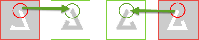
What I want is in green And what I already have Is in red in the image. And I want it to be done in CSS animation. The edge of the triangle (start and end of stroke) should be angled like in picture.
My so far code is :
.path {
  stroke-dasharray: 504;
  animation: dash 2.5s linear infinite;
  -webkit-animation: dash 2.5s linear infinite;
  -moz-animation: dash 2.5s linear infinite;
  -ms-animation: dash 2.5s linear infinite -o-animation: dash 2.5s linear infinite;
}
@keyframes dash {
  0% {
    stroke-dashoffset: 0;
    stroke-width: 30;
  }
  50% {
    stroke-dashoffset: 500;
    stroke-width: 30;
  }
  100% {
    stroke-dashoffset: 1000;
    stroke-width: 30;
  }
}
div svg {
  width: 20%;
}
<div>
<svg version="1.1" id="Layer_1" xmlns="http://www.w3.org/2000/svg" xmlns:xlink="http://www.w3.org/1999/xlink" x="0px" y="0px" viewBox="0 0 252.7 251.9" style="enable-background:new 0 0 252.7 251.9;" xml:space="preserve">
<style type="text/css">
.st0 {
fill: #fff;
}
</style>
<g>
<path stroke="#C5C5C5" stroke-width="20" stroke-linejoin="square" stroke-linecap="butt" class="path" d="M151 45 L79 200 L213 200 L152.324 50 L156 45" fill="url(#fagl)" />
</g>
</svg>
</div> 628
628
The issue you are facing is the way the stoke end is rendered. I am not aware of a way to make it end exaclty at the angle you need. None of the stoke-linecap values would fit.
You should also note that the path element in your SVG doesn't have the same start and end points.
Workaround:
A way would be to make the path go further than you need it and hide the overflow with clipPath. This way, the sroke will end at the desired angle:
.path {
  stroke-dasharray: 23;
  animation: dash 2.5s linear infinite;
}
@keyframes dash {
  to { stroke-dashoffset: -46; }
}
svg { width: 20%; }
<svg viewBox="0 0 10 10">
<clipPath id="clip">
<path d="M5 1 L8 9 H2z" />
</clipPath>
<path stroke="#C5C5C5" stroke-width="2" class="path" d="M5 1 L8 9 H2 L5 1" fill="url(#fagl)" clip-path="url(#clip)" />
</svg>Note that I also simplified your SVG and CSS
146
If you love us? You can donate to us via Paypal or buy me a coffee so we can maintain and grow! Thank you!
Donate Us With

