 Menu
Menu
I am trying to use flexbox to layout my website. The site has a video on the top of the screen and scrollable div below it. Each flex-item should use 50% of the height of the screen.
The video should maintain it's aspect ratio when the screen is resized. The width should not exceed the width of the screen and the height should not exceed 50% of the height of the screen.
Right now when the screen is narrow the video scales correctly to fit the width:
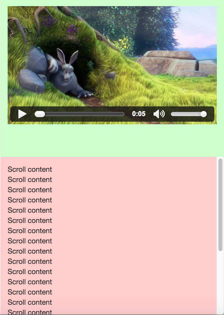
When the screen is widen the video's height extends past the height of the parent div and the controls appear above the scrollable div.

How can I ensure that the video will never exceed the height or width of the flex-item while maintaining the aspect ratio? The one requirement I have is that I must nest the video element in the flex-item (I can't use the video element as the flex-item). Also, ideally, the video should be centered vertically and horizontally.
html,
body {
  height: 100%;
}
video {
  width: 100%;
  height: auto;
}
.flex-container {
  height: 100%;
  display: flex;
  flex-direction: column;
}
.flex-item {
  padding: 1em;
  width: 100%;
  flex-basis: 50%;
}
.video-content {
  background-color: #ccffcc;
}
.scrollable-content {
  overflow-y: auto;
  background-color: #ffcccc;
}
<link href="https://maxcdn.bootstrapcdn.com/bootstrap/3.3.6/css/bootstrap.min.css" rel="stylesheet" />
<div class="flex-container">
<div class="flex-item video-content">
<video src="http://www.sample-videos.com/video/mp4/720/big_buck_bunny_720p_1mb.mp4" controls></video>
</div>
<div class="flex-item scrollable-content">
Scroll content
<br>Scroll content
<br>Scroll content
<br>Scroll content
<br>Scroll content
<br>Scroll content
<br>Scroll content
<br>Scroll content
<br>Scroll content
<br>Scroll content
<br>Scroll content
<br>Scroll content
<br>Scroll content
<br>Scroll content
<br>Scroll content
<br>Scroll content
<br>Scroll content
<br>Scroll content
<br>Scroll content
<br>Scroll content
<br>Scroll content
<br>Scroll content
<br>Scroll content
<br>Scroll content
</div>
</div> 933
933
I found a solution that works for me. I added position: relative; to .video-content made video absolute positioned with 100% height and width:
video {
    position: absolute;
    left: 0;
    top: 0;
    height: 100%;
    width: 100%;
}
https://jsfiddle.net/beeps10/0hxze25p/
104
html
<link href="https://maxcdn.bootstrapcdn.com/bootstrap/3.3.6/css/bootstrap.min.css" rel="stylesheet" />
<div class="flex-container">
  <div class="flex-item video-content">
    <video src="http://www.sample-videos.com/video/mp4/720/big_buck_bunny_720p_1mb.mp4" controls></video>
  </div>
  <div class="flex-item scrollable-content">
    <h1>Scroll content</h1>
    <p>Scroll content
    <br>Scroll content
    <br>Scroll content
    <br>Scroll content
    <br>Scroll content
    <br>Scroll content
    <br>Scroll content
    <br>Scroll content
    <br>Scroll content
    <br>Scroll content
    <br>Scroll content
    <br>Scroll content
    <br>Scroll content
    <br>Scroll content
    <br>Scroll content
    <br>Scroll content
    <br>Scroll content
    <br>Scroll content
    <br>Scroll content
    <br>Scroll content
    <br>Scroll content
    <br>Scroll content
      <br>Scroll content</p>
  </div>
</div>
css
html,
body {
  height: 100vh;
}
video {
  flex:0 1 100%;
  object-fit: fill; /* over-ride "object-fit: contain" only for webkit as it doesn't honour the ratio */
}
.flex-container {
  height: 100vh;
  display: flex;
  flex-direction:column;
  justify-content:flex-start;
}
.flex-item {
  padding: 1em;
  box-sizing:border-box;
  height:auto;
}
.video-content {
  background-color: #ccffcc;
  flex:0 1 100%;
  height:50%;
  display:flex;
  justify-content:flex-start;
}
.scrollable-content {
  flex:0 0 100%;
  overflow-y: scroll;
  min-height:50vh;
  background-color: #ffcccc;
}
http://codepen.io/anon/pen/wMrYOK
https://css-tricks.com/almanac/properties/o/object-fit/
https://css-tricks.com/snippets/css/a-guide-to-flexbox/
32
If you love us? You can donate to us via Paypal or buy me a coffee so we can maintain and grow! Thank you!
Donate Us With

