 Menu
Menu
I'm using a CSS transition on my hyperlink elements to make their interaction appear smoother. But I also want immediate feedback when the user is waiting for it. Hence I want the new state to appear immediately, but let it fade out when the user moves away.
Here's some CSS that I'm currently using:
a
{
  display: inline-block;
  padding: 20px;
  background: #eeeeee;
  color: black;
  text-decoration: none;
  transition: background 1s;
}
a:hover
{
  background: #bbbbbb;
  transition: background 0s;
}
a:active
{
  background: #888888;
  transition: background 0s;
}
<a href="javascript:void(0)">Test link</a>As you can see the colour fade is in effect when leaving the element with the mouse cursor, but not when entering it.
When pressing a mouse button on the hovered link, the colour again changes immediately.
Now comes the interesting part: When the mouse button is released, I'd like the colour to fade back to the hover state. But I can't manage to do so because the :hover state doesn't know from which state direction it's coming and always disables the transition.
Whatever is changed, there must be no transition when first hovering the link.
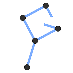
Again in a simple state diagram:
State:          normal   <---------->   hover   <---------->   active
Transition:             yes         no         yes?        no
                                          (currently no)
Is this possible with CSS? I know I could add custom JavaScript but that would need to go to a great number of elements.
 267
267
An idea is tu use pseudo-element to create your backgrounds and you can easily create the effect you want. The drawbacks is that you will have more CSS and you have to add your content inside a span in order to correctly set z-index values.
Using 2 pseudo-elements:
a {
  display: inline-block;
  padding: 20px;
  background: #eeeeee;
  color: black;
  text-decoration: none;
  transition: background 1s;
  position: relative;
}

a span {
  position: relative;
  z-index: 3;
}

a:before,
a:after {
  content: "";
  position: absolute;
  top: 0;
  bottom: 0;
  left: 0;
  right: 0;
  background: transparent;
  z-index: 1;
  transition: background 1s;
}

a:after {
  z-index: 2;
}

a:hover::before {
  background: red;
  transition: background 0s;
}

a:active::after {
  background: blue;
  transition: background 0s;
}
<a href="javascript:void(0)"><span>Test link</span></a>Using only one pseudo element:
a {
  display: inline-block;
  padding: 20px;
  background: #eeeeee;
  color: black;
  text-decoration: none;
  transition: background 1s;
  position: relative;
}

a span {
  position: relative;
  z-index: 1;
}

a:before {
  content: "";
  position: absolute;
  top: 0;
  bottom: 0;
  left: 0;
  right: 0;
  background: transparent;
  z-index: 0;
  transition: background 1s;
}

a:hover {
  background: red;
  transition: background 0s;
}

a:active::before {
  background: blue;
  transition: background 0s;
}
<a href="javascript:void(0)"><span>Test link</span></a>If you love us? You can donate to us via Paypal or buy me a coffee so we can maintain and grow! Thank you!
Donate Us With