 Menu
Menu
I would like to give below settings for Button in my application. You can think it as some theme changing for buttons.
Style Rounded or Normal
Color Red or yellow or blue or any Color code
I know with Shape defined in XML, I can achieve Rounded Corners. With setBackgroundColor, I can set any Color as background.
problem
Both setBackgroundColor, setBackground are overriding one another based on the order i call them. So I can't achieve both effects on the same button. How can I achieve these two effects simultaneously. How can I get below multiple buttons from single Button class. Thanks in Advance.

 777
777
Well I did it with GradientDrawable
    int color = Color.rgb(255,0,0); //red for example
    int radius = 5; //radius will be 5px
    int strokeWidth = 2;

    GradientDrawable gradientDrawable = new GradientDrawable();
    gradientDrawable.setColor(color);
    gradientDrawable.setCornerRadius(radius);
    gradientDrawable.setStroke(strokeWidth, color);
    button.setBackground(gradientDrawable);
You can set both shape and background color of a button in a drawable resource and assign it as android:background in XML or setBackgroundDrawable() in code.
Below is an example of such a button:
/res/drawable/button.xml
This file is to set rounded shape and background color
<selector xmlns:android="http://schemas.android.com/apk/res/android">

    <item android:state_focused="true">
        <shape android:shape="rectangle">
            <solid android:color="#ffffff" />
            <corners android:radius="16dp" />
            <stroke
                android:width="3dp"
                android:color="#ff0000" />
        </shape>
    </item>

    <item android:state_selected="true">
        <shape android:shape="rectangle">
            <solid android:color="#ffffff" />
            <corners android:radius="16dp" />
            <stroke
                android:width="3dp"
                android:color="#ff0000" />
        </shape>
    </item>

    <item android:state_pressed="true">
        <shape android:shape="rectangle">
            <solid android:color="#ff0000" />
            <corners android:radius="16dp" />
        </shape>
    </item>

    <item>
        <shape android:shape="rectangle">
        <solid android:color="#ffffff" />
        <corners android:radius="16dp" />
        <stroke
            android:width="3dp"
            android:color="#0000ff" />
    </shape>
    </item>

</selector>
/res/color/button.xml
(This file is to set text color)
<selector xmlns:android="http://schemas.android.com/apk/res/android">

    <item android:state_pressed="true" android:color="#0000ff" />
    <item android:state_focused="true" android:color="#0000ff" />
    <item android:state_selected="true" android:color="#0000ff" />
    <item android:color="#000000" />

</selector>
Then you can initialize the button in your layout as:
<Button
    android:id="@+id/button"
    android:layout_width="match_parent"
    android:layout_height="wrap_content"
    android:textColor="@color/button"
    android:background="@drawable/button"/>
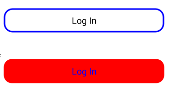
The button wil look as below (in default and pressed states from top to bottom):
26
If you love us? You can donate to us via Paypal or buy me a coffee so we can maintain and grow! Thank you!
Donate Us With