 Menu
Menu
Just testing the new developer preview and noticed that my existing ring drawables are not rendering properly. Instead of a ring it's a full circle. Is it a bug or has something changed or am I doing it wrong to begin with? Any possible solutions?
here's the code:
<layer-list xmlns:android="http://schemas.android.com/apk/res/android" >
    <item android:id="@android:id/progress">
        <shape
            android:innerRadiusRatio="3"
            android:shape="ring"
            android:thicknessRatio="7.0">
            <solid android:color="#ff5698fb"/>
        </shape>
    </item>
</layer-list>
Thanks!
Update
I've updated the shape as follows:
<layer-list xmlns:android="http://schemas.android.com/apk/res/android" >
    <item>
        <shape
            android:innerRadiusRatio="3"
            android:shape="ring"
            android:thicknessRatio="7.0">
            <solid android:color="#ff5698fb"/>
        </shape>
    </item>
    <item >
        <shape
            android:innerRadiusRatio="4"
            android:shape="ring"
            android:thicknessRatio="5.5">
            <solid android:color="#ffffff"/>
        </shape>
    </item>
</layer-list>
which produces a ring by overlaying two circles. But the progress bar that I'm using it in doesn't work. Here is the code for the progress bar:
<ProgressBar
                android:id="@+id/progressCircle"
                style="?android:attr/progressBarStyleHorizontal"
                android:layout_width="match_parent"
                android:layout_height="match_parent"
                android:indeterminate="false"
                android:max="100"
                android:progress="65"
                android:rotation="270"
                android:progressDrawable="@drawable/progress_circle"
                android:visibility="visible"/>
 995
995
You need to add android:useLevel="true" in the progress item. This didn't seem necessary in previous versions, but L wants it.
<item android:id="@android:id/progress">
    <shape
        android:innerRadiusRatio="3"
        android:shape="ring"
        android:thicknessRatio="7.0"
        android:useLevel="true" >
        <solid android:color="#ff5698fb"/>
    </shape>
</item>
useLevel for all ring shapes used in custom progress bars.Kano's answer is the way to solve your problem. I'm complementing it to add general info about ring shapes in custom progress bars.
It seems as if the default value for useLevel has changed over the Android versions. Here is a piece on investigation related to it.
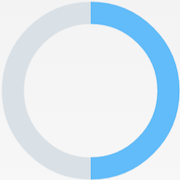
The following is a working implementation of a progress bar using a ring as a progress indicator, and another ring as the progress background:
<?xml version="1.0" encoding="utf-8"?>

<layer-list xmlns:android="http://schemas.android.com/apk/res/android">
    <!-- Progress background -->
    <item android:id="@android:id/background">
        <shape
            android:shape="ring"
            android:useLevel="false">
            <solid
                android:color="#dae1e6"/>
        </shape>
    </item>

    <!-- Progress -->
    <item android:id="@android:id/progress">
        <!-- Rotation of the progress to start at the top-->
        <rotate
            android:fromDegrees="-90"
            android:pivotX="50%"
            android:pivotY="50%"
            android:toDegrees="-90">
            <shape
                android:shape="ring"
                android:useLevel="true">
                <solid
                    android:color="#61bcf9"/>
            </shape>
        </rotate>
    </item>

</layer-list>
Using it as a progressDrawable in a ProgressBar:
<ProgressBar
    style="?android:attr/progressBarStyleHorizontal"
    android:layout_width="100dp"
    android:layout_height="100dp"
    android:progressDrawable="@drawable/custom_horizontal"
    android:progress="50"
    android:max="100"
    android:id="@+id/progressBar"
    android:layout_gravity="center"/>
Setting useLevel=true to the progress ring shape and useLevel=false in the background ring shape, gives the correct desired behavior for all Android versions:
Removing useLevel from the background shape:
Pre 5.0 (left) | 5.0 (right)

Removing useLevel from the progress shape:
Pre 5.0 (left) | 5.0 (right)

So, as I understand, useLevel is used to indicate whether the shape is affected by the progress value. If it isn't (false), it'll be fully painted; if it is (true), it'll be painted as much as the progress value is.
To sum up, it seems that:
useLevel is defaulted to true in Android < 5.0, causing the background ring to follow the progress value if useLevel is not set in its ring shape, thus making it hidden behind the progress indicator ring.useLevel is defaulted to false in Android >= 5.0, causing the progress indicator ring to be fully painted if useLevel is not set in its ring shape.So, due to this inconsistency, it's better to explicitly set the value of useLevel to true in the shapes which depend on the progress, and to false in the ones that don't.
This behavior is based on my observations, I haven't found any source confirming it. The official Android docs are not very clear about it...
21
If you love us? You can donate to us via Paypal or buy me a coffee so we can maintain and grow! Thank you!
Donate Us With