 Menu
Menu
The Problem
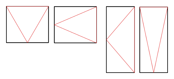
I need to create a container box that contains a triangle outline that's responsive to the size of the container, here's an image example as it's a lot simpler:
Requirements
#fff
#fff
Issues
I've tried something basic with borders around the child div but positioning it dynamically with relative width and height is proving as issue.
As is only getting the outline of a triangle and not a fully coloured triangle. This means creating the triangle using border becomes more complex unless someone can work out how to position one on top of another to give the white background with 1px border effect as in the image?
An Example
jsFiddle demo
.pane{
    border:1px solid #000;
    height:500px;
    margin:auto;
    margin-top:150px;
    position:relative;
    width:400px;
}

.triangle{
    width: 0;
    height: 0;
    border-top: 250px solid transparent;
    border-bottom: 250px solid transparent;
    border-left: 250px solid #ff0000;
}


<div class="pane">
    <div class="triangle">
    </div>
</div>
Example 2
jsFiddle Demo
This example creates responsive triangles but they'd need to be flipped and have the wider sections absolutely positioned left:0; right:0; top:0;
 289
289
Depending on the units you are using for your container, and if it's size depends on viewport, you can achieve this behaviour with vw/vh units :
DEMO
div{width:0;outline:1px solid red;}
.r{
    border-top:15vh solid transparent;
    border-bottom:15vh solid transparent;
    border-left:50vw solid teal;
}
.t{
    border-left:15vw solid transparent;
    border-right:15vw solid transparent;
    border-bottom: 50vh solid gold;
}
<div class="r"></div>
<div class="t"></div>If you only want the outline of the triangle and if you have a plain background, you can use this approach :
The point is to position an other triangle with the same color as the background over the first one :
DEMO
div {
  position: relative;
  overflow: hidden;
  outline: 1px solid red;
}
.r {
  width: 50vw;
  height: 30vh;
  border-left: 2px solid teal;
}
.t {
  height: 50vh;
  width: 30vw;
  border-bottom: 2px solid gold;
}
.r:after,
.r:before,
.t:after,
.t:before {
  content: '';
  position: absolute;
  top: 0;
  left: 0;
}
.r:before,
.r:after {
  border-top: 15vh solid transparent;
  border-bottom: 15vh solid transparent;
  border-left: 50vw solid teal;
}
.r:after {
  border-left-color: #fff;
  left: -1vw;
}
.t:before,
.t:after {
  border-left: 15vw solid transparent;
  border-right: 15vw solid transparent;
  border-bottom: 50vh solid gold;
}
.t:after {
  border-bottom-color: #fff;
  bottom: -1vh;
}
<div class="r"></div>
<div class="t"></div>This article seems to has a nice solution for responsive triangles with pure CSS
DEMO
.triangle-up {
  width: 25%;
  height: 0;
  padding-left: 25%;
  padding-bottom: 25%;
  overflow: hidden;
  border: 1px solid brown;
  margin: 20px;
}
.triangle-up div {
  width: 0;
  height: 0;
  margin-left: -500px;
  border-left: 500px solid transparent;
  border-right: 500px solid transparent;
  border-bottom: 500px solid #4679BD;
}
.triangle-right {
  width: 0;
  height: 0;
  padding-top: 25%;
  padding-bottom: 25%;
  padding-left: 25%;
  overflow: hidden;
  border: 1px solid green;
  margin: 20px;
}
.triangle-right div {
  width: 0;
  height: 0;
  margin-top: -500px;
  margin-left: -500px;
  border-top: 500px solid transparent;
  border-bottom: 500px solid transparent;
  border-left: 500px solid tomato;
}
<div class="triangle-up">
<div></div>
</div>
<div class="triangle-right">
<div></div>
</div>If you love us? You can donate to us via Paypal or buy me a coffee so we can maintain and grow! Thank you!
Donate Us With