 Menu
Menu
I want to create a shine loading animation which will appear on multiple elements with different background colors.
Currently, I'm using background-image gradient and I'm animating the background-position using vw units, but it's not scalable, my elements will have different lengths.
Is there a way I can animate background-image with percentage units?
The animation created
body {
  background: black;
}

header {
  width: 100%;
  height: 50px;
  background-color: rebeccapurple;
  background-image: linear-gradient(
    to right,
    transparent 0%,
    rgba(255,255,255,0.3) 50%,
    transparent 100%
  );
  background-repeat: no-repeat;
  background-position: -100vw;
  animation: shine 2s infinite;
}

@keyframes shine {
  0% {
    background-position: -100vw;
  }
  100% {
    background-position: 100vw;
  }
}
<header></header> 823
823
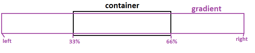
An idea is to make the size of the gradient to be 3 times bigger than the container and color the middle part of it then you slide it from left to right:
body {
  background: black;
}

.box {
  height: 50px;
  margin:5px;
  background:
    linear-gradient(90deg,#0000 33%,rgba(255,255,255,0.3) 50%,#0000 66%)
    rebeccapurple;
  background-size:300% 100%;
  animation: shine 2s infinite;
}

@keyframes shine {
  0% {
    background-position: right;
  }
  /*100% {
    background-position: left; it's the default value, no need to define it
  }*/
}
<div class="box"></div>
<div class="box" style="width:60%"></div>
<div class="box" style="width:40%"></div>Another alternative for a different animation:
body {
  background: black;
}

.box {
  height: 50px;
  margin:5px;
  background:
    repeating-linear-gradient(90deg,#0000 0,rgba(255,255,255,0.3) 25%,#0000 50%)
    rebeccapurple;
  background-size:200% 100%;
  animation: shine 1s infinite linear;
}

@keyframes shine {
  0% {
    background-position: right;
  }
}
<div class="box"></div>
<div class="box" style="width:60%"></div>
<div class="box" style="width:40%"></div>Related question: Using percentage values with background-position on a linear-gradient
180
If you love us? You can donate to us via Paypal or buy me a coffee so we can maintain and grow! Thank you!
Donate Us With

