 Menu
Menu
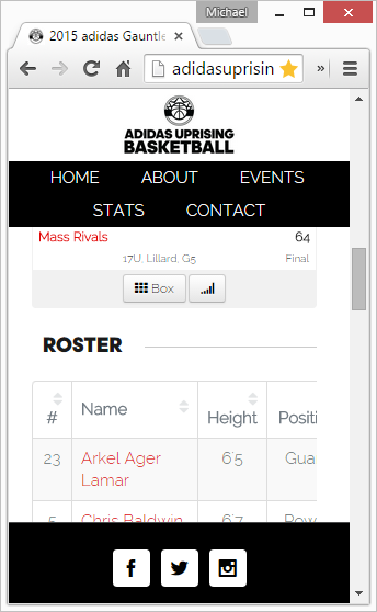
I am having an issue where my website looks off on an actual mobile device, but when I resize the screen on my computer it looks just fine. This is within an iframe also, and looks fine outside of the iframe on a mobile device. Below is the actual URL, click on search for a player and you wills see the page.
http://adidasuprising.com/adidas-grassroots-mens-events/adidas-gauntlet-series/dallas/
UPDATE
Looks like someone else has this issue. (Responsive)Table Width does not fit the container inside iframe on ios safari
Desktop Resized
Google Chrome on iPhone

 659
659
I fixed it with this from this page.
 iframe {
        width: 1px;
        min-width: 100%;
        *width: 100%;
    }
If you love us? You can donate to us via Paypal or buy me a coffee so we can maintain and grow! Thank you!
Donate Us With