 Menu
Menu
We have a strange issue here. We have a website wich worked nice since a few years. A couple of months ago, Firefox startet to scale the page depending on the user DPI-settings on his operating system.
The problem is, by default the DPI scale is set to 125% (in our country) in Windows 7 and every visitor using Firefox sees the page scaled. Howevery, Internet Explorer and Safari now doing the same, and I guess chrome will follow.
The tricky part is: When I open the page I see the correct layout. If I check the zoom level of the browser it tells me 100% - When I am opening the same page with firefox or Internet explorer, everything is scaled up (zoomed in) by 25%. If i check the zoom level in the browser settings, it says 100%. If I zoom out twice (to 80%) I see the original layout.
Is there an easy way to set the default dpi scale / zoom level by CSS, JavaScript or maybe a header tag?
Here are some screenshots to explain my issue a bit.
 This is the right layout as used to over the past years. The page is centered and on the left and right side is a bit of the background
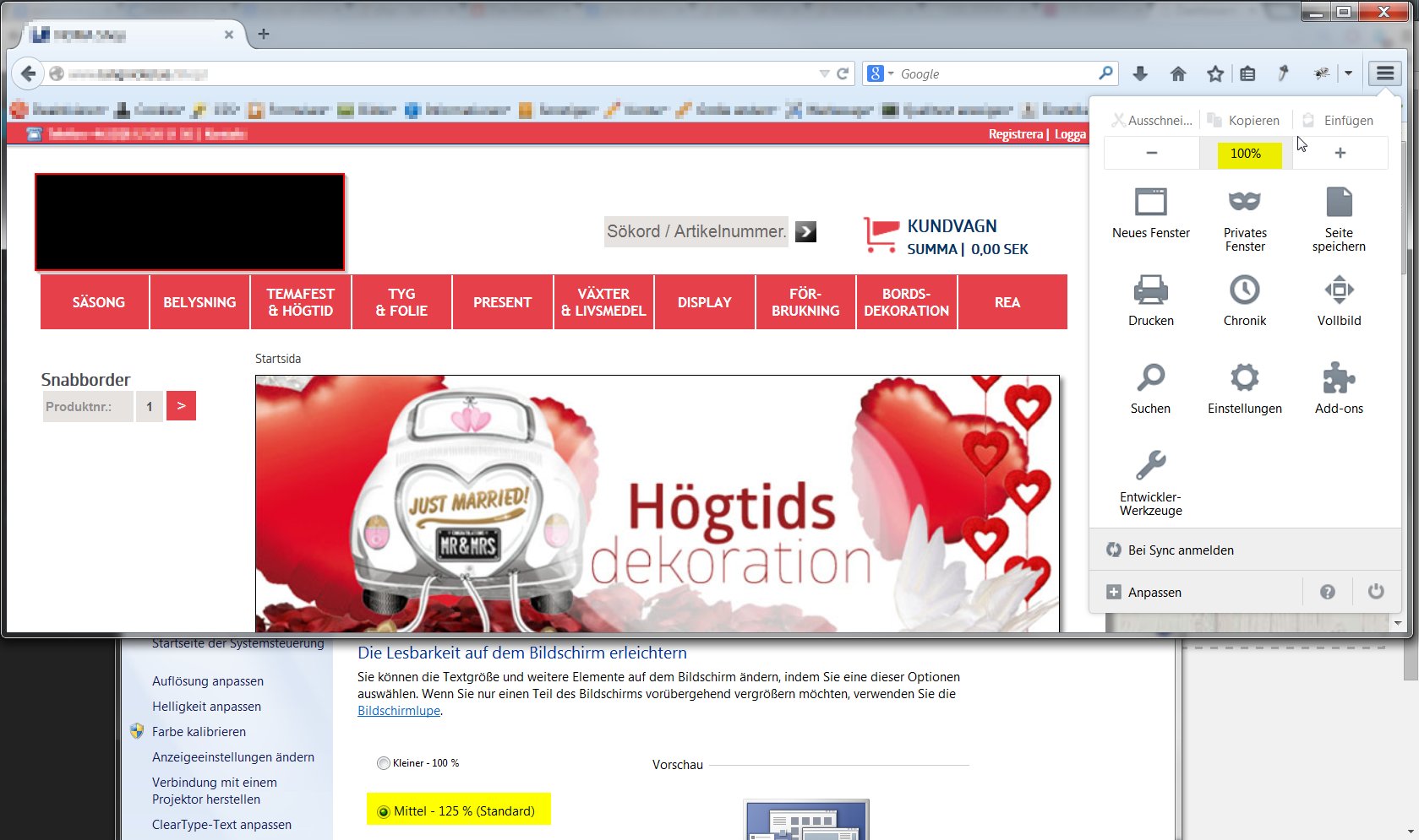 On Firefox, IE and Safari the same page on the same computer looks like this. It is zoomed in, you don't see the background and you see a bit less of the total content.
So now my question: what can I do, to make the same page look the same way on different computers as it comes to the scaling. I know several things always differ but the scale should be the same.
Edit:
Always scaling the page with transform: scale(.75); transfor-origin: 100%; 0; is not always suitable, because if a user with 100% DPI setting visits the page, everything is minimized for him. I can not always scale the page. I need to somehow identify if the user has set his operating system to 100% or 125% DPI scaling.
Edit:
Yes there is an option to determine the setted scale rate. At least for my setup this works by now. I add a screenshot with two browsers opened on the same machine (chrome top, firefox bottom) to see the difference (and the problem which seriously needs to get fixed by someone)

 829
829
 asked Nov 25 '14 09:11
You can check the browser dpi level with javascript and zoom the page contents accordingly with css(if needed).
if(window.devicePixelRatio == 1 )
  $("body").addClass("zoom2x")
Where zoom2x is a css class.
.zoom2x{
      zoom: 200%; /* all browsers */
     -moz-transform: scale(2);  /* Firefox */
}
You may crosscheck your current dpi setting here and verify results.
91
If you love us? You can donate to us via Paypal or buy me a coffee so we can maintain and grow! Thank you!
Donate Us With