 Menu
Menu
My app home page is composed by a nav bar and six big round buttons.
I would like to place the buttons in a (responsive) grid of 2x3 in portrait, and 3x2 in landscape.
Something like this, visually:
portrait:
+-----------+
|   navbar  |
|           |
| +--+ +--+ |
| |B1| |B2| |
| +--+ +--+ |
| +--+ +--+ |
| |B3| |B4| |
| +--+ +--+ |
| +--+ +--+ |
| |B5| |B6| |
| +--+ +--+ |
+-----------+

landscape:
+-------------------------+
|         navbar          |
|   +--+   +--+   +--+    |
|   |B1|   |B2|   |B3|    |
|   +--+   +--+   +--+    |
|   +--+   +--+   +--+    |
|   |B4|   |B5|   |B6|    |
|   +--+   +--+   +--+    |
+-------------------------+
My current solution is not satisfactory, since it doesn't resize correctly when changing orientation:
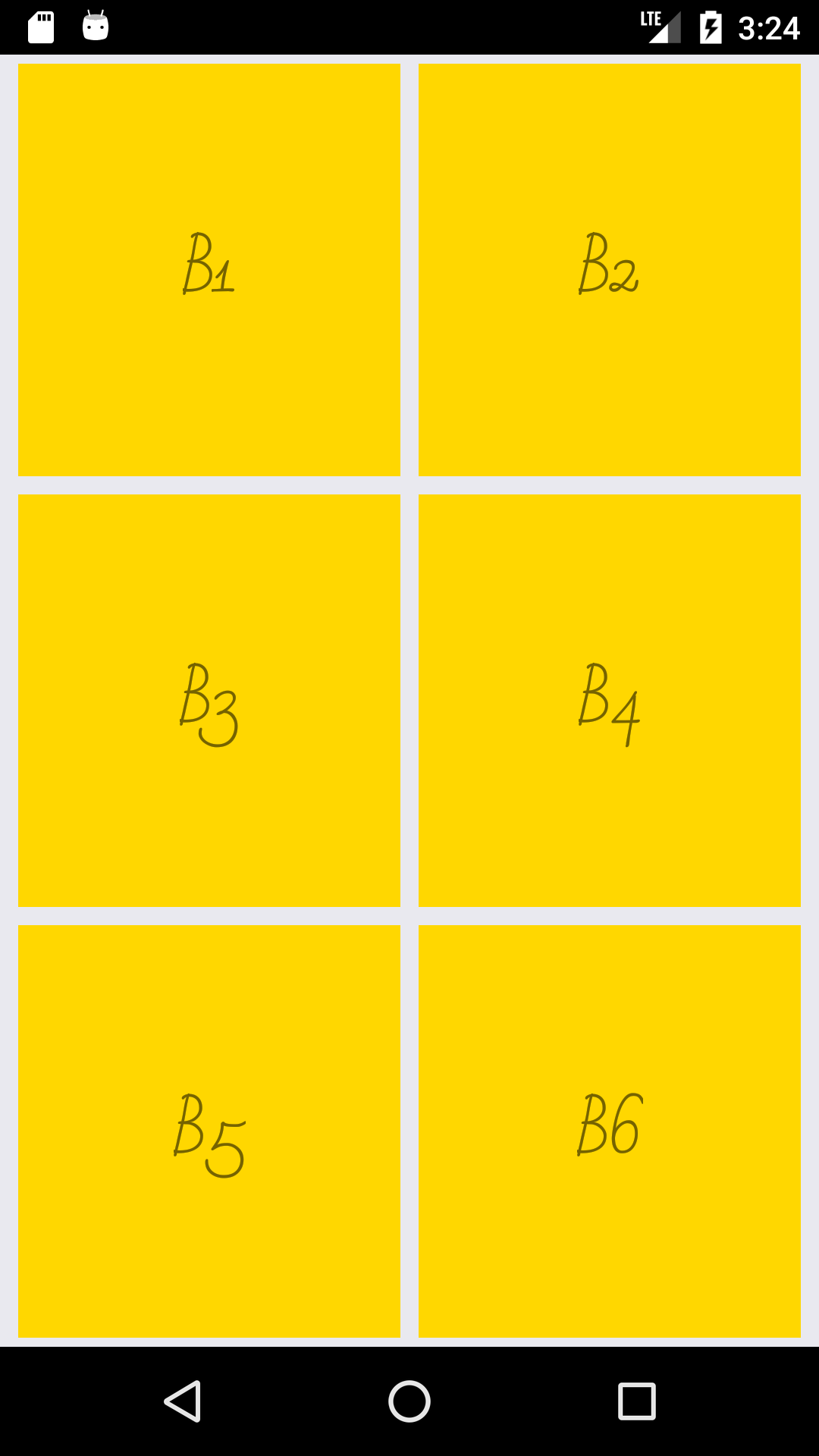
On portrait (fine):
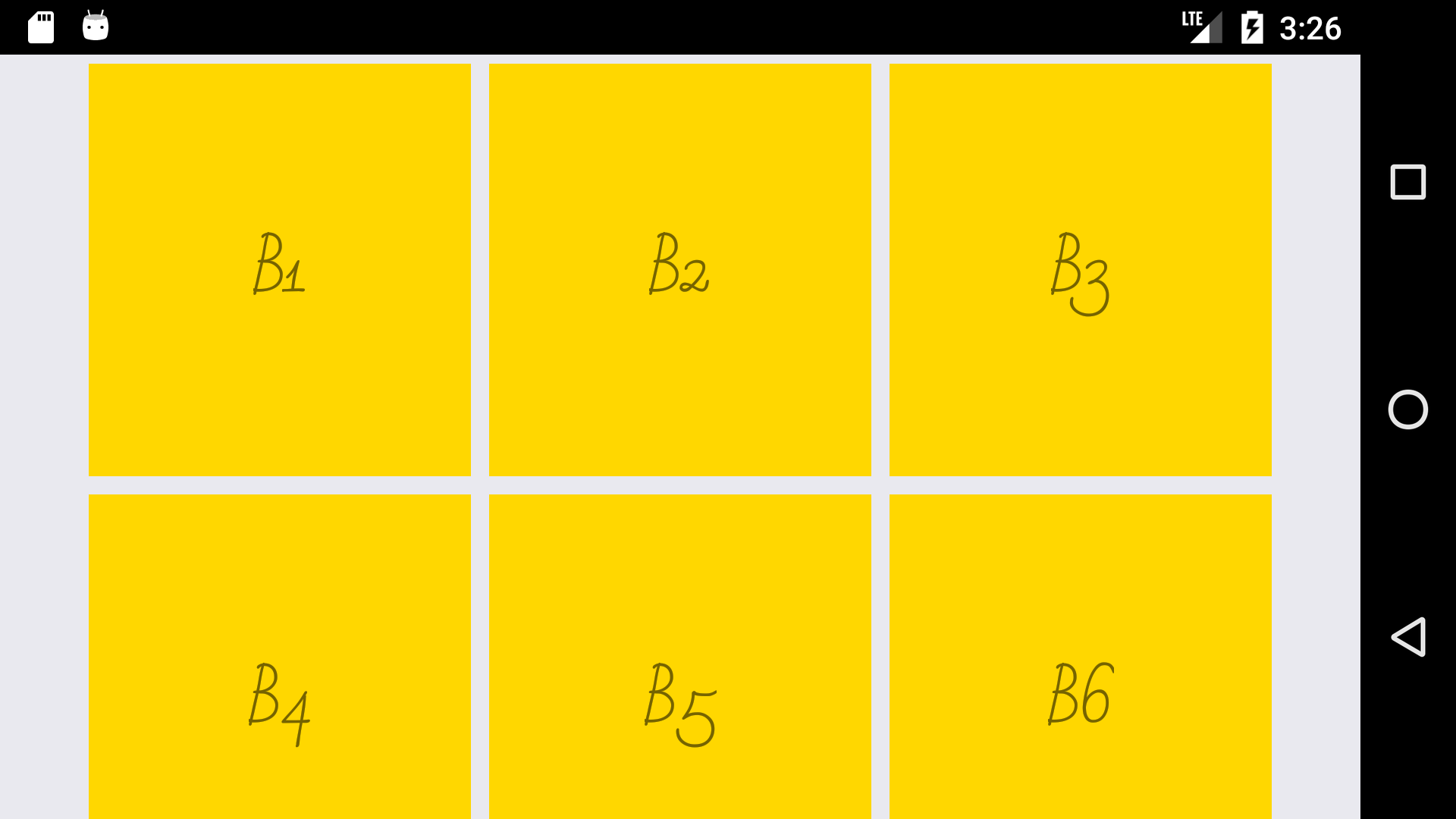
but, on landscape:
This is my component render method:
const rows = 3;
const cols = 2;
const marginHorizontal = 4;
const marginVertical = 4;
const width = (Dimensions.get('window').width / cols) - (marginHorizontal * (cols + 1));
const height = (Dimensions.get('window').height / rows) - (marginVertical * (rows + 1));

render() {
  return (
  <Container ref="root">
    <ScrollView style={stylesGrid.scrollContainer}>
      <View style={stylesGrid.sectionContainer}>
        <View style={stylesGrid.boxContainer}><Text>B1</Text></View>
        <View style={stylesGrid.boxContainer}><Text>B2</Text></View>
        <View style={stylesGrid.boxContainer}><Text>B3</Text></View>
        <View style={stylesGrid.boxContainer}><Text>B4</Text></View>
        <View style={stylesGrid.boxContainer}><Text>B5</Text></View>
        <View style={stylesGrid.boxContainer}><Text>B6</Text></View>
      </View>
    </ScrollView>
  </Container>
);
}

const stylesGrid = StyleSheet.create({
  scrollContainer: {
    flex: 1,
  },
  sectionContainer: {
    flex: 1,
    flexDirection: 'row',
    flexWrap: 'wrap',
    justifyContent: 'center',
    alignItems: 'center',
  },
  boxContainer: {
    marginTop: marginVertical,
    marginBottom: marginVertical,
    marginLeft: marginHorizontal,
    marginRight: marginHorizontal,
    width: width,
    height: height,
    justifyContent: 'center',
    alignItems: 'center',
    backgroundColor: 'gold',
  },
});
Even worse things happen when loading in landscape: 3x2 layout is not even kept when changing orientation...
Any suggestion for a consistent responsive layout in react-native?
 395
395
I solved following @agmcleod suggestion: added an orientation change listener in constructor:
Dimensions.addEventListener('change', () => {
  if (this.refs.root) { // avoid updating state when not necessary
    this.setState({
      orientation: Dimensions.get('window').width < Dimensions.get('window').height ? 'portrait' : 'landscape'
    });
  }
});
And then moved logic for setting layout variables inside render() function.
Works like a charm.
118
If you love us? You can donate to us via Paypal or buy me a coffee so we can maintain and grow! Thank you!
Donate Us With
