 Menu
Menu
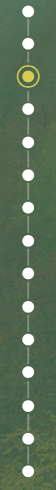
i need to create somthing like you see on the picture. I already created the line with circles, but i have problems with the yellow one which should have a border circle around with space in between.
I already created a fiddle with the steps i already have, but the yellow one is my problem. Any suggestions are welcome! jsfiddle
My HTML:
<section class="preview">
    <ul>
        <li class="first">
            <div>
            </div>
        </li>
        <li>
            <div>
            </div>
        </li>
        <li>
            <div>
            </div>
        </li>
        <li class="current">
            <div>
            </div>
        </li>
        <li>
            <div>
            </div>
        </li>
        <li>
            <div>
            </div>
        </li>
        <li>
            <div>
            </div>
        </li>
        <li>
            <div>
            </div>
        </li>
        <li>
            <div>
            </div>
        </li>
        <li>
            <div>
            </div>
        </li>
        <li>
            <div>
            </div>
        </li>
        <li class="last">
            <div>
            </div>
        </li>
    </ul>
</section>
My CSS:
.preview ul li {
    list-style-type: none;
    position: relative;
    width: 1px;
    margin: 0 auto;
    padding-top: 35px;
    background: #fff;
}

.preview ul li::after {
    content: '';
    position: absolute;
    left: 50%;
    top: 0;
    transform: translateX(-50%);
    width: 15px;
    height: 15px;
    border-radius: 50%;
    background: inherit;
}

.preview ul li.last {
    padding-top: 0;
}

.preview ul li.current:after {
    background: #fff934;
    border: 2px solid #fff934;
    box-shadow: 1px 1px 0px 5px black;
}
 727
727
There is a simpler way of doing this without the extra div inside the li. You set a background with background-clip: content-box - what this does is restrict your background to the content area, meaning that your background won't show underneath the padding or border area outside the content if these are non-zero. You then give your element a non-zero padding and a border. You'll have both the background and the border showing and a transparent space between them determined by the size of the padding.
ul {
  list-style: none;
  background: url(https://i.stack.imgur.com/SVlc8.jpg);
}

li {
  margin: .25em;
  border: solid 2px transparent;
  padding: 3px;
  width: 10px; height: 10px;
  border-radius: 50%;
  background: currentColor content-box;
  color: #fff;
}

.current { border-color: currentColor; }
<ul>
<li></li>
<li class='current'></li>
<li></li>
<li></li>
<li></li>
</ul>(for a more detailed explanation and more similar examples, you can check out this article about background-clip I wrote last year)
71
You need to add another circle with transparent background with yellow border for current class
body {
  font: normal 16px/1.5 "Helvetica Neue", sans-serif;
  background: #456990;
  color: #fff;
  overflow-x: hidden;
  padding-bottom: 50px;
}
.preview ul li {
  list-style-type: none;
  position: relative;
  width: 1px;
  margin: 0 auto;
  padding-top: 35px;
  background: #fff;
}

.preview ul li::after {
  content: '';
  position: absolute;
  left: 50%;
  top: 0;
  transform: translateX(-50%);
  width: 15px;
  height: 15px;
  border-radius: 50%;
  background: inherit;
}

.preview ul li.last {
  padding-top: 0;
}

.preview ul li.current:after { /* Code i edited */
  background: #fff934;
}
.preview ul li.current:before {  /* Code i added*/
  content: '';
    position: absolute;
    left: 50%;
    top: -4px;
    transform: translateX(-50%);
    width: 22px;
    height: 21px;
    border-radius: 50%;
    background: transparent;
    border: 1px solid #fff934;
}
<section class="preview">
<ul>
<li class="first">
<div>
</div>
</li>
<li>
<div>
</div>
</li>
<li>
<div>
</div>
</li>
<li class="current">
<div>
</div>
</li>
<li>
<div>
</div>
</li>
<li>
<div>
</div>
</li>
<li>
<div>
</div>
</li>
<li>
<div>
</div>
</li>
<li>
<div>
</div>
</li>
<li>
<div>
</div>
</li>
<li>
<div>
</div>
</li>
<li class="last">
<div>
</div>
</li>
</ul>
</section>If you love us? You can donate to us via Paypal or buy me a coffee so we can maintain and grow! Thank you!
Donate Us With