 Menu
Menu
I made a design using css grids which gave me unexpected space between rows. I reproduced my issue with the following code:
main {
  display: grid;
  grid-template-columns: repeat(3, 1fr);
  grid-column-gap: 10px;
  grid-row-gap: 10px;
}
article {
  background: red;
}
.item1 {
  height: 30px;
  grid-column-start: 1;
  grid-column-end: 2;
  grid-row-start: 1;
  grid-row-end: 2;
}
.item2 {
  height: 100px;
  grid-column-start: 1;
  grid-column-end: 2;
  grid-row-start: 2;
  grid-row-end: 3;
}
.item3 {
  height: 300px;
  grid-column-start: 1;
  grid-column-end: 2;
  grid-row-start: 3;
  grid-row-end: 4;
}
.item4 {
  height: 490px;
  grid-column-start: 2;
  grid-column-end: 3;
  grid-row-start: 1;
  grid-row-end: 5;
}
.item5 {
  height: 160px;
  grid-column-start: 1;
  grid-column-end: 2;
  grid-row-start: 4;
  grid-row-end: 6;
}
.item6 {
  height: 520px;
  grid-column-start: 2;
  grid-column-end: 3;
  grid-row-start: 5;
  grid-row-end: 7;
}
.item7 {
  height: 300px;
  grid-column-start: 1;
  grid-column-end: 2;
  grid-row-start: 6;
  grid-row-end: 7;
}
<main>
<article class="item1"></article>
<article class="item2"></article>
<article class="item3"></article>
<article class="item4"></article>
<article class="item5"></article>
<article class="item6"></article>
<article class="item7"></article>
</main>Here you can see extra gap on top of the bottom items.
I found a similar question -- Why does CSS Grid layout add extra gaps between cells? -- where the extra gap was caused by figures and solved using display: flex on the figures, but that didn't work for me.
Any idea?
EDIT:
My example was misleading, here is a closer-to-the-real-problem version:
main {
  display: grid;
  grid-template-columns: repeat(3, 1fr);
  grid-column-gap: 10px;
  grid-row-gap: 10px;
}
article {
  background: red;
}
article div {
  background: blue;
}
.item1 {
  grid-column-start: 1;
  grid-column-end: span 1;
  grid-row-start: 1;
  grid-row-end: span 1;
}
.item1 div {
  height: 30px;
}
.item2 {
  grid-column-start: 1;
  grid-column-end: span 1;
  grid-row-start: 2;
  grid-row-end: span 1;
}
.item2 div {
  height: 100px;
}
.item3 {
  grid-column-start: 1;
  grid-column-end: span 1;
  grid-row-start: 3;
  grid-row-end: span 1;
}
.item3 div {
  height: 300px;
}
.item4 {
  grid-column-start: 2;
  grid-column-end: span 1;
  grid-row-start: 1;
  grid-row-end: span 4;
}
.item4 div {
  height: 490px;
}
.item5 {
  grid-column-start: 1;
  grid-column-end: span 1;
  grid-row-start: 4;
  grid-row-end: span 2;
}
.item5 div {
  height: 160px;
}
.item6 {
  grid-column-start: 2;
  grid-column-end: span 1;
  grid-row-start: 5;
  grid-row-end: span 2;
}
.item6 div {
  height: 520px;
}
.item7 {
  grid-column-start: 1;
  grid-column-end: span 1;
  grid-row-start: 6;
  grid-row-end: span 1;
}
.item7 div {
  height: 300px;
}
<main>
<article class="item1"><div></div></article>
<article class="item2"><div></div></article>
<article class="item3"><div></div></article>
<article class="item4"><div></div></article>
<article class="item5"><div></div></article>
<article class="item6"><div></div></article>
<article class="item7"><div></div></article>
</main>Here you can see extra gap in red. The heights on the contained div are just here to simulate the real content of the articles, so they can't be modified in the real example (they are left to default in the real code). Based on the pre-edit answers, I tried grid-auto-rows property, but it didn't solve the problem.
 442
442
To adjust the gap size, use grid-column-gap, grid-row-gap or grid-gap property in CSS.
Use the Grid to place shapes precisely on a page. Go to View, and select the Grid check box to show the grid. Go to View, and clear the Grid check box to hide the grid.
By default, a grid item cannot be smaller than the size of its content. Grid items have an initial size of min-width: auto and min-height: auto . You can override this behavior by setting grid items to min-width: 0 , min-height: 0 or overflow with any value other than visible .
You have a grid container with three explicit columns and 10px gutters:
main {
  display: grid;
  grid-template-columns: repeat(3, 1fr);
  grid-column-gap: 10px;
  grid-row-gap: 10px;
}
There are no rows defined. All rows are implicit and take content height (because a default setting of a grid container is grid-auto-rows: auto).
Inside this container are seven grid items that are positioned using line-based placement.
Let's break this down to individual pieces.
.item1 {
    height: 30px;
    grid-column-start: 1;
    grid-column-end: 2;
    grid-row-start: 1;
    grid-row-end: 2;
}

Simple enough. Item 1 spans across the first column and first row. It is 30px in height, which sets the row height.
.item2 {
    height: 100px;
    grid-column-start: 1;
    grid-column-end: 2;
    grid-row-start: 2;
    grid-row-end: 3;
}

Again, pretty straightforward. Item 2 spans across the first column and second row. It is 100px in height, which sets the row height.
.item3 {
    height: 300px;
    grid-column-start: 1;
    grid-column-end: 2;
    grid-row-start: 3;
    grid-row-end: 4;
}

Like the two items above, Item 3 is clear and simple. It spans across the first column and third row. It is 300px in height, which sets the row height.
Now it starts to get a bit tricky...
.item4 {
    height: 490px;
    grid-column-start: 2;
    grid-column-end: 3;
    grid-row-start: 1;
    grid-row-end: 5;
}

Item 4 is set to span a total of four rows:
grid-row-start: 1 / grid-row-end: 5
It has a height of 490px.
But items 1, 2 & 3 are set to span a total of three rows:
grid-row-start: 1 / grid-row-end: 4
...and their total height is: 430px (30px + 100px + 300px)
Therefore, Item 4 creates a new row with a height of 30px (490px - 430px - 30px grid row gaps).
.item5 {
    height: 160px;
    grid-column-start: 1;
    grid-column-end: 2;
    grid-row-start: 4;
    grid-row-end: 6;
}

Item 5 has a height of 160px and is set to span two rows. It starts at the fourth row (which was created by Item 4) and creates a new fifth row.
Because row heights are set to auto, each row receives an equal distribution of the height of the grid item, as defined in the spec for grid areas that cover multiple tracks. This makes rows 4 and 5 each 80px tall.
Important: Notice how Item 5 equal height rows expand row 4, which is now spaced away from its original position at the bottom of Item 4. The first gap has been created.
.item6 {
    height: 520px;
    grid-column-start: 2;
    grid-column-end: 3;
    grid-row-start: 5;
    grid-row-end: 7;
}
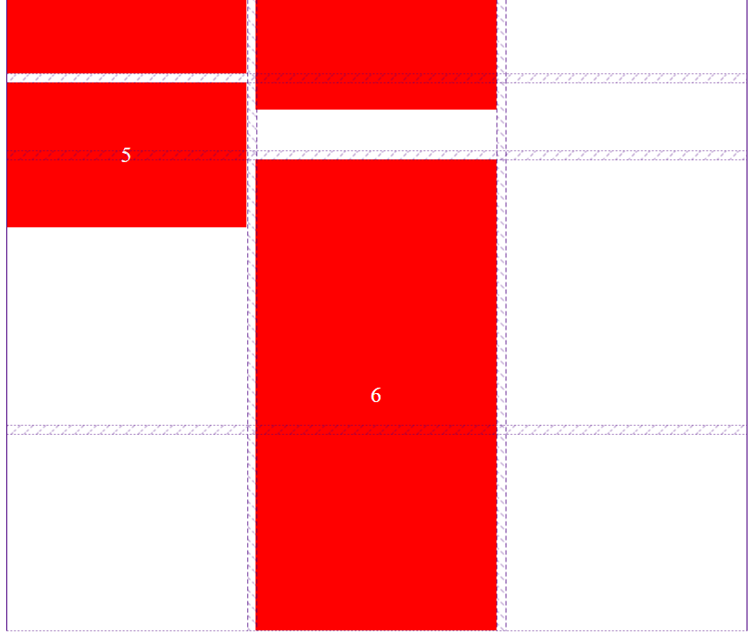
Item 6 is set to start at row 5. As explained above (see Important), row 5 can no longer be fitted to Item 4 because of grid-auto-rows: auto on the Item 5 grid area. This results in a 50px gap above Item 6.
80px height of row 4 - 30px excess of Item 4 = 50px
But now Item 6 adds to the 80px height of row 5 created by Item 5. The second gap has been created.
.item7 {
    height: 300px;
    grid-column-start: 1;
    grid-column-end: 2;
    grid-row-start: 6;
    grid-row-end: 7;
}

The height of the last two rows is determined by the following three factors:
For the same reason that grid row line 5 is spaced away from Item 4, grid row line 6 spaces away from Item 5: The auto row height is distributing the height of Item 6 among the rows it covers.
Instead of setting heights to Grid Items, consider setting grid-auto-rows to something like 10px. Then use the span keyword to created the grid areas you want.
So instead of this...
main {
  display: grid;
  grid-template-columns: repeat(3, 1fr);
  grid-column-gap: 10px;
  grid-row-gap: 10px;
}

.item5 {
  height: 160px;
  grid-column-start: 1;
  grid-column-end: 2;
  grid-row-start: 4;
  grid-row-end: 6;
}
consider this:
main {
  display: grid;
  grid-template-columns: repeat(3, 1fr);
  grid-auto-rows: 10px; /* new */
  grid-column-gap: 10px;
  grid-row-gap: 10px;
}

.item5 {
  /* height: 160px; */
  grid-column-start: 1;
  grid-column-end: 2;
  grid-row-start: 4;     /* this would have to be adjusted, as well */
  grid-row-end: span 16; /* new */
}
This approach is covered here: CSS-only masonry layout but with elements ordered horizontally
151
If you love us? You can donate to us via Paypal or buy me a coffee so we can maintain and grow! Thank you!
Donate Us With