 Menu
Menu
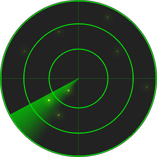
I'm trying to figure out a possible solution on how to create a radar scanner effect using jquery and css. Essentially, a semi-transparent triangle would rotate around the middle point of a div. Is this possible with jquery or should I resort to some other means? I prefer to not use animated gifs.
 418
418
$(function() {

  var $rad = $('#rad'),
      $obj = $('.obj'),
      deg = 0,
      rad = $rad.width() / 2;

  $obj.each(function(){
    var pos = $(this).data(),
        getAtan = Math.atan2(pos.x-rad, pos.y-rad),
        getDeg = (-getAtan/(Math.PI/180) + 180) | 0;
    // Read/set positions and store degree
    $(this).css({left:pos.x, top:pos.y}).attr('data-atDeg', getDeg);
  });

  (function rotate() {
    $rad.css({transform: 'rotate('+ deg +'deg)'}); // Radar rotation
    $('[data-atDeg='+deg+']').stop().fadeTo(0,1).fadeTo(1700,0.2); // Animate dot at deg

    deg = ++deg % 360;      // Increment and reset to 0 at 360
    setTimeout(rotate, 25); // LOOP
  })();

});
#radar{
position:relative;
overflow:hidden;
width:321px; height:321px;
background:#222 url(http://i.stack.imgur.com/vY6Tl.png);
border-radius: 50%;
}
#rad{
position:absolute;
width:321px;
height:321px; background:url(http://i.stack.imgur.com/fbgUD.png);
}
.obj{
background:#cf5;
position:absolute;
border-radius: 50%;
width:4px; height:4px; margin:-2px;
box-shadow:0 0 10px 5px rgba(100,255,0,0.5);
opacity:0.2;
}<script src="https://ajax.googleapis.com/ajax/libs/jquery/2.1.1/jquery.min.js"></script>
<div id="radar">
<div id="rad"></div>
<div class="obj" data-x="120" data-y="65"></div>
<div class="obj" data-x="140" data-y="185"></div>
<div class="obj" data-x="220" data-y="35"></div>
<div class="obj" data-x="120" data-y="235"></div>
</div><div id="radar">
<div id="rad"></div>
</div>
CSS:
#radar{
  position:relative;
  width:321px;
  height:321px;
  background:#222 url(http://i.stack.imgur.com/vY6Tl.png);
  border-radius:320px;
}
#rad{
  position:absolute;
  width:321px;
  height:321px; background:url(http://i.stack.imgur.com/fbgUD.png);
}
jQuery:
$(function() {

    var $rad = $('#rad'),
        d = 0;

    (function rotate() {
        $rad.css({ transform: 'rotate('+ d +'deg)'}); // apply CSS3
        setTimeout(function() {
            ++d;         // next degree
            rotate();    // recall function
        }, 25);          // every 25ms
    })();                // 1st start

});
CSS only demonstration
HTML:
<div id="radar">
    <div class="beacon" id="beacon"></div>
    <div class="beacon" id="beacon-75"></div>
    <div class="beacon" id="beacon-50"></div>
    <div class="beacon" id="beacon-25"></div>
    <div class="circle" id="circle-big"></div>
    <div class="circle" id="circle-medium"></div>
    <div class="circle" id="circle-small"></div>
    <div class="circle" id="dot"></div>
    <div id="vertical"></div>
    <div id="horizontal"></div>
</div>
CSS:
#radar {
    position:relative;
    width:400px;
    height:400px;
    margin:20px auto;
    border:3px solid #0c0;
    background-color:#020;
    border-radius:50%;
}
#radar>* {position:absolute}
.beacon {
    left:50%;
    top:50%;
    border-style:solid;
    border-width:8px 200px 8px 0;
    border-color:transparent;
    margin-top:-8px;
    transform-origin:0 50%;
}
#beacon {border-right-color:#0c0;animation:spin 2s 0s linear infinite}
#beacon-75 {border-right-color:rgba(0,204,0,0.75);animation:spin 2s 0.03s linear infinite}
#beacon-50 {border-right-color:rgba(0,204,0,0.5);animation:spin 2s 0.06s linear infinite}
#beacon-25 {border-right-color:rgba(0,204,0,0.25);animation:spin 2s 0.09s linear infinite}
.circle {
    left:50%;
    top:50%;
    border:1px solid #0c0;
    border-radius:50%;
}
#circle-big {
    width:300px;
    height:300px;
    margin:-150px;
}
#circle-medium {
    width:200px;
    height:200px;
    margin:-100px;
}
#circle-small {
    width:100px;
    height:100px;
    margin:-50px;
}
#dot {
    width:8px;
    height:8px;
    margin:-4px;
    background-color:#0c0;
}
#vertical {
    left:50%;
    top:0;
    bottom:0;
    border-left:1px solid #0c0;
}
#horizontal {
    top:50%;
    left:0;
    right:0;
    border-top:1px solid #0c0;
}

@keyframes spin {
    from {transform:rotate(0)}
    to {transform:rotate(360deg)}
}
Please note that to support some browsers you will need to add vendor prefixes, but this by itself works in IE10 and Firefox.
32
If you love us? You can donate to us via Paypal or buy me a coffee so we can maintain and grow! Thank you!
Donate Us With