 Menu
Menu
I asked a similar question yesterday but explained it poorly, and didn't specify my desire for a pure-CSS solution, which I think should be possible, so I'm trying again.
Basically, I have an issue where I have a div of scrollable messages and an input field below it. When I click a button, I would like the input field to be bumped up 100 pixels, without having the div of messages scroll as well.
Here is a fiddle that demonstrates the problem in its entirety
As you can see, when you click the "add margin" button, the messages div scrolls up as well. I would like it to stay where it was. Similarly, if you are slightly scrolled up so you can only see the second to last message, clicking the button should similarly retain that position upon click.
The interesting thing is that this behavior is "sometimes" preserved. For example, in some circumstances (which I can't quite deduce) the scroll position is retained. I would just like it to consistently behave as such.
window.onload = function(e) {
  document.querySelector(".messages").scrollTop = 10000;
};

function test() {
  document.querySelector(".send-message").classList.toggle("some-margin");
}
.container {
width: 400px;
height: 300px;
border: 1px solid #333;
display: flex;
flex-direction: column;
}
.messages {
overflow-y: auto;
height: 100%;
}
.send-message {
width: 100%;
display: flex;
flex-direction: column;
}
.some-margin {
margin-bottom: 100px;
}<div class="container">
<div class="messages">
<div class="message">hello</div>
<div class="message">hello</div>
<div class="message">hello</div>
<div class="message">hello</div>
<div class="message">hello</div>
<div class="message">hello</div>
<div class="message">hello</div>
<div class="message">hello</div>
<div class="message">hello</div>
<div class="message">hello</div>
<div class="message">hello</div>
<div class="message">hello</div>
<div class="message">hello</div>
<div class="message">hello</div>
<div class="message">hello</div>
<div class="message">hello</div>
<div class="message">hello</div>
<div class="message">hello</div>
<div class="message">hello</div>
<div class="message">hello</div>
</div>
<div class="send-message">
<input />
</div>
</div>
<button onclick="test()">add margin</button>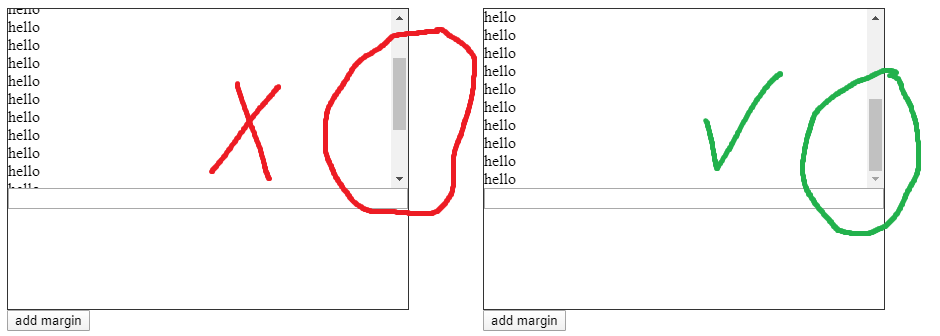
 370
370
use css position top keep it at the bottom {position : relative; bottom:0;} . Remove the css property once the user has scroll.
To hide the scrollbar and disable scrolling, we can use the CSS overflow property. This property determines what to do with content that extends beyond the boundaries of its container. To prevent scrolling with this property, just apply the rule overflow: hidden to the body (for the entire page) or a container element.
To do this (in Chrome, Firefox, and Edge), we can add the CSS property overscroll-behavior: contain to the overflow: auto element. This will prevent the "scroll chaining" behavior, which will, in turn, keep the mouse-wheel active within the target element.
This is a funny solution that you might like.
What we know about the div that it preserve only the top position of the scrollbar so if the height changed due to any reason the scrollbar will remain the same and this is what causes your issue.
As workaround you can flip the .messages 180 degree using transform: rotate(180deg) scaleX(-1); and flip back the .message to cancel flipping the content then the div will maintain the bottom scrollbar (which is top) automatically.
function test() {
  document.querySelector(".send-message").classList.toggle("some-margin")
}
.container {
width: 400px;
height: 300px;
border: 1px solid #333;
display: flex;
flex-direction: column;
}
.messages {
overflow-y: auto;
height: 100%;
transform: rotate(180deg) scaleX(-1);
}
.message
{
transform: rotate(180deg) scaleX(-1);
}
.send-message {
width: 100%;
display: flex;
flex-direction: column;
}
.some-margin {
margin-bottom: 100px;
}<div class="container">
<div class="messages">
<div class="message">hello1</div>
<div class="message">hello2</div>
<div class="message">hello3</div>
<div class="message">hello4</div>
<div class="message">hello5</div>
<div class="message">hello6</div>
<div class="message">hello7</div>
<div class="message">hello8</div>
<div class="message">hello9</div>
<div class="message">hello10</div>
<div class="message">hello11</div>
<div class="message">hello12</div>
<div class="message">hello13</div>
<div class="message">hello14</div>
<div class="message">hello15</div>
<div class="message">hello16</div>
<div class="message">hello17</div>
<div class="message">hello18</div>
<div class="message">hello19</div>
<div class="message">hello20</div>
</div>
<div class="send-message">
<input />
</div>
</div>
<button onclick="test()">add margin</button>If you love us? You can donate to us via Paypal or buy me a coffee so we can maintain and grow! Thank you!
Donate Us With

