 Menu
Menu
I am trying to create a posted paper in pure css3 with transitions and box-shadow.
So far I have accomplished a paper with shadows on both sides but I would like to make it look like this:
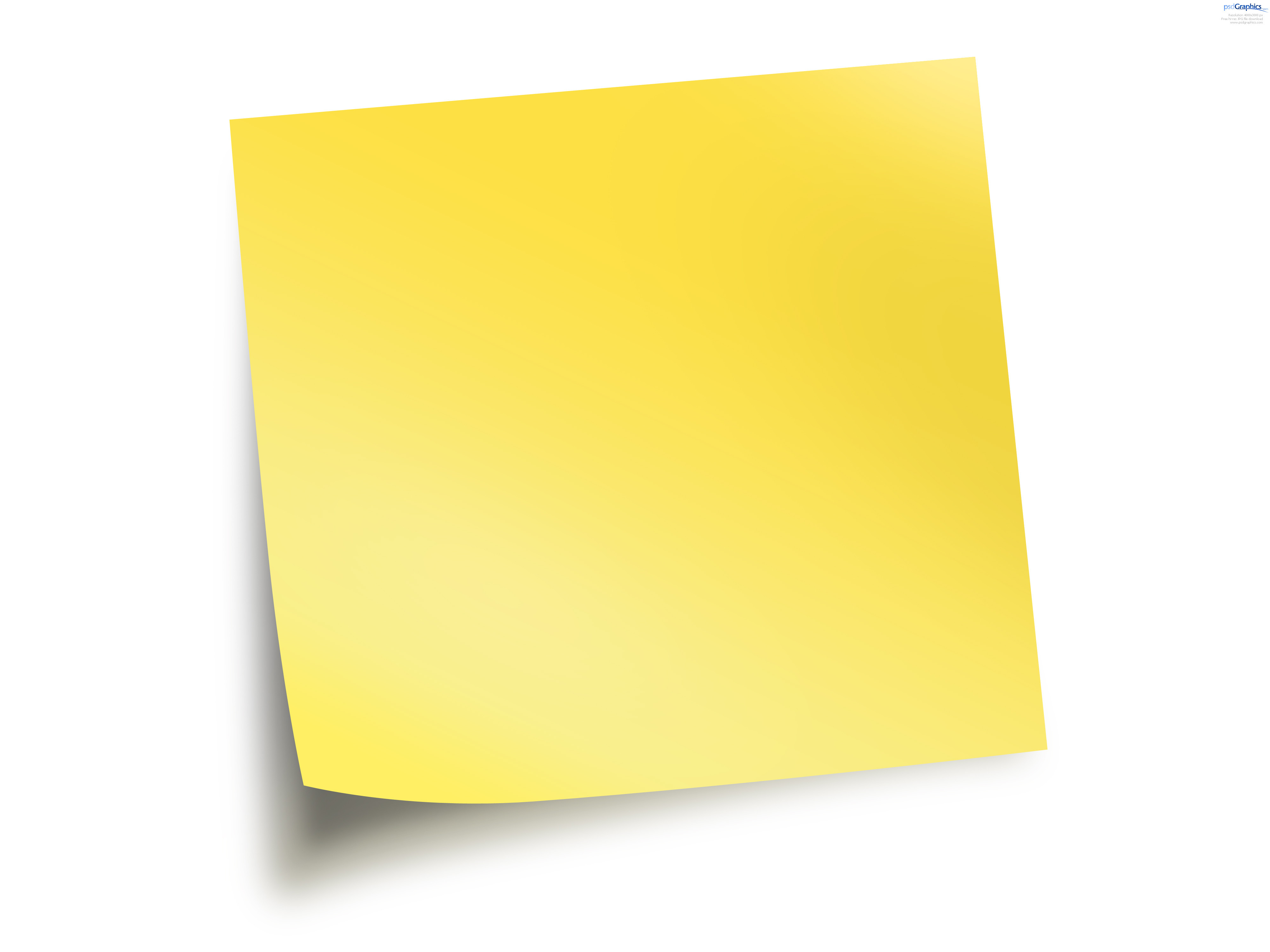
Is that even possible without images?
.shadow {
  width: 150px;
  height: 150px;
  background-color: yellow;
  position: relative;
}
.shadow:after {
  position: absolute;
  right: 10px;
  left: auto;
  -webkit-transform: skew(8deg) rotate(3deg);
  -moz-transform: skew(8deg) rotate(3deg);
  -ms-transform: skew(8deg) rotate(3deg);
  -o-transform: skew(8deg) rotate(3deg);
  transform: skew(8deg) rotate(3deg);
}
<div class="shadow">
edit this even further
</div> 411
411
Here is my attempt, just to give you the idea.
Needs a lot of artistic adjustment, but has all the elements needed.
Included backface-visibility : hidden; thanks to Harry suggestion
.test {
    width: 300px;
    height: 300px;
    left: 50px;
    top: 50px;
    border-bottom-left-radius: 250px 45px;
    position: absolute;
    overflow: hidden;
    transform: rotate(-19deg);
    box-shadow: -9px 10px 31px 6px gray;
    backface-visibility: hidden;
}

.test:after {
    content: "";
    width: 100%;
    height: 100%;
    position: absolute;
    background-color: yellowgreen;
    border-bottom-left-radius: 45px 250px;
    background-image: radial-gradient(circle at 50px 180px, rgba(255,255,255,0.3), transparent 70px),
    radial-gradient(circle at 85px 215px, rgba(255,255,255,0.4), transparent 70px),
    radial-gradient(circle at 120px 250px, rgba(255,255,255,0.3), transparent 70px);
    box-shadow: -9px 10px 14px 22px gray;
}
<div class="test"></div>If you love us? You can donate to us via Paypal or buy me a coffee so we can maintain and grow! Thank you!
Donate Us With

