 Menu
Menu
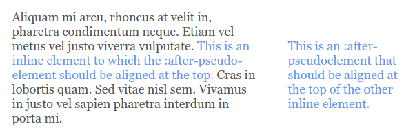
I'm looking for a CSS-only way to position content in an :after pseudo element absolutely relative to another - possibly multiline - element's top edge. The result should resemble this:
Usually there's no rocket science involved to archieve this, but I'd like to find a solution that also meets the following criteria:
:before pseudoelement (this is already needed to achieve some other independent thing),display: block/inline-block; on the inline element (because it creates ugly holes in the text flow),:after-pseudo-element in any way that makes it dependent of the parent element's position inside the grandparent element, the parent element's height or the actual element's height (or to make it short: don't make anything dependent of the content),I created a Codepen that hopefully makes it easier to grasp what I'm going for here.
I know that it is easily possible to get to the result by violating one of the restrictions listed above (as demonstrated in the Codepen), but I'm looking for an elegant solution to this problem where this is not needed.
After playing around with this for quite a while I'd say that it is not possible, but it would be great if someone could convince me of the contrary - or at least formally proves that it actually is impossible. Thanks a lot for any help in advance.
 788
788
Well, the only possible solution with the wanted method could be this.
- First to mention, for this to work you'd need to define ::after content directly in CSS, not through data- attribute. (I don't know why, but seems like a parsing problem.)
- Set position:relative to the .wrapper. as you're going to move ::after left-right based on that parent (not direct one).
- Set width: 100% to ::after (100% of the parent)
- Set white-space: pre to ::after - this is important
- Write the content directly with using \A (escape character) to break the word in particular places.
- Set top: 0 and give it a negative right position (how far you want)
Note: You might need to set word-wrap: break-word on certain elemenets if the additional text is overflowing out of the wrapper.
Basically, this is the addition/modification for your CSS:
.wrapper {
  position: relative;
}

.accent::before{
    position: absolute;
    width: 100%;
    content: "Unfortunately \A it is aligned with \A the last line of said span.";
    white-space: pre;
    right: -70%;
}

.content p {
    word-wrap: break-word; /* in my example <p> was problematic */
}
Note: I don't know how good this method is for responsive designs, never tried it that way.
Tested on FF and Chrome.
Live example
EDIT:
Hm, yeah, I started with ::after then by accident switched to ::before =)
Alright, minor modifications to the CSS:
- Instead of width: 100% set width: auto
- Instead of top: 0 you need to manually (sorry) reduce margin-top: -(number)px - don't use top as it's gonna set top position based on the wrapper itself.
- Switch right: -(number)% to right: -(number)px
CSS modification:
.accent::after{
    width: auto;
    right: -50px;
    margin-top: -40px;
    /* and remove "top" property completely */
}
Live example
ANOTHER EDIT
Cleaner working solution where you can use content: attr(data-meta) (removed white-space: pre and set width to wanted percentage size:
.accent::after{
    position: absolute;
    width: 30%;
    content: attr(data-meta);
    right: -50px;
    margin-top: -40px;
}
Live example
119
If you love us? You can donate to us via Paypal or buy me a coffee so we can maintain and grow! Thank you!
Donate Us With

