 Menu
Menu
What's intended
I'm using a off canvas menu using CSS and JavaScript. The off canvas menu is working as intended. I want a sidebar menu that is left of the screen and moves along when the menu is triggered. The idea is to have a menu trigger that is 100px across and has a height of 100% and always left of the screen. Using position absolute I had problems with the height on all browsers, using fixed position Firefox works fine but encounters problems mentioned below.
Errors
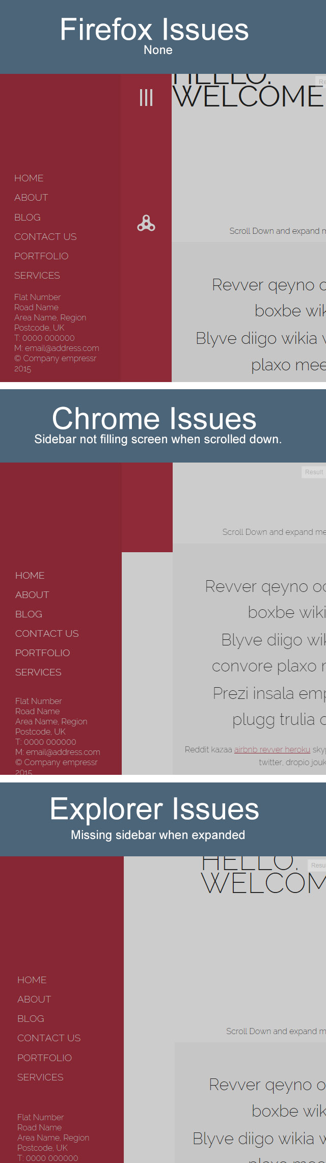
Firefox Issues: None, as far as I can tell.
Chrome Issues: After scrolling a few pixels down the sidebar menu trigger does not stretch the entire page.
Internet Explorer: The sidebar seems to vanish completely when the sidebar menu is triggered.
jsFiddle
Because my code is heavy on both HTML, CSS and JavaScript I have included a jsFiddle. Please note that the problem only occurs on Chrome and Internet Explorer as far as I know. You can replicate the problem by scrolling down the page a little and then clicking the left hand side menu button.
Screenshots
NOTE WORTHY HTML CODE (Full Code in Fiddle)
<div id="sbContainer" class="sbContainer"> <div class="sbPush"> <header class="contain-to-grid sbMenu sbFX"> <nav class="top-bar" data-topbar> <ul class="title-area show-for-small-only"><!--SITENAME--></ul> <section class="top-bar-section"><!--LINKS--></section> </nav> </header> <div class="sbContent-one"> <div class="sbContent-two"> <div class="sbMenuTrigger" data-effect="sbFX"><!--SIDEBAR TRIGGER--></div> <div class="sbMainContent" role="document"><!--PAGE CONTENT--></div> </div> </div> </div> </div> NOTE WORTHY CSS CODE (Full Code in Fiddle)
html, body, .sbContainer, .sbPush, .sbContent-one { height:100% } .sbContent-one { overflow-x:hidden; background:#fff; position:relative } .sbContainer { position:relative; overflow:hidden } .sbPush { position:relative; left:0; z-index:99; height:100%; -webkit-transition:-webkit-transform .5s; transition:transform .5s } .sbPush::after { position:absolute; top:0; right:0; width:0; height:0; background:rgba(0,0,0,0.2); content:''; opacity:0; -webkit-transition:opacity 0.5s,width .1s 0.5s,height .1s .5s; transition:opacity 0.5s,width .1s 0.5s,height .1s .5s } .sbMenu-open .sbPush::after { width:100%; height:100%; opacity:1; -webkit-transition:opacity .5s; transition:opacity .5s } .sbMenu { position:absolute; top:0; left:0; z-index:100; visibility:hidden; width:244px; height:100%; background:#872734; -webkit-transition:all .5s; transition:all .5s } .sbMenu::after { position:absolute; top:0; right:0; width:100%; height:100%; background:rgba(0,0,0,0.2); content:''; opacity:1; -webkit-transition:opacity .5s; transition:opacity .5s } .sbMenu-open .sbMenu::after { width:0; height:0; opacity:0; -webkit-transition:opacity 0.5s,width .1s 0.5s,height .1s .5s; transition:opacity 0.5s,width .1s 0.5s,height .1s .5s } .sbFX.sbMenu-open .sbPush { -webkit-transform:translate3d(300px,0,0); transform:translate3d(244px,0,0) } .sbFX.sbMenu { -webkit-transform:translate3d(-100%,0,0); transform:translate3d(-100%,0,0) } .sbFX.sbMenu-open .sbFX.sbMenu { visibility:visible; -webkit-transition:-webkit-transform .5s; transition:transform .5s } .sbFX.sbMenu::after { display:none } .no-csstransforms3d .sbPush,.no-js .sbPush { padding-left:244px } .sbMenuTrigger { background-color:#b23445; cursor:pointer; height:100%; width:100px; position:fixed; left:0; top:0 } .sbMainContent { margin-left:100px; width:calc(100% - 100px); top:0; padding-top:50px; position:absolute; height:100% }  448
448
Off-Canvas menu lets you display your content as a sidebar when a button is triggered. This helps you to showcase a certain aspect of your site in the side navigation panel thus giving a user-friendly experience to your visitors.
To create a fixed top menu, use position:fixed and top:0 . Note that the fixed menu will overlay your other content. To fix this, add a margin-top (to the content) that is equal or larger than the height of your menu.
Here is a work-around that requires very little changes.
It works consistently in the latest versions of FF, Chrome, and IE11/10.
Updated Example
.sbContent-one { overflow: visible; /* Or remove overflow-x: hidden */ } .sbMainContent { overflow-x: hidden; } .sbMenuTrigger { position: static; /* Or remove position: fixed */ } The easiest way to resolve the issue in Chrome is to simply move the overflow from .sbContent-one to .sbMainContent. In doing so, you can't actually scroll past the .sbMenuTrigger element (which resolves the issue) since .sbMainContent is a sibling element.
There are currently many inconsistencies across browser around how fixed elements are positioned relative to elements that are transformed using translate3d. The issue in IE was due to the fact that fixed elements are positioned relative to the window without taking the elements that are transformed using translate3d into account. To solve this avoid fixed positioning completely, and add the element .sbMenuTrigger back into the normal flow by removing position: fixed (or overriding that with position: static, the default). In doing so, the sidebar expands as expected.
In other words:
overflow-x: hidden from .sbContent-one (or override it with overflow: visible).overflow-x: hidden to .sbMainContent.position: fixed from .sbMenuTrigger (or override it with position: static).
111
Here is my solution to your problem. Tested on 3 mayor browsers and it works fine!
see fiddle
Take a look at my changes on the following classes:
.sbContent-one .sbContent-two (new rule).sbMainContent .sbMenuTrigger the main problems were:
.sbContent-one and .sbMainContent.
33
If you love us? You can donate to us via Paypal or buy me a coffee so we can maintain and grow! Thank you!
Donate Us With