 Menu
Menu
I needed a way to add a "stroke" (outline) and drop-shadow effect to a transparent PNG image based on its alpha mask, and the only solution I could find was using custom SVG filters. (Note: The web app for which I need these effects is for my own private use, so it's ok that this solution isn't compatible with legacy browsers. Moving on...)
I had never used SVG before, but it was pretty simple to create stroke and drop-shadow filters individually. Unfortunately, I could not find a way to create a combined effect without actually copying-and-pasting the filters into a new one, as shown in the code below:
<svg width="0" height="0" xmlns="http://www.w3.org/2000/svg">

    <!-- drop shadow -->
    <filter id="drop-shadow">
        <feGaussianBlur in="SourceAlpha" stdDeviation="4" />
        <feOffset result="m_offsetBlurred" dx="12" dy="12" />
        <feFlood result="m_floodTrans50" flood-color="rgba(0,0,0,0.5)" />
        <feComposite result="m_offsetBlurredTrans50" in="m_floodTrans50" in2="m_offsetBlurred" operator="in" />
        <feMerge>
            <feMergeNode in="m_offsetBlurredTrans50" />
            <feMergeNode in="SourceGraphic" />
        </feMerge>
    </filter>


    <!-- outer stroke -->
    <filter id="outer-stroke">
        <!-- create rectangle of the desired color -->
        <feFlood result="m_floodRect" flood-color="black" />

        <!-- create copy of png's alpha mask and expand -->
        <feMorphology result="m_expandedMask" in="SourceAlpha" operator="dilate" radius="1" />

        <!-- "cut out" a section of the flood fill matching the expanded copy -->
        <feComposite result="m_expandedColored" in="m_floodRect" in2="m_expandedMask" operator="in" />

        <!-- blend it behind the original shape to create the outline effect -->
        <feBlend in="SourceGraphic" in2="m_expandedColored" mode="normal" />
    </filter>


    <!-- drop shadow & outer stroke (must copy & paste the 2 filters above, which violates the DRY principle) -->
    <filter id="outer-stroke-drop-shadow">
        <!-- create rectangle of the desired color -->
        <feFlood result="m_floodRect" flood-color="black" />

        <!-- create copy of png's alpha mask and expand -->
        <feMorphology result="m_expandedMask" in="SourceAlpha" operator="dilate" radius="1" />

        <!-- "cut out" a section of the flood fill matching the expanded copy -->
        <feComposite result="m_expandedColored" in="m_floodRect" in2="m_expandedMask" operator="in" />

        <!-- blend it behind the original shape to create the outline effect -->
        <feBlend result="m_stroked" in="SourceGraphic" in2="m_expandedColored" mode="normal" />

        <!-- add drop shadow -->
        <feGaussianBlur result="m_blurred" in="SourceAlpha" stdDeviation="4" />
        <feOffset result="m_offsetBlurred" in="m_blurred" dx="12" dy="12" />
        <feFlood result="m_floodTrans50" flood-color="rgba(0,0,0,0.5)" />
        <feComposite result="m_offsetBlurredTrans50" in="m_floodTrans50" in2="m_offsetBlurred" operator="in" />
        <feMerge>
            <feMergeNode in="m_offsetBlurredTrans50" />
            <feMergeNode in="m_stroked" />
        </feMerge>
    </filter>
</svg>


<style>
    .fx_drop_shadow              { filter: url('#drop-shadow'); }
    .fx_outer_stroke             { filter: url('#outer-stroke'); }
    .fx_outer_stroke_drop_shadow { filter: url('#outer-stroke-drop-shadow'); }
</style>


<div>
    <img src="gfx/odd_shape.png" />
    <img src="gfx/odd_shape.png" class="fx_drop_shadow" />
    <img src="gfx/odd_shape.png" class="fx_outer_stroke" />
    <img src="gfx/odd_shape.png" class="fx_outer_stroke_drop_shadow" />
</div>
Here is how the above code will render in an HTML5 document:
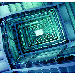
And here is the original PNG graphic (odd_shape.png):

Question 1: How can I reuse the first 2 filters (drop-shadow and outer-stroke) so I can simply apply them in the combined filter (outer-stroke-drop-shadow) instead of having to copy and paste them.
Question 2: Is it possible to parameterize the custom filters so that I can specify things such as the stroke color, or the transparency of the drop shadow? This would make them even more reusable.
Thanks.
 454
454
Here is a complete solution that works in both browsers I tested (Firefox and Chrome)...
Solution for Question 1: None of the browsers I tested support specifying more than one filter in the filter property, so the best (and perhaps only) way to combine user-defined filters is using the technique suggested by Michael Mullany: apply them sequentially in nested <g> elements, creating the filter graph as desired.
Solution for Question 2: The W3C has a working draft for SVG Parameters and the draft includes a polyfill script for using and testing the proposed feature. Parameters are declared via param() functional attribute value (e.g., param(shadowColor) black) and defined through a query-string-like interface (e.g., foo.svg?shadowColor=red) or through child elements of the <object> container (e.g., <param name="shadowColor" value="red"/>).
Demo code for both solutions is provided below, along with a screenshot from Firefox.
<object type="image/svg+xml" data="filters.svg?osColor=lime&dsAlpha=0.4"></object>
<object type="image/svg+xml" data="filters.svg?osColor=white&osWidth=4&dsAlpha=0.8&dsBlurSigma=8&dsOffsetX=32"></object>
<svg xmlns="http://www.w3.org/2000/svg" xmlns:xlink="http://www.w3.org/1999/xlink" width="300px" height="320px" viewBox="0 0 300 320">
    <defs>
        <filter id="dropShadow" width="150%">
            <feGaussianBlur in="SourceAlpha" stdDeviation="param(dsBlurSigma) 4" />
            <feOffset result="m_offsetBlurred" dx="param(dsOffsetX) 12" dy="param(dsOffsetY) 12" />
            <feComponentTransfer result="m_offsetBlurredTranslucent" in="m_offsetBlurred">
                <feFuncA type="linear" slope="param(dsAlpha) 0.5" />
            </feComponentTransfer>
            <feMerge>
                <feMergeNode in="m_offsetBlurredTranslucent" />
                <feMergeNode in="SourceGraphic" />
            </feMerge>
        </filter>
        <filter id="outerStroke" width="150%">
            <feFlood result="m_floodRect" flood-color="param(osColor) black" />
            <feMorphology result="m_expandedMask" in="SourceAlpha" operator="dilate" radius="param(osWidth) 1" />
            <feComposite result="m_expandedColored" in="m_floodRect" in2="m_expandedMask" operator="in" />
            <feBlend in="SourceGraphic" in2="m_expandedColored" mode="normal" />
        </filter>
    </defs>

    <!-- combine stroke & drop shadow -->
    <g style='filter:url(#dropShadow);' width='300' height='320'>
        <g style='filter:url(#outerStroke);'>
            <image width='240' height='280' xlink:href="gfx/odd_shape.png"></image>
        </g>
    </g>

    <!-- use polyfill from http://dev.w3.org/SVG/modules/param/master/SVGParamPrimer.html -->
    <script type="text/ecmascript" xlink:href="http://dev.w3.org/SVG/modules/param/master/param.js" />
</svg>
The result:

112
Answer to question 1:
The Filter Effects spec does allow you to have multiple effects in a linear list, for example:
filter: url(#outer-stroke) drop-shadow(5px 5px 10px black);
or even:
filter: url(#outer-stroke) url(#drop-shadow);
Whether this is implemented yet is another question however. In Chrome you can currently only combine the shorthand syntax in this way. The effects are applied in the order you specify them in.
Answer to question 2:
If you use the drop-shadow shorthand you can specify the shadow color as rgba, which gives you opacity.
38
If you love us? You can donate to us via Paypal or buy me a coffee so we can maintain and grow! Thank you!
Donate Us With