 Menu
Menu
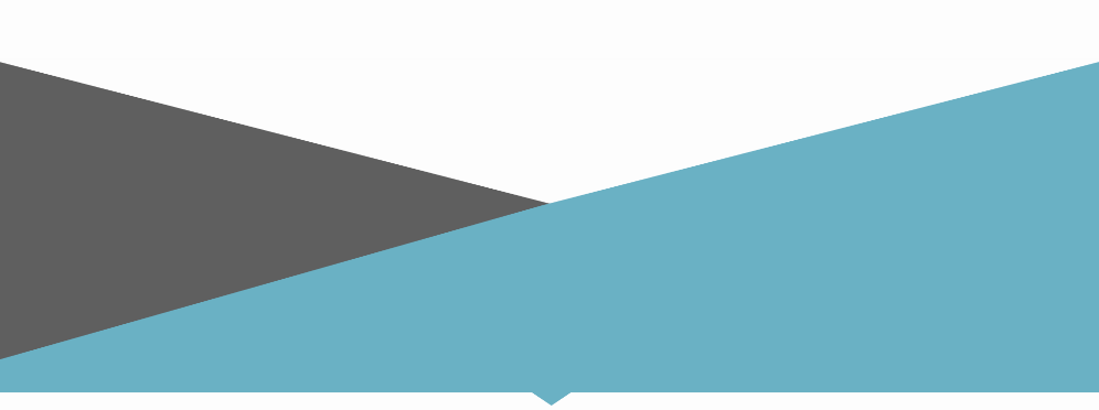
Here is the shape I'm trying to create in pure CSS:
I have a more complete jsfiddle http://jsfiddle.net/8Lxr5s57/7/. Is there a better, more efficient way to achieve this same result?
.angled_container {
  background-color: #fff;
  height: 200px;
  position: relative;
  overflow: hidden;
  clear: both;
}
.angled_container:before,
.angled_container:after {
  content: "";
  width: 110%;
  height: 100%;
  display: block;
  position: absolute;
  top: 0;
}
.angled_container:before {
  background-color: #606060;
  transform: rotate(12deg);
  -webkit-transform-origin: left top;
  left: 0;
}
.angled_container:after {
  background-color: #6bb2c6;
  transform: rotate(-12deg);
  -webkit-transform-origin: right top;
  left: -10%;
}
.angled_container--open-left:before {
  background-color: #6bb2c6;
  z-index: 2;
}
.angled_container--open-left:after {
  background-color: #606060;
  z-index: 1;
}
<div class="angled_container angled_container--open-right"></div> 516
516
I would suggest using skewY() instead of rotate() for the two triangles. it will avoid some positioning issues and prevent using wider pseudo elements than the container :
.angled_container {
  height: 200px;
  position: relative;
  overflow: hidden;
}
.angled_container:before,
.angled_container:after {
  content: "";
  width: 100%; height: 100%;
  display: block;
  position: absolute;
  top: 0; left: 0;
}
.angled_container:before {
  background-color: #606060;
  transform: skewY(12deg);
  transform-origin: left top;
}
.angled_container:after {
  background-color: #6bb2c6;
  transform: skewY(-12deg);
  transform-origin: right top;
}
<div class="angled_container angled_container--open-right"></div>Alternatively, you can use an inline SVG with 2 polygon elements. This is totaly responsive and probably easier to make/maintain as you can style the triangles in CSS with the fill property :
svg{display:block; width:100%;}
.first{
  fill:#606060;
}
.second{
  fill:#6bb2c6;
}
<svg viewbox="0 0 100 30">
<polygon class="first" points="0 0 100 28 0 25 0 28"/>
<polygon class="second" points="0 28 0 25 100 0 100 28 52 28 50 30 48 28 0"/>
</svg>If you love us? You can donate to us via Paypal or buy me a coffee so we can maintain and grow! Thank you!
Donate Us With

