 Menu
Menu
I have been working on a self-project to duplicate the reddit page for javascript using the JSON data available. But am not able to replicate the behaviour of the original website in its header section, where the header is responsive (behaviour when screen size is decreased).

GIF : how the original website header section works.
The problem :
divs are translucent, the behind text too shows. Can't think of any solution for this.GIF : my header (behind text seen)
navbar elements transcend down when space is not enough. This is not how it is in the original, where they get hidden by the more and Login section. I cannot figure out how to go about having it in a single row.GIF : my header (header elements move down)
A smaller, similar sample snippet :
.custom-header-full{
    background: rgba(255,255,0,1);
}

/* Top */
.custom-top-header-container{
    background: rgba(0,0,0,0.7);       /* translucent */
    position:absolute;
    top:0;
    width: 100%;
}
#top-right-div{
    position: absolute;
    right: 0;
    z-index: 1000;
}
<link href="https://maxcdn.bootstrapcdn.com/bootstrap/3.3.7/css/bootstrap.min.css"
rel="stylesheet"/>
<div class="navbar navbar-static-top custom-header-full">
<!-- TOPMOST header with Links and Login/Signup -->
<div class="navbar-header custom-top-header-container">
<!-- Left side with various links -->
<div id="top-left-div">
<a class="navbar-brand" href="#">MY SUBREDDITS ▼</a>
<a class="navbar-brand" href="#">POPULAR</a>
<a class="navbar-brand" href="#">ALL</a>
<a class="navbar-brand" href="#">RANDOM</a>
</div>
<!-- Login/Signup on the right -->
<div id="top-right-div">
<span class="navbar-brand">Want to join?
<a href="#">Log in or sign up</a>
in seconds |
<button class="glyphicon glyphicon-wrench tools-icon"></button>
</span>
</div>
</div>
</div>In case you want to check with the full project, the link on Github.
An interesting point to Note : in the header, the left sided titles are being overlapped by the right sided section. So it is a smooth transaction where the possibility is such that even partial of the text is seen in a title when overlapped. Basically its not a matter of making the title element invisible by width as that would make the whole title invisible.
Ex :
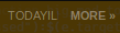
The title has TODAYIL
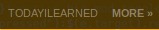
The title has TODAYILEARNED (whole of the title)
 580
580
You can use the CSS position property in combination with the z-index property to overlay an individual div over another div element. The z-index property determines the stacking order for positioned elements (i.e. elements whose position value is one of absolute , fixed , or relative ).
You need to take out the min-width from your CSS. When the page is sized smaller the min-width stops it from shrinking any further. Thus causing the overlap. Save this answer.
If you're able to use CSS flexbox, I think this solution works the way you want:
.custom-header-full{
    background: rgba(255,255,0,1);
}

/* Top */
.custom-top-header-container{
    background: rgba(0,0,0,0.7);       /* translucent */
    position:absolute;
    top:0;
    width: 100%;
    display: flex;
}
#top-left-div {
    flex: 1 1 0%;
    overflow: hidden;
    display: flex;
    white-space: nowrap;
}
#top-right-div{
    flex: 0 0 auto;
}
<link href="https://maxcdn.bootstrapcdn.com/bootstrap/3.3.7/css/bootstrap.min.css"
rel="stylesheet"/>
<div class="navbar navbar-static-top custom-header-full">
<!-- TOPMOST header with Links and Login/Signup -->
<div class="navbar-header custom-top-header-container">
<!-- Left side with various links -->
<div id="top-left-div">
<a class="navbar-brand" href="#">MY SUBREDDITS ▼</a>
<a class="navbar-brand" href="#">POPULAR</a>
<a class="navbar-brand" href="#">ALL</a>
<a class="navbar-brand" href="#">RANDOM</a>
</div>
<!-- Login/Signup on the right -->
<div id="top-right-div">
<span class="navbar-brand">Want to join?
<a href="#">Log in or sign up</a>
in seconds |
<button class="glyphicon glyphicon-wrench tools-icon"></button>
</span>
</div>
</div>
</div>What I did:
.custom-top-header-container display:flex to ensure the left and right display side-by-side.#top-right-div only ever take up the space that its content needs (i.e. don't grow or shrink)#top-left-div fill whatever space remains in the container, and use overflow:hidden to hide any content that might overlap with #top-right-div on small widths.#top-left-div to white-space: nowrap to prevent links with spaces (like "My Subreddits") from breaking onto multiple lines when the screen shrinks small enough.
120
I've managed to implement a pure-CSS solution without flex of what I assume you wanted to get.
I will highlight some of the changes I've made (the ones that don't directly pertain to the problem and could therefore be overlooked):
.navbar, .navbar-static-top, .navbar-header, .custom-header-full and .custom-top-header-container. Please find a way to overwrite their behaviour at your own time if you really need those classes. I can try to help if it proves too difficult.text-transform: uppercase; inside the CSS file. This can really help in the future if one happens to fall asleep while adding a new navigation link.▼). Modern browsers normally don't care, but it's still good practice.Here is a Fiddle of the end result. Let me know if you have any questions.
40
A little hack can help you I guess. Try doing these CSS changes :
#top-right-div {
    position: absolute;
    right: 0px;
    z-index: 1000;
    background: rgba(255,255,0,1);
}
And add background: rgba(0, 0, 0, 0.7); to the .navbar-brand under top-right-div in html.
This would create an illusion of what you are trying to achieve.
.custom-header-full{
    background: rgba(255,255,0,1);
}

/* Top */
.custom-top-header-container{
    background: rgba(0,0,0,0.7);       /* translucent */
    position:absolute;
    top:0;
    width: 100%;
    display: flex;
}
#top-left-div {
    flex: 1 1 0%;
    overflow: hidden;
    display: flex;
    white-space: nowrap;
}
#top-right-div{
    flex: 0 0 auto;
    background: rgba(255,255,0,1);
}
<link href="https://maxcdn.bootstrapcdn.com/bootstrap/3.3.7/css/bootstrap.min.css"
rel="stylesheet"/>
<div class="navbar navbar-static-top custom-header-full">
<!-- TOPMOST header with Links and Login/Signup -->
<div class="navbar-header custom-top-header-container">
<!-- Left side with various links -->
<div id="top-left-div">
<a class="navbar-brand" href="#">MY SUBREDDITS ▼</a>
<a class="navbar-brand" href="#">POPULAR</a>
<a class="navbar-brand" href="#">ALL</a>
<a class="navbar-brand" href="#">RANDOM</a>
</div>
<!-- Login/Signup on the right -->
<div id="top-right-div">
<span class="navbar-brand" style="background: rgba(0, 0, 0, 0.7);">Want to join?
<a href="#">Log in or sign up</a>
in seconds |
<button class="glyphicon glyphicon-wrench tools-icon"></button>
</span>
</div>
</div>
</div>If you love us? You can donate to us via Paypal or buy me a coffee so we can maintain and grow! Thank you!
Donate Us With