 Menu
Menu
I need a curved vertical line with 5 dots like this -
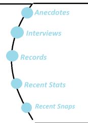
On hovering over each dot, text should slide besdide it from left to right, and text should disappear on taking away the mouse.
So far I have only been able to indent and place those 5 dots by means of modifying margin-leftproperty for each item in the list. I am not able to get the curved line. How do I achieve that?
 431
431
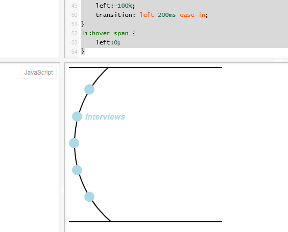
Border-radius is really great for creating the appearance of curves. The problem is that anything inside an container which is curved using this style ignores said curving. As you pointed out, we need to use margins. However, by keeping everything symmetric, we can keep the margin-lefts to three sets, one of which doesn't require a class.
We can get away with a very simple structure here:
<ul>
    <li><span>Text</span></li>
</ul>
We have the ul as the outer wrapper with the top and bottom horizontal borders. We use a ::before pseudo-element attached to the wrapper, to create the curved line. Each li is the menu entry. The blue circles are created with ::before pseudo-elements attached to the li, and we can achieve the text animation via the span inside. We could get away with not having a span, but we'd need to declare the actual text content in the CSS, and I think it belongs in the HTML.
The CSS isn't too bad. We curve the ul::before and give it the border. We make it larger than 100% because the curve you show cuts off the top and bottom.
ul {
    height:300px;
    width:300px;
    margin:0;
    padding:0;
    list-style:none;
    position:relative;
    border-top:solid 2px black;
    border-bottom:solid 2px black;
    overflow:hidden;
}
ul::before {
    height:133%;
    width:133%;
    border-radius:50%;
    border:solid 2px black;
    display:block;
    position:absolute;
    top:-18%;
    left:10px;
    content:"";
}
li {
    margin:28px 0;
    color:lightblue;
    font-style:italic;
    font-weight:bold;
    overflow:hidden;
}
li::before {
    height:20px;
    width:20px;
    content:"";
    display:inline-block;
    background-color:lightblue;
    border-radius:50%;
    position:relative;
    top:4px;
    margin-right:6px;
}
li.right {
    margin-left:30px;
}
li.middle {
    margin-left:6px;
}
li span {
    position:relative;
    left:-100%;
    transition: left 200ms ease-in;
}
li:hover span {
    left:0;
}
<ul>
<li class="right"><span>Anecdotes</span></li>
<li class="middle"><span>Interviews</span></li>
<li><span>Records</span></li>
<li class="middle"><span>Recent Stats</span></li>
<li class="right"><span>Recent Snaps</span></li>
</ul>Success! As mentioned, this might be better using Canvas, or possible SVG. But if you want to stay strictly with HTML & CSS, this should help.
Another way we can do this, staying with HTML & CSS, is to use transform:translate. I thought this might be easier and more reliable, but it turns out it requires more CSS and more classes. However, I got it working so I'm going to post it here anyway, because despite that it's pretty cool I think.
ul {
    height:300px;
    width:300px;
    margin:0;
    padding:0;
    list-style:none;
    position:relative;
    border-top:solid 2px black;
    border-bottom:solid 2px black;
    overflow:hidden;
}
ul::before {
    height:133%;
    width:133%;
    border-radius:50%;
    border:solid 2px black;
    display:block;
    position:absolute;
    top:-17.5%;
    left:10px;
    content:"";
}
li {
    margin:0;
    color:lightblue;
    font-style:italic;
    font-weight:bold;
    overflow:hidden;
    position:absolute;
    top:50%;
    left:50%;
    line-height:30px;
    margin-top:-15px;
}
li::before {
    height:20px;
    width:20px;
    content:"";
    display:inline-block;
    background-color:lightblue;
    border-radius:50%;
    position:relative;
    top:4px;
    margin-right:6px;
}
li.one {
    transform: translate(60px) rotate(-140deg) translate(208px) rotate(140deg);
}
li.two {
    transform: translate(60px) rotate(-160deg) translate(208px) rotate(160deg);
}
li.three {
    transform: translate(60px) rotate(-180deg) translate(208px) rotate(180deg);
}
li.four {
    transform: translate(60px) rotate(-200deg) translate(208px) rotate(200deg);
}
li.five {
    transform: translate(60px) rotate(-220deg) translate(208px) rotate(220deg)
}
li span {
    position:relative;
    left:-100%;
    transition: left 200ms ease-in;
}
li:hover span {
    left:0;
}
<ul>
<li class="one"><span>Anecdotes</span></li>
<li class="two"><span>Interviews</span></li>
<li class="three"><span>Records</span></li>
<li class="four"><span>Recent Stats</span></li>
<li class="five"><span>Recent Snaps</span></li>
</ul>Here's how you can achieve the curve, dots, and text display below. You have to adjust it to suit your need.
#arch {
  border-left: solid 2px black;
  border-radius: 50%;
  height: 500px;
  width: 300px;
  margin-left: 100px;
  padding-top: 100px;
  margin-top: -80px;
}
#arch-outer {
  /* serves as a blade to cut off overly curved area */
  height: 450px;
  width: 300px;
  overflow: hidden;
  /* Cuts off the overly cured area */
}
#arch li {
  font-size: 76px;
  height: 85px;
  color: rgb(153, 217, 234);
}
#arch li:nth-of-type(1) {
  margin-left: 20px;
}
#arch li:nth-of-type(4) {
  margin-left: 15px;
}
#arch li:nth-of-type(5) {
  margin-left: 40px;
}
#arch li a {
  font-size: 20px;
  line-height: 76px;
  vertical-align: middle;
  color: rgb(153, 217, 234);
}
<div id="arch-outer">
<div id="arch">
<ul>
<li><a href="#">One</a>
</li>
<li><a href="#">Two</a>
</li>
<li><a href="#">Three</a>
</li>
<li><a href="#">Four</a>
</li>
<li><a href="#">Five</a>
</li>
<ul>
</div>
<!-- End arch -->
</div>
<!-- End arch outer -->View on jsfiddle
24
If you love us? You can donate to us via Paypal or buy me a coffee so we can maintain and grow! Thank you!
Donate Us With


