 Menu
Menu
I'm sure this has been asked before but I can't find an answer to the exact question.
I want a very simple layout:
-------------------
      header
-------------------
         |
 content | graphic
         |
-------------------
where:
[edited to add:]
I've tried using flexboxes and have satisfied the first three constraints, but I can't get the content pane to grow horizontally to fill the space not used by the image. The best results I've got are using the HTML and CSS below but, as you can see in the screenshot below, this results in the content div and the image taking up the same size instead of the content div pushing the image to the right. (This is expected behavior from setting flex=1 on both, so I wasn't expecting it to work; but at least this gives me the image size behaving how I'd like).
What I'm using is at https://jsfiddle.net/uv566jc3/:
.grid {
  border: solid 1px #e7e7e7;
  height: 95vh;
  display: flex;
  flex-direction: column;
}
.header {
  flex: 0;
}
.grid__row {
  flex: 1;
  display: flex;
  flex-direction: row;
}
.grid__item {
  flex: 1;
  padding: 12px;
  border: solid 1px #e7e7e7;
}
img {
  flex: 1;
  object-fit: contain;
  overflow: hidden;
  border: solid 1px #e7e7e7;
}
<div class="grid">
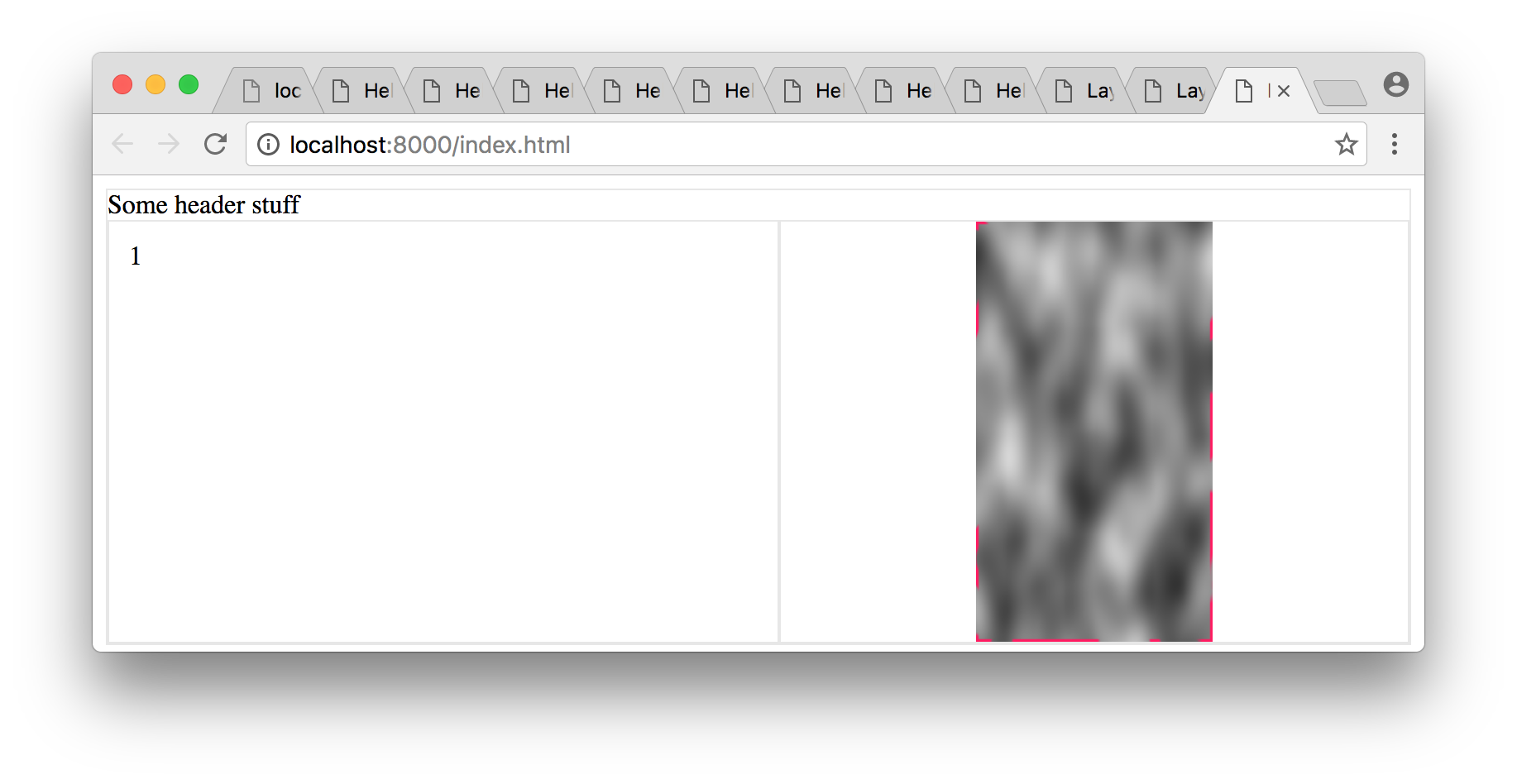
<div class="header">Some header stuff
</div>
<div class="grid__row">
<div class="grid__item">1</div>
<img id="pic" src="https://s27.postimg.org/oc7sozu7n/clouds.png">
</div>
</div>I haven't set min-width explicitly on the grid__item item in the jsfiddle, but I don't anticipate that making any difference.
Is there an easy way to get what I want in CSS? Apologies if this is a duplicate.
 394
394
I've edited the code your solution is this what you want ? I'm not sure..
https://jsfiddle.net/vjLps7qs/6/
It becomes :
  .container {
    width: calc(100vw);
    height: 100vh;
    overflow: hidden;
  }

  .top {
    height: 1.25em;
    padding: 3px;
    background: yellow;
    display: flex;
    flex-direction: row;
  }

  .innerCtr {
    height: 100%;
    overflow: hidden;
  }

  .left {
    height: 100%;
    background: red;
    overflow: hidden;
  }

  .right {
    max-height: 100%;
    max-width: 80%;
    calc(100% - 1.25rem);
    background: blue;
    float: right;
    object-fit: contain;
    overflow: hidden;
    position: relative;
    top: calc(50% - 1.25rem);
    transform: translateY(-52%) scale(0.95);
  }
added calc, which is supported by all major browsers
  .right {
    calc(100% - 1.25rem);
    top: calc(50% - 1.25rem);
  }
Again, I'm very sorry if that wasn't what you were looking for but this thread is hard to navigate.
182
flex: 1 factorIn your grid__row flex container, which is in row-direction, the two flex items – grid__item and img – each have flex: 1 applied.
This means that both items will divide the available space in the container evenly among themselves. In other words, 50/50, like in your illustration.
My suggestion: Remove flex: 1 from the img.
object-fit: contain
With object-fit: contain the aspect ratio of the image is kept and it scales to fit within the box.
As a result, there may be whitespace on the left and/or right (portrait fit), or top and/or bottom (landscape fit).
That could be the reason you're seeing "padding" space on the left and right of the image.
If you try cover, all the space gets used, but there's cropping (demo).
Here's more about object-fit: https://stackoverflow.com/a/37127590/3597276
overflow: hidden effectWith regard to your side comment:
...overflow=hidden (which I don't really understand what it's doing, but if I leave it out the img container expands horizontally by a factor of 2).
It's likely this is due to the minimum sizing algorithm of flex items.
By default, a flex item cannot be smaller than the size of its content.
However, this feature can be overridden with overflow: hidden.
More details here: Why doesn't flex item shrink past content size?
20
This example uses float concept:
Portrait image:
* {
  box-sizing: border-box;
}
body {
  margin: 0px;
}
.header {
  width: 100%;
  height:8vh;
  border: 1px solid #aaa;
}
.main-content {
  width: 100%;
  border: 1px solid #aaa;
  padding: 0px;
}
.main-content > .left {
  float: left;
  width: 50%;
}
.main-content > .right {
  float: right;
  width: 50%;
}
.main-content > div {
  min-height: 50%;
  max-height: 90%;
}
.main-content > .right > img {
  max-width: 100%;
  max-height: 90vh;
}
.main-content:after,
.main-content:before {
  display: table;
  clear: both;
  content: "";
}
<div class="header">
Some Header stuff..
<br>
</div>
<div class="main-content">
<div class="left">
Somehitng on the left
</div>
<div class="right">
<img src="https://s-media-cache-ak0.pinimg.com/236x/41/89/8c/41898cae6d9edd8737dfef07ab50ea57.jpg" />
</div>
</div>Landscape image:
* {
  box-sizing: border-box;
}
body {
  margin: 0px;
}
.header {
  width: 100%;
  height: 8vh;
  border: 1px solid #aaa;
}
.main-content {
  width: 100%;
  border: 1px solid #aaa;
  padding: 0px;
}
.main-content > .left {
  float: left;
  width: 50%;
}
.main-content > .right {
  float: right;
  width: 50%;
}
.main-content > div {
  min-height: 50%;
  max-height: 90%;
}
.main-content > .right > img {
  max-width: 100%;
  max-height: 90vh;
}
.main-content:after,
.main-content:before {
  display: table;
  clear: both;
  content: "";
}
<div class="header">
Some Header stuff..
<br>
</div>
<div class="main-content">
<div class="left">
Somehitng on the left
</div>
<div class="right">
<img src="http://www.w3schools.com/css/img_fjords.jpg" />
</div>
</div>If you love us? You can donate to us via Paypal or buy me a coffee so we can maintain and grow! Thank you!
Donate Us With